OverviewAll statesSouth Dakota
60/100
Grade: C- — A Minimalist Approach With Strong Tools Behind the Curtain
The South Dakota Department of Education website at doe.sd.gov takes a strikingly simple approach in a landscape where most states are moving toward modern CMS platforms and audience-segmented navigation. The site has essentially two navigation links — an A-Z Index and a Contact Us page — paired with a sidebar of Quick Links on the homepage. There are no dropdown menus, no audience-based pathways, no hamburger menu on mobile. It's a throwback to early-2010s government web design.
What makes South Dakota interesting is the contrast between the dated main site and the quality of its standalone tools. The South Dakota Report Card at sdschools.sd.gov is a well-designed, modern application with 2024-25 data. The Educator 411 portal is a comprehensive educator verification platform. The Data Dashboards provide interactive visualizations of teacher salaries, enrollment, and staffing. These tools deliver real value — they're just not surfaced well by the main site's minimalist design.
The site's biggest gaps are a near-complete absence of general parent resources (only special education parent content exists) and a dated visual design that relies on deprecated HTML elements. For a state with approximately 140,000 K-12 students across 149 districts, the DOE website functions as a simple directory rather than a comprehensive service platform.
Strengths
1. South Dakota Report Card — Modern Data Portal
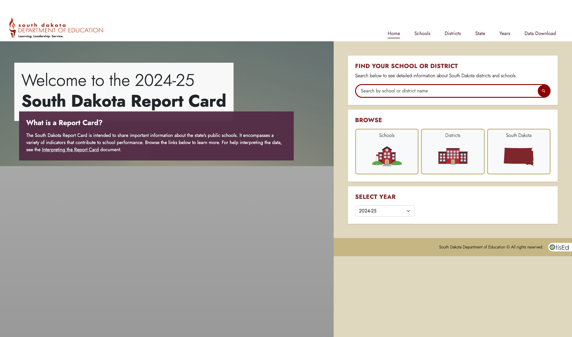
The standout tool in South Dakota's education ecosystem is the Report Card at sdschools.sd.gov, a well-designed Angular application built by OtisEd. It features school and district search, browse capabilities (Schools, Districts, South Dakota statewide), a year selector currently showing 2024-25 data, and a clean layout with the state's maroon branding. The "What is a Report Card?" panel provides context, and users can link to an "Interpreting the Report Card" guide. The top navigation includes Schools, Districts, State, Years, and Data Download tabs — a solid, focused data tool.
2. Educator Certification and Educator 411
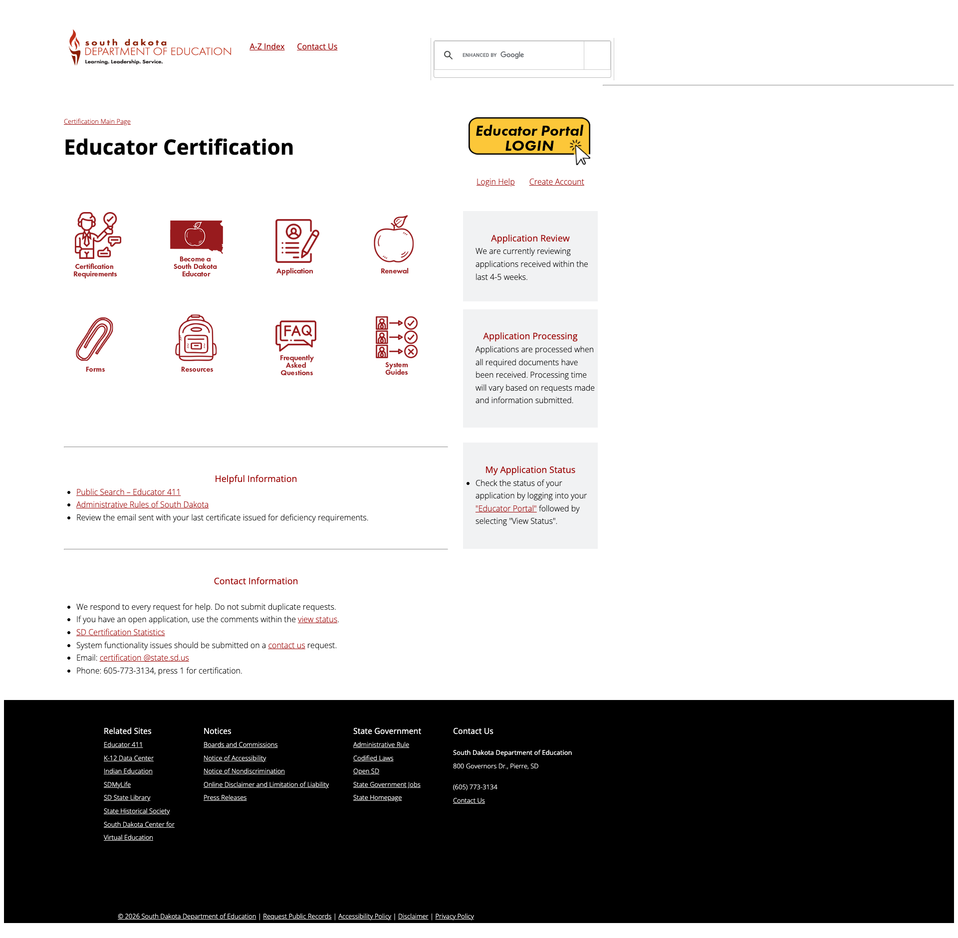
The Educator Certification section is one of the best-organized pages on the main site, using icon-based navigation tiles for Certification Requirements, Become a South Dakota Educator, Application, Renewal, Forms, Resources, FAQ, and System Guides. An Educator Portal login provides direct access to the application system, and a sidebar shows live processing status (currently reviewing applications from 4-5 weeks ago).
The linked Educator 411 tool at sd.gov/411 is a comprehensive portal with Educator Search, Endorsement Search, Disciplinary Actions, Staffing Data, and an "Apply Here" pathway — all under one modern interface with mySD single sign-on integration.
3. Data Dashboards and Data Center
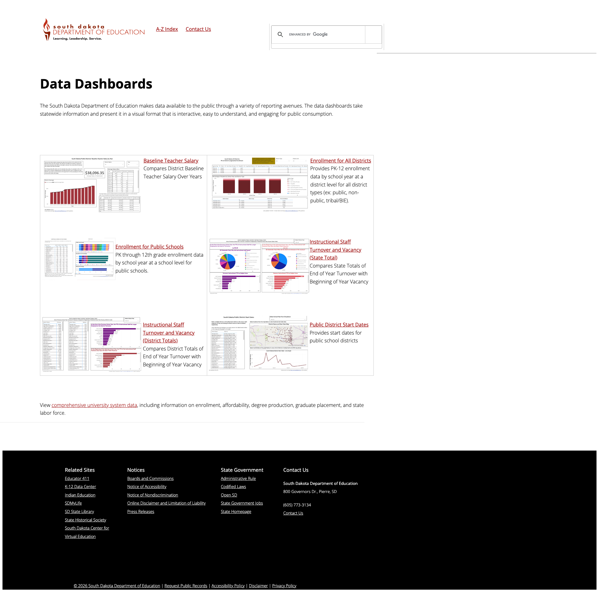
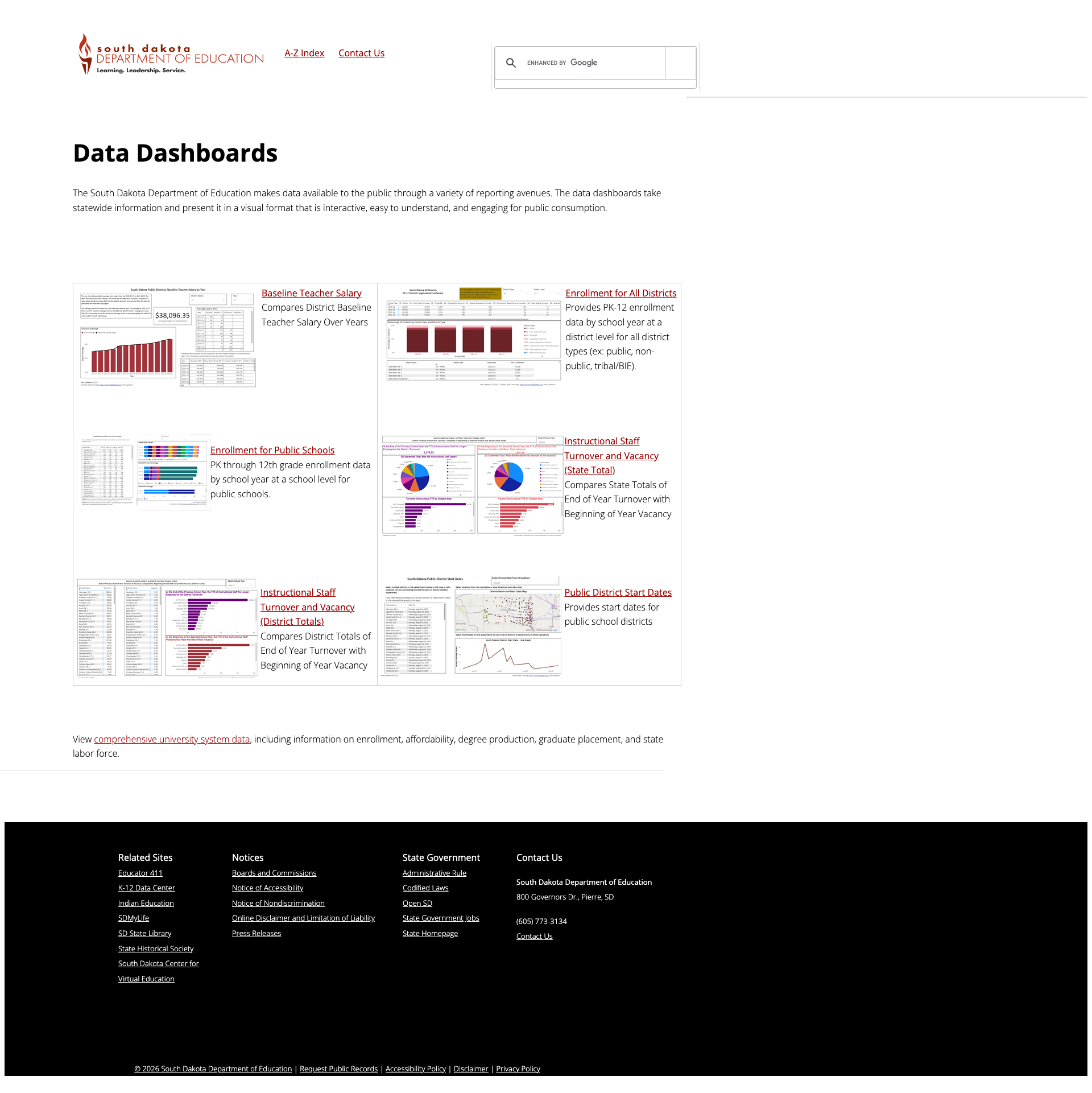
The Data Center serves as a hub linking to six interactive Data Dashboards: Baseline Teacher Salary (comparing district salary trends over years), Enrollment for All Districts (PK-12 by school year and district type), Enrollment for Public Schools, Instructional Staff Turnover and Vacancy (state and district totals), and Public District Start Dates. Each dashboard includes a preview thumbnail and clear description. The Data Center also links to the Report Card, School Finance data, Statistical Digest, and Student Enrollment reports through the Office of Finance & Management.
4. Google Custom Search Delivers Relevant Results
The site uses Google Custom Search Engine (CSE), which performs well — a query for "school report card" returned approximately 939 results in 0.19 seconds with relevant content including the Report Card page, FAQ documents, navigation guides, and CSI school classifications. Results include document thumbnails, PDF format indicators, and a Sort By option. For a site with minimal navigation, effective search is critical, and this delivers.
Weaknesses
1. Minimal Navigation Structure
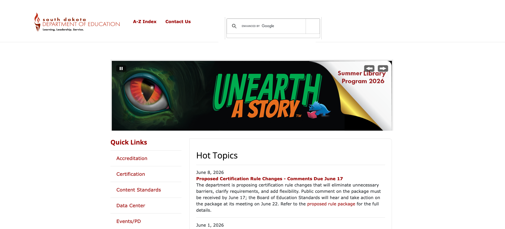
The site's header contains only three elements: the DOE logo, an "A-Z Index" link, and "Contact Us." There are no dropdown menus, no audience-based pathways (Parents, Educators, Administrators), no section menus, and no breadcrumbs on most pages. The homepage Quick Links sidebar provides 8 shortcut links (Accreditation, Certification, Content Standards, Data Center, Events/PD, Finance/Management, Report Card, School Directory), but once you navigate away from the homepage, the sidebar disappears. Users must rely on the A-Z Index — a flat alphabetical listing of 100+ pages — or the search box to find content. This approach assumes users already know what they're looking for.
2. Dated Visual Design with Deprecated HTML
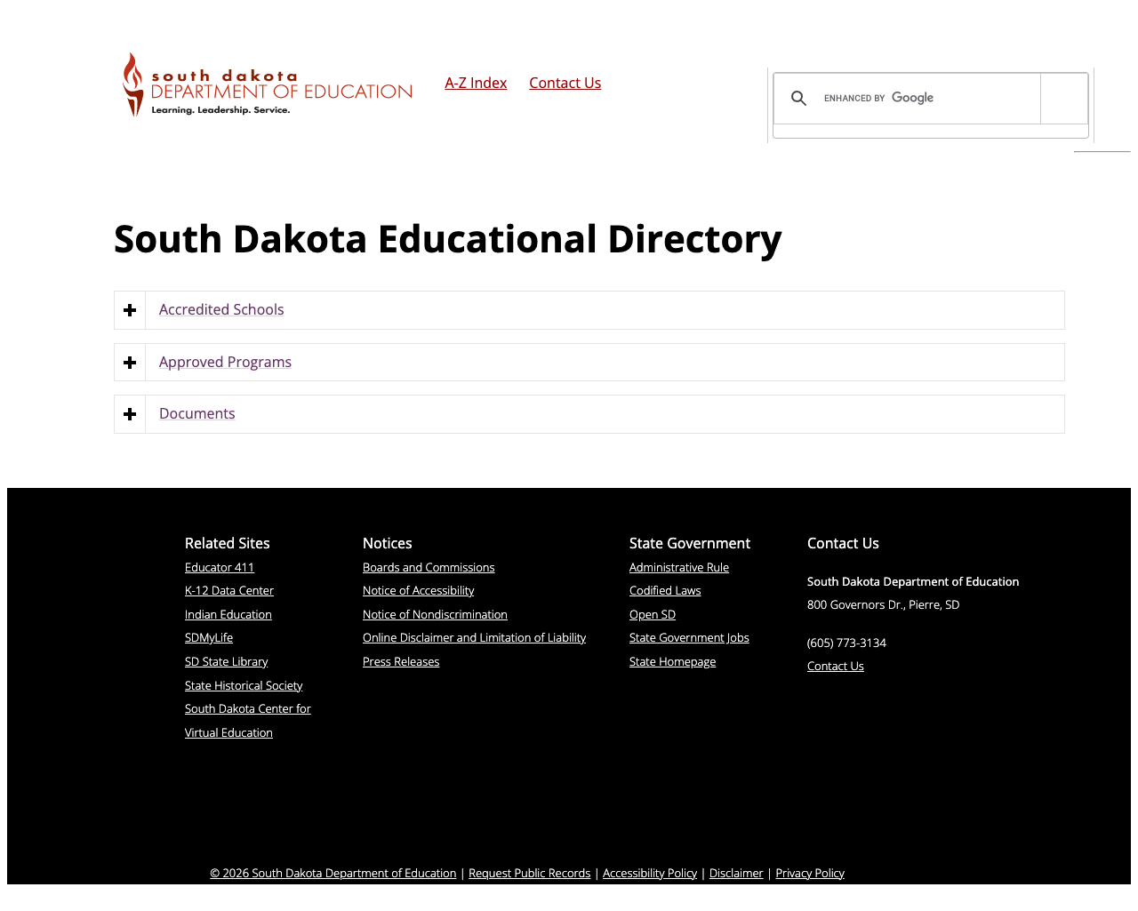
The site uses 36 instances of the deprecated <font> tag for styling, mixing Bootstrap 2's bootstrap-responsive.css with Bootstrap 4.4.1 in the same page — an unusual combination that suggests incremental upgrades without a unified redesign. The Quick Links sidebar uses inline <font color="#990000"> attributes instead of CSS classes. The design is functional but unmistakably dated, with no modern UI patterns beyond the homepage carousel. Some pages (like the School Directory) render with a completely different footer theme (dark background) than the rest of the site (light footer), creating visual inconsistency.
3. Parent Resources Limited to Special Education
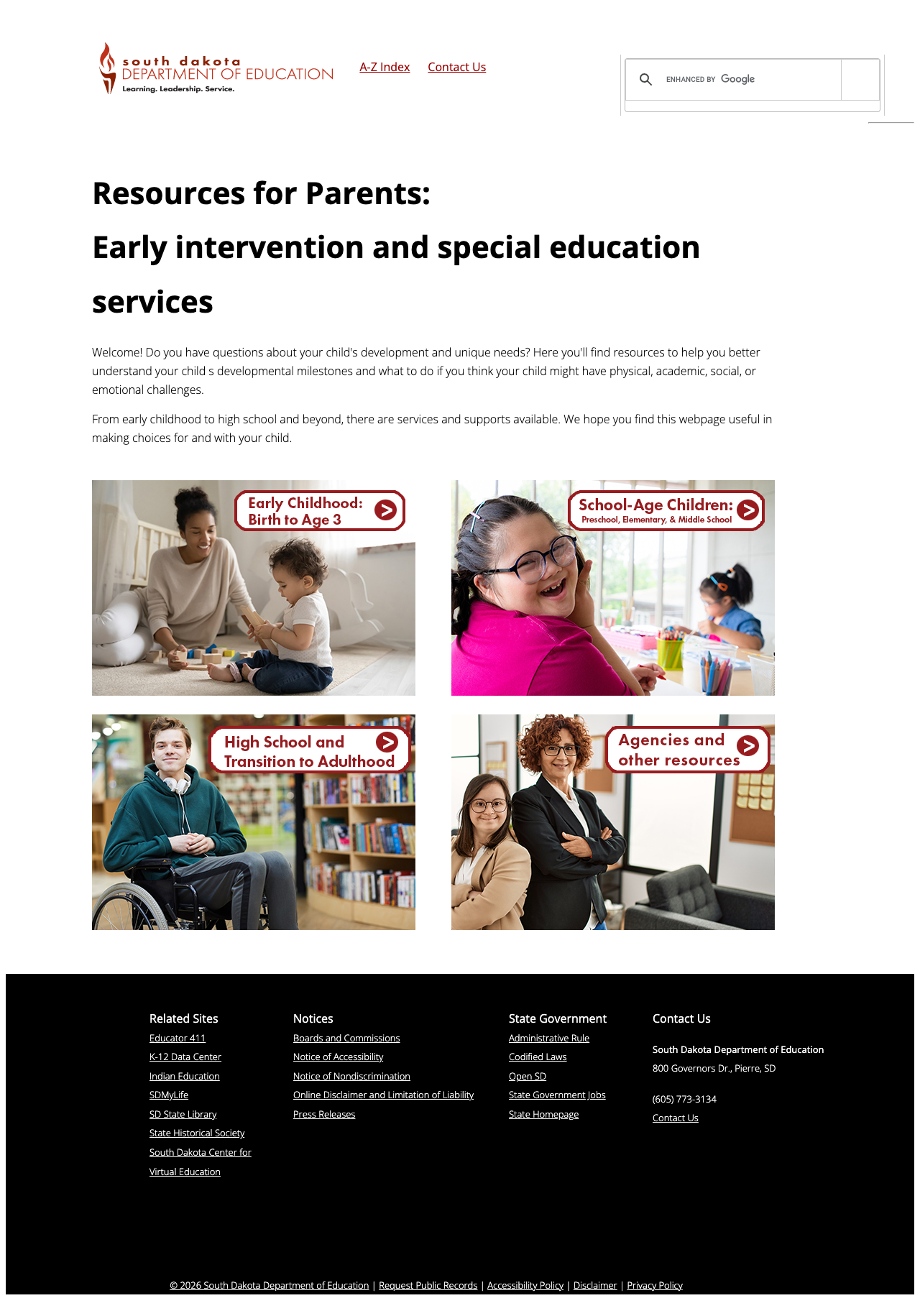
The only parent-facing content on the site is the Resources for Parents: Early intervention and special education services section. While this page is actually well-designed — featuring life-stage navigation tiles for Early Childhood (Birth to Age 3), School-Age Children, High School and Transition to Adulthood, and Agencies — it serves only families with children who have special needs. There is no general parent portal, no school choice information, no testing guides, no new family orientation content, and no curriculum explainers. With approximately 20% of South Dakota's population being Native American, the absence of multilingual content is also notable — there is no integrated translation on the site.
4. No Multilingual Support
The site is English-only with no translation option, no Google Translate widget, and no multilingual content. South Dakota has significant Lakota, Dakota, and Nakota-speaking populations, plus growing immigrant communities. The <html lang="en"> attribute is properly set, but there's no mechanism for non-English speakers to access content.
5. Mobile Responsiveness — Functional but Basic
While the site includes a viewport meta tag and loads Bootstrap responsive CSS, the mobile experience is merely adequate. Content stacks vertically on narrow screens, and the minimal navigation (just A-Z Index and Contact Us) actually helps avoid hamburger menu confusion. However, the lack of mobile-specific optimizations — no touch-optimized tap targets, no mobile Quick Links, and mixed CSS frameworks — means the mobile experience is a byproduct of simplicity rather than intentional design.
Opportunities
Implement audience-based navigation: Adding top-level pathways for Parents & Families, Educators, Schools & Districts, and Data & Reports would transform the site from a simple directory into a service platform. South Dakota's small scale makes this achievable — the content already exists but is scattered across the A-Z Index.
Surface tools more prominently: The Report Card (sdschools.sd.gov), Educator 411 (sd.gov/411), and SDMyLife (sdmylife.com) are strong standalone tools that most users would never discover from the current homepage. Prominent cards or feature sections highlighting these tools would immediately increase the site's perceived value.
Add general parent content with multilingual support: A parent portal covering school readiness, state testing (Smarter Balanced), school report card interpretation, and college/career planning (linking to SDMyLife) would serve a major constituency. Adding Google Translate integration would address linguistic diversity at minimal cost.
Threats
Technical debt from mixed frameworks: Running Bootstrap 2 and Bootstrap 4 simultaneously on the same pages, combined with 36 deprecated
<font>tags, creates maintenance risk. Future browser updates could break layout behavior, and the inconsistent codebase makes redesign more complex over time.Accessibility compliance risk: While the site does some things well (carousel ARIA, image alt text, accessibility complaint process), the absence of a skip-navigation link, reliance on deprecated HTML, and the lack of demonstrable WCAG testing could expose the department to complaints. The accessibility page references WCAG 2.1 and Section 508, setting a standard the site doesn't consistently meet.
Standout Feature
The South Dakota Report Card at sdschools.sd.gov is the clear standout. This OtisEd-built Angular application provides 2024-25 school and district performance data with clean navigation (Home, Schools, Districts, State, Years, Data Download), a school/district search, browse-by-level tiles, and contextual help ("What is a Report Card?" panel with link to interpretation guide). It's a modern, focused tool that demonstrates what South Dakota's education data could look like if the main DOE site received similar investment.
Bottom Line
The South Dakota DOE website is a study in contrasts: a bare-bones main site serving as a simple directory to genuinely useful standalone tools. Educators will find the Educator 411 portal and certification resources helpful. Data seekers will appreciate the Report Card and dashboards. But parents looking for general education guidance, families needing multilingual content, or newcomers trying to understand South Dakota's education system will find little to work with on the main site. The bones are solid — every link works, search is functional, and the content that exists is current — but the lack of audience-focused design and modern navigation keeps this site from reaching its potential.
Grade Breakdown
| Criterion | Weight | Score | Notes |
|---|---|---|---|
| Navigation & Information Architecture | 15% | 5/10 | Only A-Z Index and Contact Us in header; Quick Links sidebar on homepage only; no dropdown menus, breadcrumbs, or audience pathways; A-Z Index is comprehensive flat list |
| Accessibility (WCAG 2.1 AA) | 15% | 6/10 | Excellent carousel ARIA with pause button; all images have alt text; lang="en" set; accessibility complaint form; but 36 deprecated font tags, no skip-nav link, inline color styling |
| Search Functionality | 10% | 7/10 | Google CSE returns 939 results for "school report card" with thumbnails and sort option; no autosuggest or filters, but reliably relevant results |
| Mobile Responsive Design | 10% | 6/10 | Viewport meta tag present; Bootstrap responsive CSS; content stacks cleanly; no horizontal scroll; but mixed BS2+BS4 frameworks, no mobile-specific optimizations |
| Data Transparency & Open Data | 10% | 7/10 | Modern Report Card (sdschools.sd.gov) with 2024-25 data; 6 interactive dashboards; Data Center hub; links to Open SD; Statistical Digest and enrollment data |
| Parent Resources | 10% | 4/10 | Well-organized SPED parent resources by life stage, but no general parent portal; no multilingual support; SDMyLife career tool is adjacent but not parent-specific |
| Educator Resources | 10% | 7/10 | Strong certification section with icon-based nav; Educator 411 portal; Content Standards for 15 subjects; Professional Learning Platform via Canvas/Instructure |
| Visual Design & Branding | 10% | 4/10 | Consistent maroon/white color scheme; decent homepage carousel; but 36 deprecated font tags, mixed CSS frameworks, inconsistent page templates, dated overall aesthetic |
| Performance & Load Speed | 10% | 8/10 | 0.234s TTFB; 33KB page size; strong security headers (HSTS, X-Frame-Options, CSP-adjacent); simple pages load fast and reliably |
| Overall | 100% | 60/100 | C- |
Discussion