OverviewAll statesOklahoma
73/100
Grade: C+ — A Solid Government Platform With Deep Content but an Overwhelming Navigation Labyrinth
Oklahoma's State Department of Education website lives on the unified oklahoma.gov platform (powered by Adobe Experience Manager), which gives it enterprise-grade infrastructure, exceptional performance, and consistent state branding. The site excels where it matters most for educators — teacher certification, recruitment initiatives, and a remarkably comprehensive American Indian Education section — but its sheer scope creates a navigation challenge. With 30+ items crammed into a single Services dropdown and resource pages that read more like phone directories than curated guides, the site rewards the persistent visitor while frustrating the casual one.
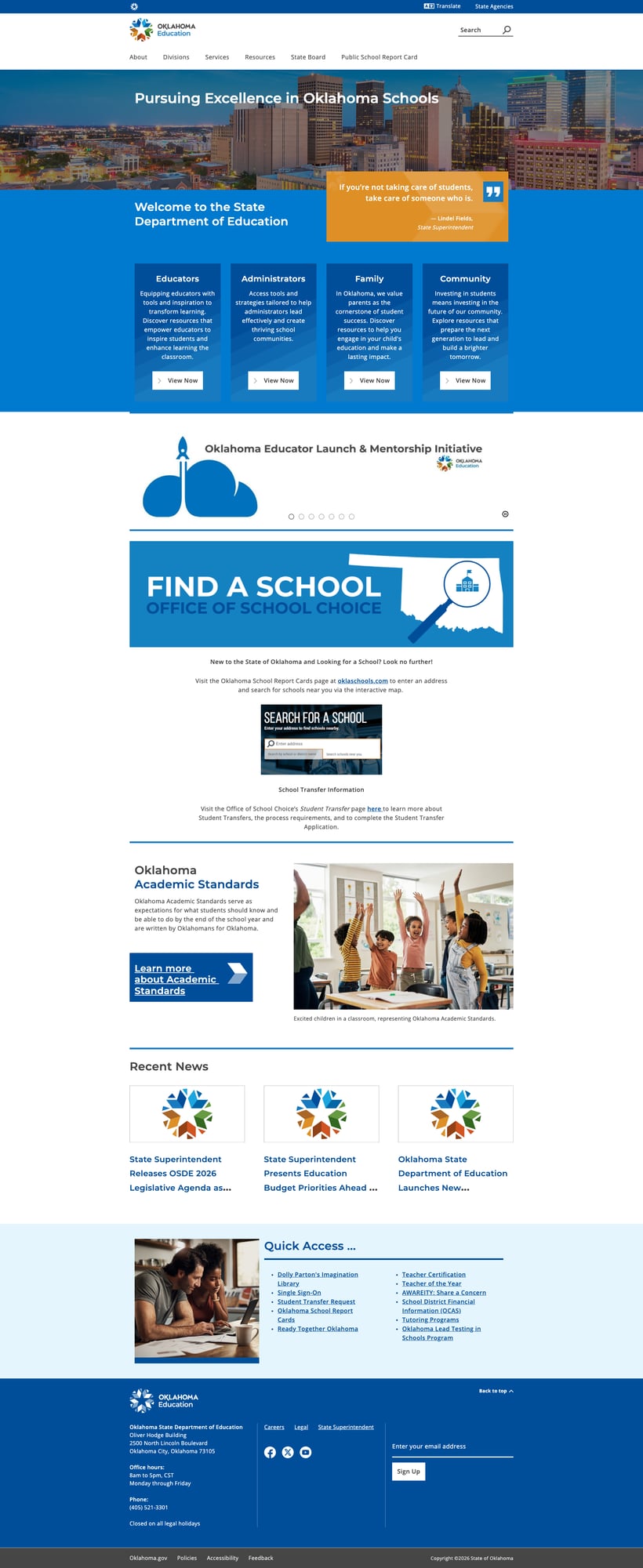
The homepage makes a promising first impression: audience-organized cards for Educators, Administrators, Family, and Community each link to dedicated resource hubs. A rotating carousel promotes current initiatives (inspireOK, Grow Your Own, CLASS Grant), and the "Find a School" section prominently directs visitors to the standalone OklaSchools.com report card platform. But dig into the Services or Resources menus and the information architecture buckles under its own weight. The content is there — impressively so — but the paths to it need serious decluttering.
Strengths
1. Exceptional Performance and Infrastructure
Oklahoma's site is built on Adobe Experience Manager (AEM) within the unified oklahoma.gov platform, and it shows. The site delivered a blistering 34ms time to first byte (TTFB) during testing — one of the fastest we've measured across all state education agency sites. Security headers are solid with HSTS, X-Frame-Options (SAMEORIGIN), and X-Content-Type-Options enforcement. The site uses proper HTML semantics with lang="en", responsive viewport configuration, and ARIA labels throughout the navigation structure. Every single internal link tested returned HTTP 200 — a perfect 100% link health score that very few state sites achieve.
2. Comprehensive Educator Resources and Teacher Recruitment
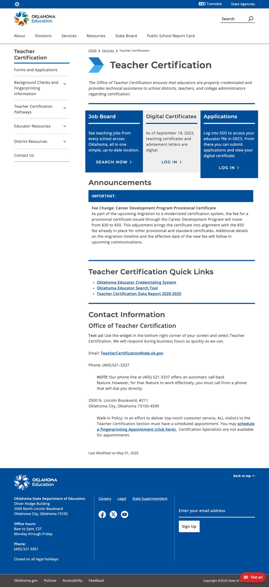
Oklahoma's educator-facing content is among the most thorough we've seen. The Educator Resources page organizes links across eight clear sections: Certification, Professional Development, Instruction (with 12 subject-specific sub-links), Instructional Resources, Assessment and Results, Teacher Evaluation, Educator Recognition, and Support Services. The Teacher Certification page goes further with a left sidebar navigation, direct links to the Job Board, Digital Certificates portal, and the Oklahoma Educator Credentialing System (OECS). A "Text us!" chat widget provides real-time support during business hours. The homepage carousel actively promotes recruitment initiatives including the Oklahoma Educator Launch & Mentorship Initiative, inspireOK, Grow Your Own, and CLASS Grant programs.
3. Outstanding American Indian Education Section
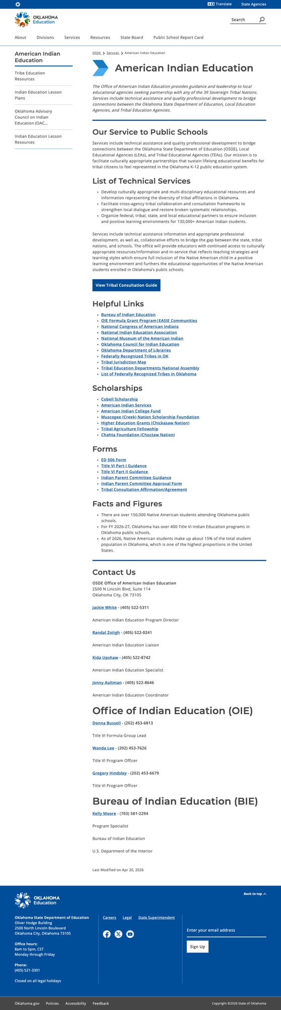
Given that Native American students make up approximately 15% of Oklahoma's public school enrollment — one of the highest proportions in the nation — the dedicated American Indian Education section is critically important. It delivers: a comprehensive list of technical services, a Tribal Consultation Guide link, helpful links to 10+ external organizations (Bureau of Indian Education, National Congress of American Indians, Oklahoma Council for Indian Education), six scholarship programs from tribal nations, Title VI forms, and direct contact information for five named staff members with phone numbers and emails. The Bureau of Indian Education (BIE) liaison information connects state and federal resources. This section is a model for states serving significant Native American populations.
4. Functional Search with Pagination and Sorting
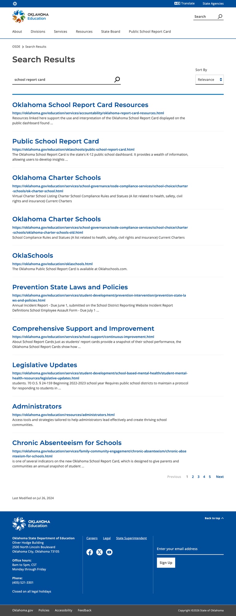
The site's search engine (a custom AEM component at /education/search-results.html) returns relevant results with full pagination and a Sort By dropdown (Relevance being the default). A search for "school report card" correctly surfaces the Oklahoma School Report Card Resources page and the Public School Report Card landing page as its top two results. A search for "special education" returned multiple pages of relevant content across different service areas. While it lacks autosuggest and advanced filters, the search is genuinely useful — a contrast to the many state education sites where search is decorative or broken.
5. Strong Mobile Responsiveness
The site transitions cleanly to mobile viewports with a proper hamburger menu, reflowed content, and touch-friendly elements. The audience cards stack vertically, the hero section adapts, the Quick Access links remain accessible, and the footer reorganizes appropriately. No horizontal scrolling or broken layouts were observed at 375px width.

Weaknesses
1. Overwhelming Services Mega Menu (30 Items, No Grouping)
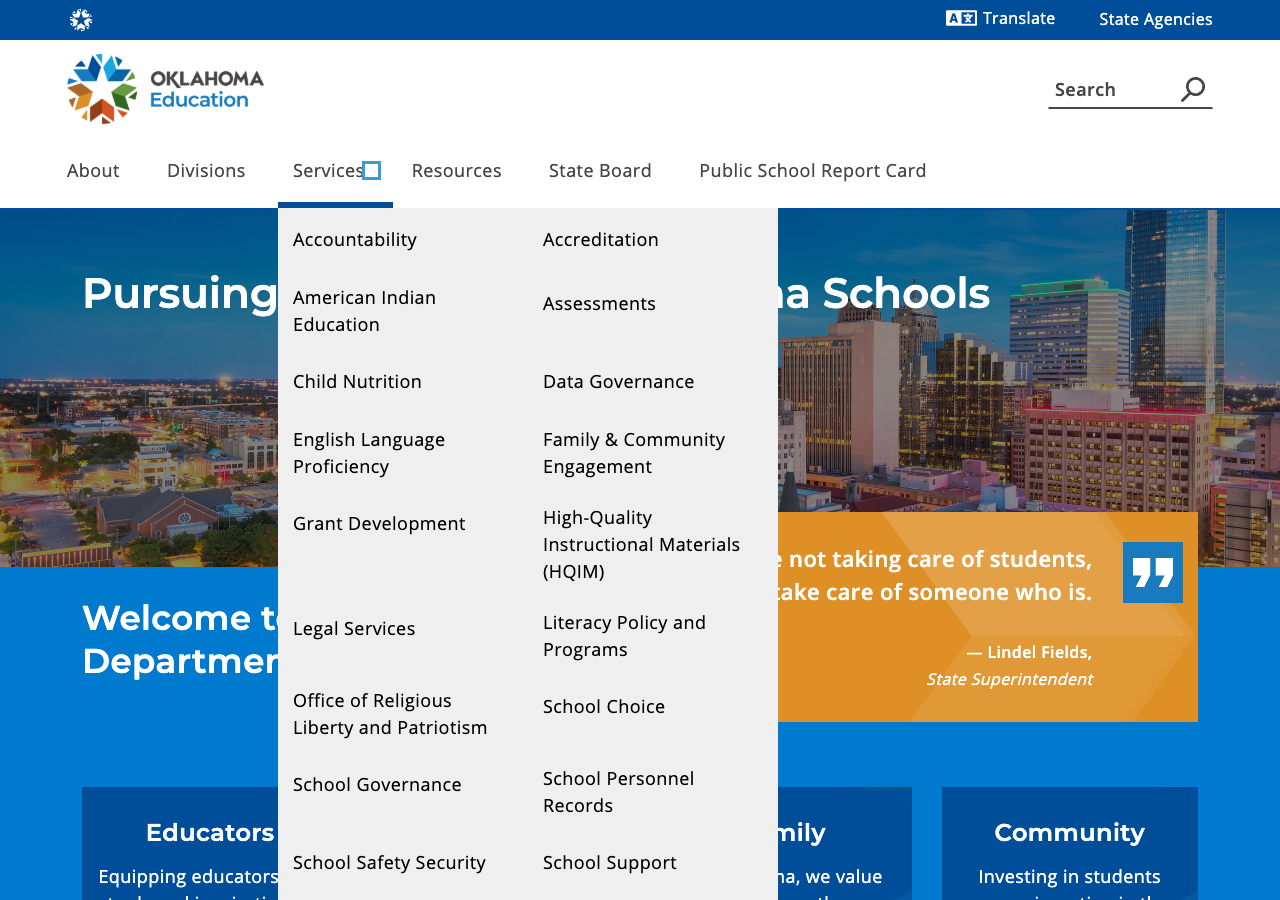
The Services dropdown is the site's most significant navigation problem. It contains approximately 30 items arranged in two alphabetical columns with no categorization, no grouping headers, and no visual differentiation. Users scanning for "School Choice" must wade through Accountability, Accreditation, American Indian Education, Assessments, Child Nutrition, Data Governance, English Language Proficiency, Family & Community Engagement, Grant Development, HQIM, Legal Services, Literacy Policy, and the Office of Religious Liberty and Patriotism before finding it. The Divisions and Resources dropdowns have the same flat-list pattern, though with fewer items. While all the content exists (and every link works), the navigation architecture assumes users already know exactly what they're looking for.
2. Stale Data in Community-Facing Pages
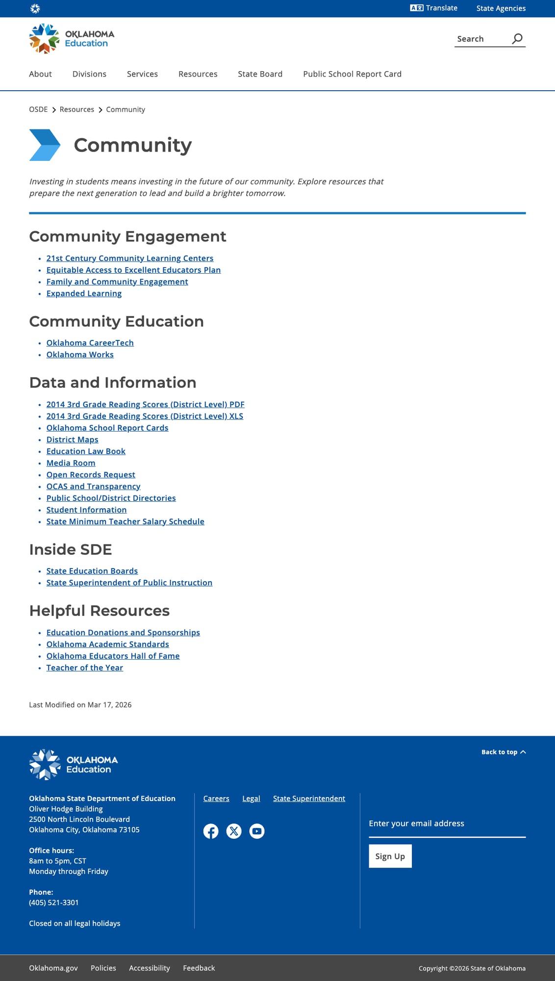
The Community Resources page's "Data and Information" section prominently links to "2014 3rd Grade Reading Scores (District Level)" in both PDF and XLS formats. In 2026, twelve-year-old reading data is worse than useless — it's misleading. While the page also links to the current Oklahoma School Report Cards (oklaschools.com), the stale data entries undermine credibility. The School Finance page similarly runs through budget documents from FY 2016 to FY 2023 but appears to lack FY 2024-2026 data. Several pages show "Last Modified" dates in 2024, suggesting a content audit would surface more stale material.
3. Resource Pages Are Link Lists Without Context
The Family, Educators, Administrators, and Community resource pages follow an identical pattern: section heading followed by a bulleted list of links with no descriptions, no icons, and no visual hierarchy. The Family page has five sections with 30+ links; the Educators page has eight sections with 40+ links. While organized by category, these pages feel like a table of contents rather than a curated guide. A parent looking for help with their child's education encounters a wall of blue links like "Strong Readers for Families," "Alcohol and Drug Prevention," "Child Nutrition," and "Gifted and Talented Education" with no indication of what they'll find at each destination. Compare this with states that use cards, descriptions, or icons to help users self-select.
4. No Native Multilingual Support
Oklahoma's diverse population (approximately 11% Spanish-speaking, plus significant Native American language communities) is served only by a Google Translate widget in the global header bar. While Google Translate covers many languages, machine translation of education policy documents and parent resources can produce confusing or inaccurate results. No content appears to be professionally translated, and there is no Spanish-language landing page or translated parent guide. The American Indian Education section, despite its depth, doesn't include any resources in Native languages.
5. Accessibility Gaps on Homepage
While the site's structural accessibility is generally good (skip link, ARIA labels, proper heading hierarchy, breadcrumbs), the homepage has 5 of 18 images with empty alt="" attributes, including decorative SVG elements and at least one content image (cwsbg.jpeg) that appears to carry meaningful visual content. No third-party accessibility overlay (UserWay, AudioEye, etc.) is present, and there is no visible accessibility statement beyond the generic Oklahoma.gov policy page linked in the footer.
Opportunities
1. Reorganize Services into Grouped Categories
The 30-item Services dropdown could be restructured into 4-5 logical groups (e.g., "Teaching & Curriculum," "School Operations," "Student Support," "Data & Accountability," "Specialized Programs") with headers, reducing cognitive load and making the mega menu scannable. This is the single highest-impact UX improvement available.
2. Add Descriptions to Resource Pages
Each link on the Family, Educators, and Community pages could benefit from a one-sentence description. This would transform link-list pages into genuinely helpful resource hubs and significantly reduce bounce rates from confused visitors clicking random links.
3. Create a Centralized Open Data Portal
Oklahoma has substantial data assets (OklaSchools.com, OCAS financial reporting, various downloadable datasets) but no single entry point. A data portal page linking all available datasets with descriptions, formats, and update frequencies would serve researchers, journalists, and administrators far better than the current scattered approach.
Threats
1. Content Sprawl and Maintenance Burden
With 30+ service areas, each containing multiple sub-pages, the risk of stale or contradictory content is significant — and already manifesting (2014 reading data, missing recent budget years). Without a regular content audit process and clear ownership assignments, the site's comprehensiveness becomes a liability as outdated pages accumulate.
2. Platform Lock-In on Oklahoma.gov
The unified oklahoma.gov AEM platform provides consistency and infrastructure benefits, but it also means OSDE has limited control over design, layout options, and interactive features. As other states adopt modern frameworks with custom data dashboards and interactive tools, Oklahoma's education site may increasingly feel constrained by the shared platform's template system.
Standout Feature
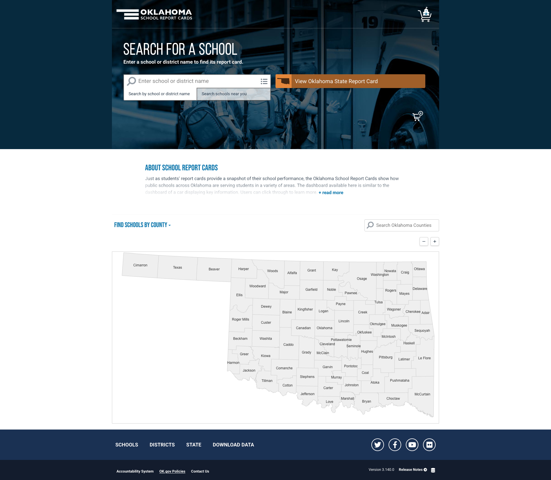
The OklaSchools.com report card platform is Oklahoma's standout feature. This standalone application provides an interactive county map of Oklahoma where users can click any county to find schools, search by school or district name, search for nearby schools by address, and view the Oklahoma State Report Card. The "Download Data" link in the footer suggests data export capabilities. The platform organizes information at school, district, and state levels with dedicated navigation tabs. Version 3.140.0 indicates active development with regular releases. The OSDE site prominently promotes OklaSchools through both the homepage "Find a School" section and a top-level navigation link ("Public School Report Card") — making the report card one of the most discoverable data tools across all state education agency sites.
Bottom Line
Oklahoma's SDE website is a content-rich government platform that rewards users who know what they're looking for. Educators will find an exceptionally deep set of resources spanning certification, recruitment, evaluation, and professional development. The American Indian Education section is among the best in the nation. But casual visitors — parents trying to understand school options, community members seeking data — face an overwhelming navigation structure and list-heavy resource pages that could benefit from curation and visual hierarchy. The blazing-fast performance and perfect link health provide a solid technical foundation; the next step is making the content as easy to find as it is to load.
Grade Breakdown
| Criterion | Weight | Score | Notes |
|---|---|---|---|
| Navigation & Information Architecture | 15% | 7 | Clean top-level nav with breadcrumbs; 100% link health. Services mega menu with 30 ungrouped items is overwhelming. Audience cards on homepage are effective. |
| Accessibility (WCAG 2.1 AA) | 15% | 7 | Skip link, ARIA labels, proper lang/viewport. Google Translate in header. 5/18 homepage images have empty alt text. No accessibility overlay. |
| Search Functionality | 10% | 7 | JS-powered search with relevance ranking, sort options, and pagination. No autosuggest or filters. Returns relevant results. |
| Mobile Responsive Design | 10% | 8 | Clean responsive behavior at 375px. Hamburger menu, reflowed content, no broken layouts. Touch-friendly elements. |
| Data Transparency & Open Data | 10% | 7 | OklaSchools.com report card is strong. OCAS financial reporting available. School finance data (FY2016-2023). Some community data stale (2014). No centralized data portal. |
| Parent Resources | 10% | 7 | Dedicated Family page with 5 sections and 30+ links. School Choice FAQ with accordions. OklaSchools for school finding. Google Translate only — no native multilingual content. |
| Educator Resources | 10% | 8 | Exceptionally comprehensive — 8 sections, 40+ links. Teacher Certification with Job Board, digital certificates, OECS. Chat widget. Active recruitment initiatives. |
| Visual Design & Branding | 10% | 6 | Consistent oklahoma.gov blue/gold branding. Clean header. Resource pages are link lists without descriptions or visual hierarchy. Carousel is dated. |
| Performance & Load Speed | 10% | 9 | 34ms TTFB — one of the fastest tested. HSTS, X-Frame-Options, X-Content-Type-Options. AEM/CDN infrastructure. 100% link health. |
| Overall | 100% | 73/100 | C+ |
Discussion