76/100
Grade: B- — A Data Powerhouse Wearing a Dated Suit
Ohio's Department of Education and Workforce (DEW) website is a fascinating study in contrasts. Behind a visual design that feels firmly rooted in 2013, you'll find one of the most comprehensive data ecosystems in the country — including a dedicated attendance dashboard, a robust school report card portal, and one of the first state-level AI in education strategy pages we've seen. The site does many things well, but its Kentico CMS-powered exterior and a few nagging usability issues hold it back from a higher grade.
For parents, teachers, and administrators in the Buckeye State, education.ohio.gov is a functional and content-rich resource. The audience-segmented navigation puts the right links in front of the right people, and the depth of data tools available is genuinely impressive. But the site's aging infrastructure — jQuery 1.11.1, HTTP links sprinkled among HTTPS ones, and a persistent email signup popup — reveals a platform that could use a modern refresh to match the quality of its content.
Ohio serves approximately 1.7 million K-12 students across more than 600 school districts, and the DEW website reflects the scale and ambition of that mission, even if the packaging hasn't kept pace.
Strengths
1. Outstanding Data Ecosystem
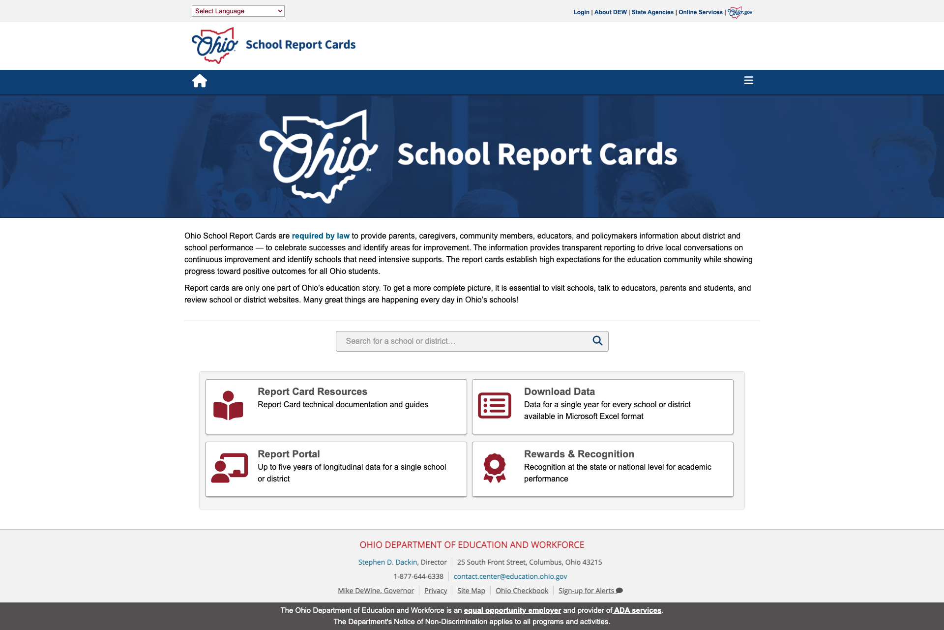
Ohio's data infrastructure is among the strongest we've reviewed. The centerpiece is Ohio School Report Cards, a standalone portal that provides school and district search, downloadable data in Excel format, a Report Portal with up to five years of longitudinal data, and a Rewards & Recognition section. Report cards are mandated by law, and Ohio takes that mandate seriously.
Beyond report cards, the EMIS (Education Management Information System) page is a data professional's dream — organized into Documentation, Reporting Responsibilities, Resources, Training, and an Advisory Council. EMIS Newsflashes are published multiple times weekly (the most recent on June 5, 2026), and the system tracks FY26 and FY27 changes in real time.
The Data hub page ties it all together with links to Report Card Resources, EMIS, Consolidated School Reports, Frequently Requested Data, OEDS (Ohio Educational Directory System), and the Comprehensive Continuous Improvement Plan (CCIP).
2. Modern Attendance Dashboard
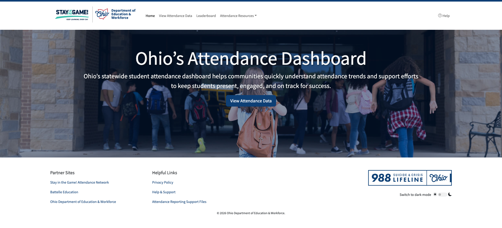
Attendance.ohio.gov is a modern, standalone data dashboard that helps communities understand student attendance trends. Built with a contemporary design (dark mode toggle, clean navigation), it includes attendance data views, a leaderboard, and attendance resources. This is exactly the kind of focused, purpose-built tool that makes data accessible to non-technical users.
The dashboard connects to the broader "Stay in the Game!" network and Battelle Education partnership, showing Ohio's commitment to tackling chronic absenteeism with dedicated digital tools rather than just policy pages.
3. Strong Mobile Responsiveness
Ohio's site handles mobile devices well. At 375px width, the navigation collapses into a proper hamburger menu, the hero carousel adapts cleanly, and the four audience resource sections (Administrators, Teacher Resources, Parent Resources, Community Resources) collapse into expandable accordions. Content reflows without horizontal scrolling, and the viewport meta tag is properly configured (width=device-width, initial-scale=1) without the user-scalable=no restriction we've seen on other state sites.

4. Effective Search with Google Custom Search
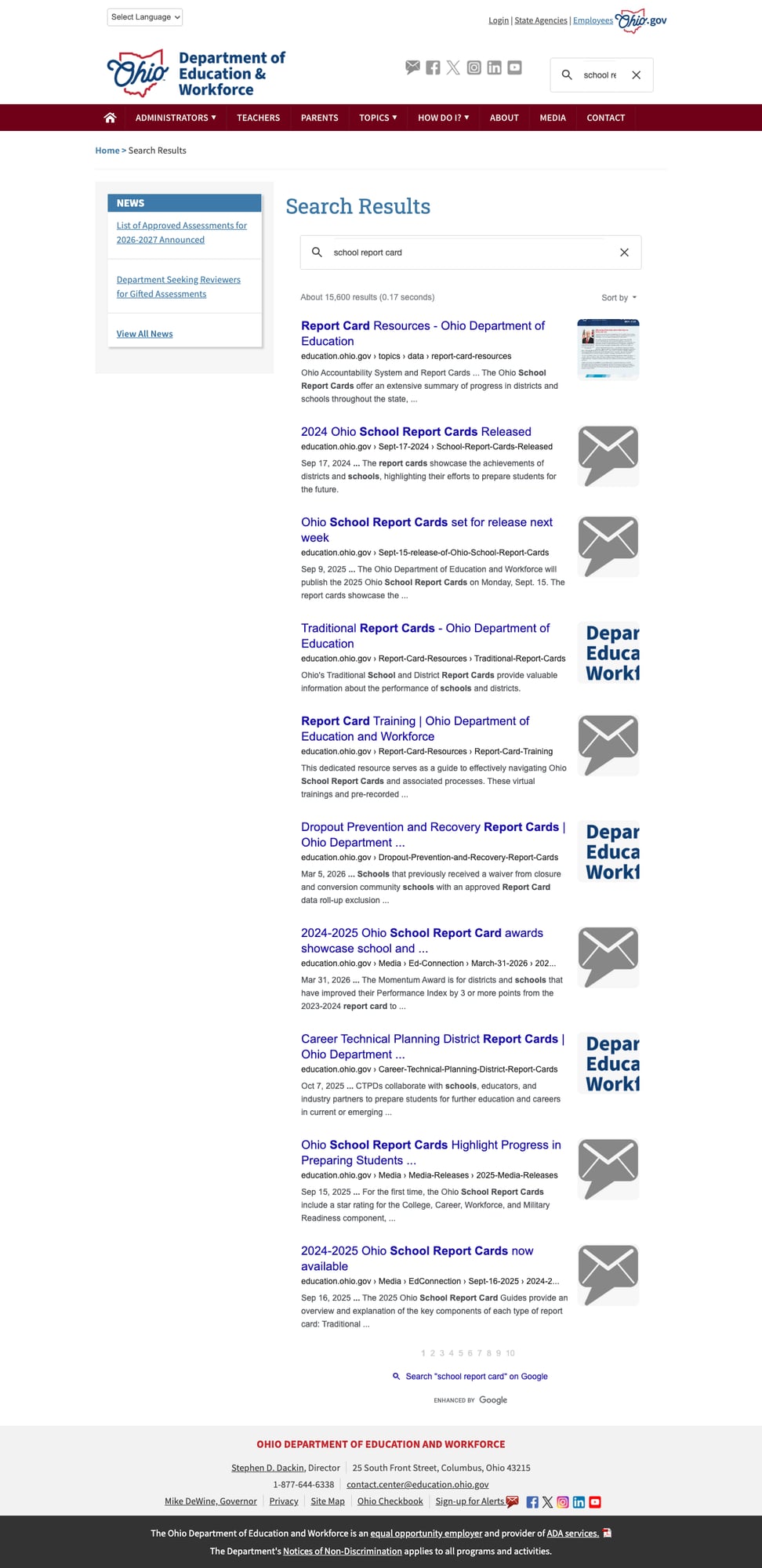
The site's Google Custom Search integration returns relevant results quickly. A search for "school report card" yielded approximately 15,600 results in 0.17 seconds, with the Report Card Resources page appearing first, followed by relevant press releases and training materials. Results include pagination and a sort-by option. While it lacks autosuggest and advanced filters, the core search functionality is solid and reliably returns useful content.
5. Comprehensive Parent Resources
The Parents page is one of the most thoroughly organized we've reviewed, with seven distinct sections: Ohio Schools, Curriculum and Instruction, Age-specific Resources, Student Supports, Workforce Readiness, and Additional Information. Each section contains multiple relevant links. A prominent "Literacy Academy for Families" banner promotes an upcoming June 2026 event, showing active family engagement efforts. The "How Do I?" sidebar provides quick-action links for common parent tasks like resolving school problems, finding engagement resources, and obtaining student records.
Weaknesses
1. Aggressive Email Signup Popup
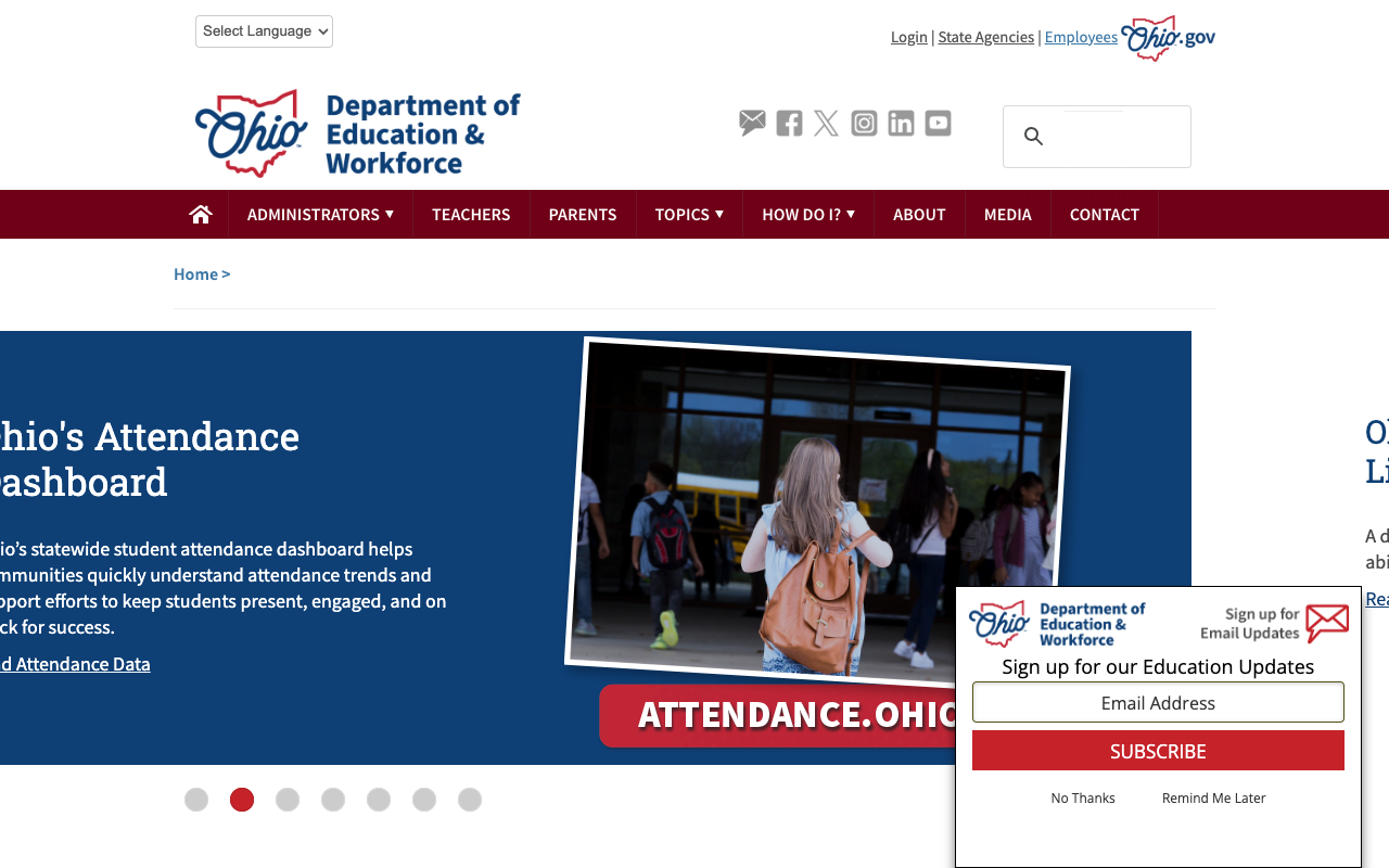
An email subscription popup appears on every page load, positioned in the bottom-right corner where it overlaps with the hero content area. On the homepage, it obscures part of the carousel content and the "attendance.ohio.gov" call-to-action banner. While the popup offers "No Thanks" and "Remind Me Later" options, it reappears on navigation to new pages, creating a persistent interruption to the browsing experience. This is a significant UX issue that undermines the site's otherwise solid content delivery.
2. Dated Visual Design and Aging Technology Stack
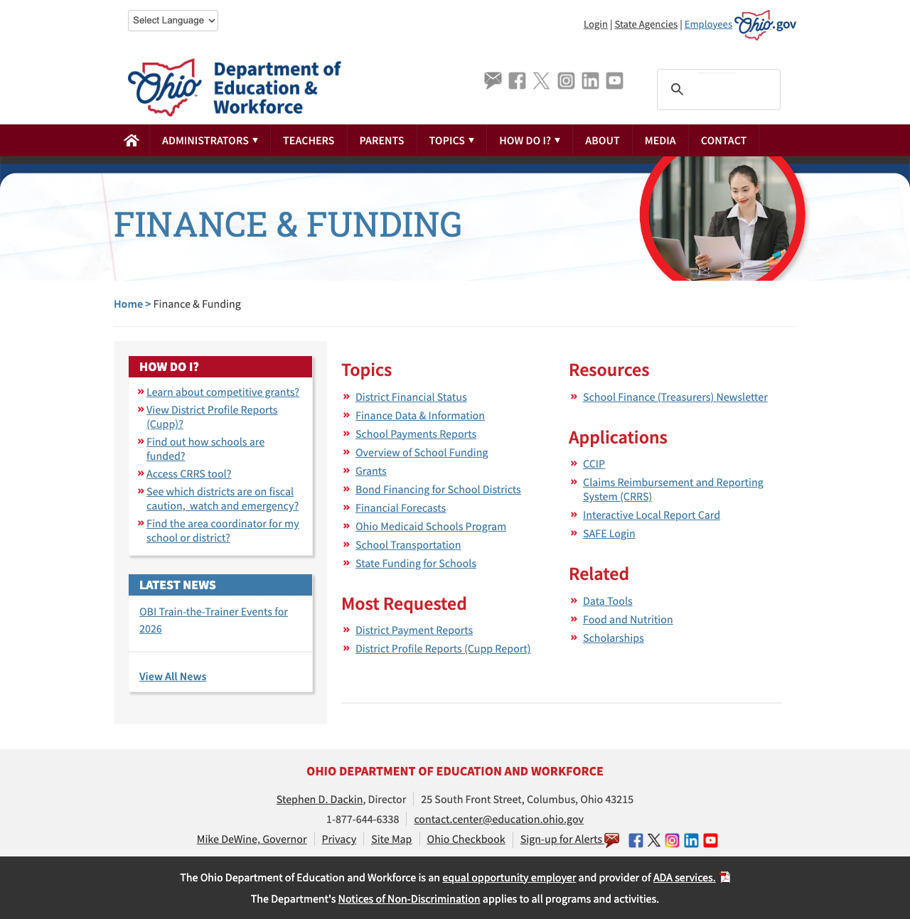
The site runs on Kentico CMS with jQuery 1.11.1 (released 2014) and jQuery UI 1.11.0. The visual design features stock photography banners on every section page with large serif-font section titles — a layout pattern that was common in government web design circa 2013-2015 but feels outdated compared to modern state education sites. The red/white/blue color scheme is consistent but lacks the visual hierarchy and whitespace that contemporary designs use to improve scannability.
The technology debt extends to multiple http:// links embedded in the HTML (Instagram, LinkedIn, YouTube, and even the Report Card site) instead of https://, and the "Current Test Materials" link routes through a Microsoft Outlook Safelinks wrapper URL rather than linking directly to the test portal.
3. Limited Security Headers
The site returns only X-Frame-Options: SAMEORIGIN as a security header. Missing are Strict-Transport-Security (HSTS), Content-Security-Policy, X-Content-Type-Options, and X-XSS-Protection. For a site handling state education data and linking to login portals, this is a notable gap in the security posture.
Opportunities
1. Modern Site Redesign
Ohio's content and data infrastructure are genuinely strong — the packaging just needs to catch up. A migration from Kentico to a modern CMS (or headless architecture like the Report Card site uses) with updated visual design would dramatically improve the user experience. The attendance dashboard proves Ohio can build modern web experiences; the main site deserves the same treatment.
2. Unified Reporting Portal
Ohio has multiple standalone data tools (Report Cards, Attendance Dashboard, Reports Portal, EMIS) that each serve different audiences. A unified data landing page or portal that helps users discover the right tool for their needs — similar to California's data ecosystem approach — would improve data accessibility.
3. Replace Google Custom Search with Native Search
While functional, Google Custom Search lacks features like autosuggest, faceted filtering, and result previews that would help users find content faster. A native search solution could also better integrate with the site's audience segmentation.
Threats
1. Technology Debt Compounds Over Time
jQuery 1.11.1 hasn't received security updates since 2016. Kentico CMS, while still maintained, is increasingly niche. As the gap between Ohio's data tools (built on modern frameworks) and the main site widens, maintenance becomes harder and the user experience more fragmented.
2. Accessibility Compliance Risk
While the site has basic accessibility features (skip links, alt text, proper viewport), the lack of a comprehensive accessibility program (no accessibility toolbar, no accessibility statement page, limited ARIA implementation) leaves it vulnerable as WCAG enforcement tightens for government sites.
Standout Feature
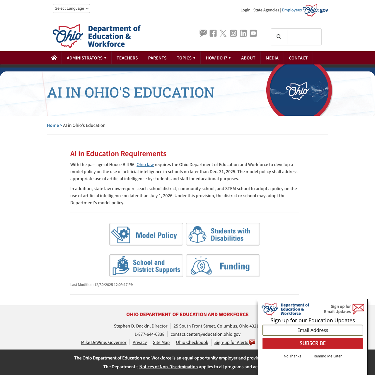
AI in Ohio's Education — Ohio is one of the first states to create a dedicated AI in education strategy page backed by legislation (House Bill 96). The page provides a Model Policy for school districts, resources for students with disabilities, school and district implementation supports, and funding information. With state law requiring every school district to adopt an AI use policy by July 1, 2026, this page serves as both a policy hub and a practical toolkit. It's a forward-looking resource that other states should study.
Bottom Line
Ohio's DEW website is a strong resource for anyone willing to look past its dated exterior. Data professionals, administrators, and policy researchers will find one of the nation's best data ecosystems here — from EMIS to school report cards to the modern attendance dashboard. Parents get a genuinely comprehensive resource section, and educators benefit from literacy-focused resources and AI policy guidance. But the 2013-era visual design and aggressive popup prevent this from being the top-tier experience Ohio's content deserves.
Grade Breakdown
| Criterion | Weight | Score | Notes |
|---|---|---|---|
| Navigation & Information Architecture | 15% | 8 | Clear audience-segmented nav (Administrators, Teachers, Parents, Topics, How Do I?), breadcrumbs, all main nav links functional, 20+ topic dropdown items. Hover menus need touch-device consideration. |
| Accessibility (WCAG 2.1 AA) | 15% | 7 | Skip links, proper viewport meta, Google Translate (250+ languages), ARIA labels on nav. Missing HSTS, no accessibility toolbar, several HTTP links. |
| Search Functionality | 10% | 7 | Google Custom Search returns 15,600+ results with relevance ranking and pagination. No autosuggest, no filters, no spelling correction. /Search endpoint returns 404 but JS search works. |
| Mobile Responsive Design | 10% | 8 | Clean mobile layout with hamburger menu, collapsible audience sections, proper content reflow. No horizontal scrolling at 375px. |
| Data Transparency & Open Data | 10% | 9 | Outstanding: Report Card portal (law-mandated, 5-year longitudinal data, downloads), EMIS (updated daily), Attendance Dashboard (modern standalone), OEDS, Frequently Requested Data. |
| Parent Resources | 10% | 8 | Comprehensive Parents page with 7 sections, Literacy Academy events, How Do I? sidebar, school choice info. No dedicated parent portal login. |
| Educator Resources | 10% | 8 | Strong Teachers page, AI in Education strategy with Model Policy, EMIS deep resources, Teacher Licensure Course Search, Science of Reading focus, Professional Practice section. |
| Visual Design & Branding | 10% | 5 | Kentico CMS design from ~2013-2015 era. jQuery 1.11.1. Stock photo banners on every page. Consistent red/white/blue scheme but uninspired. Aggressive email popup. |
| Performance & Load Speed | 10% | 8 | 163ms TTFB, fast page loads. Kentico delivers efficiently. No lazy loading but reasonable page sizes. |
| Overall | 100% | 76/100 | B- |
Discussion