OverviewAll statesNew Hampshire
67/100
Grade: C — A Data Powerhouse Wrapped in a Dated Package
The New Hampshire Department of Education website at education.nh.gov serves the Granite State's approximately 170,000 K–12 students across 162 school districts. Built on the NH.gov platform, the site features a distinctive green-and-white color scheme aligned with the state's "Live Free and Learn" branding, and packs a remarkable amount of content into a structure that occasionally struggles under its own weight.
The standout story here is data. New Hampshire's iPlatform ecosystem is one of the most comprehensive data transparency portals we've reviewed in this series — eight interconnected tools spanning assessment, financial transparency, school report cards, and data exploration. The state has even invested in multilingual report card translations in six languages. Where the site falters is in the user experience wrapping that data: a cluttered homepage, sparse parent resources, and a visual design that hasn't kept pace with the quality of its underlying content.
For a small state punching above its weight on data, the challenge is clear: the information is there, but finding it requires patience or knowledge of where to look.
Strengths
1. iPlatform Data Ecosystem — Among the Best in the Nation
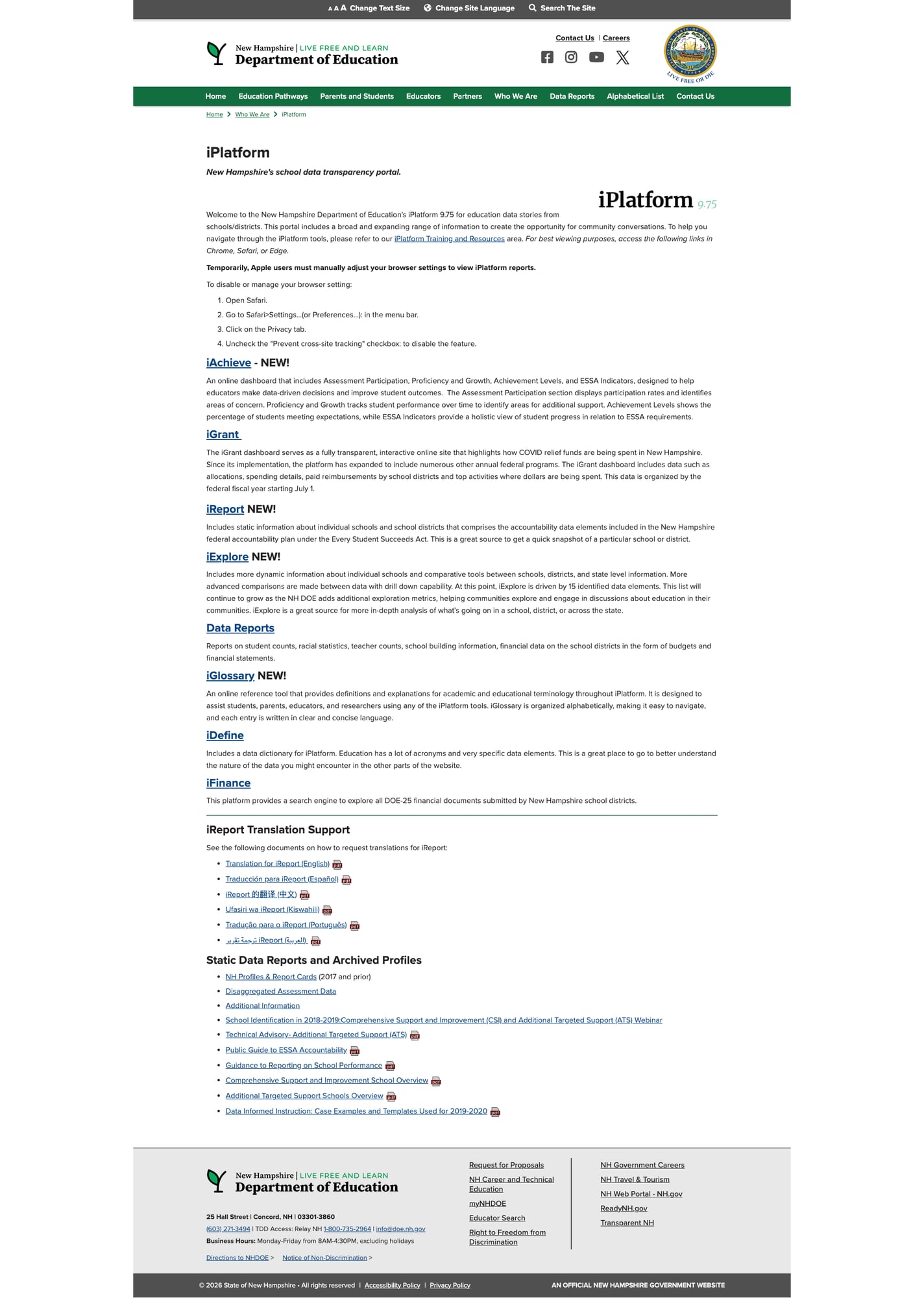
New Hampshire's iPlatform 9.75 is a genuine standout. This isn't a single dashboard — it's an interconnected suite of eight tools, each serving a distinct purpose:
- iAchieve — Assessment participation, proficiency, growth, and ESSA indicators
- iGrant — Full transparency on federal funding allocations and spending by district
- iReport — School-level accountability snapshots under ESSA
- iExplore — Dynamic comparative analysis across schools, districts, and state-level data with drill-down capability
- iFinance — Search engine for all DOE-25 financial documents from school districts
- iDefine — Data dictionary explaining education terminology
- iGlossary — Alphabetical reference tool for iPlatform-specific terms
- Public Reports — Student counts, racial statistics, teacher counts, school building data, and financial statements
What truly sets this apart is the multilingual support for iReport: translation guides are available in English, Spanish, Chinese, Swahili, Portuguese, and Arabic — six languages serving New Hampshire's growing immigrant communities. The iPlatform page also links to archived profiles dating back to 2017 and disaggregated assessment data, providing longitudinal context that researchers and journalists need.
The platform is powered by Tableau dashboards hosted at jwt.nh.gov, with 15+ data elements driving iExplore alone. This is data transparency done right.
2. Strong Navigation with Alphabetical Topic Index
The site features a well-organized nine-item navigation bar — Home, Education Pathways, Parents and Students, Educators, Partners, Who We Are, Data Reports, Alphabetical List, and Contact Us. Each section includes dropdown submenus with direct links to sub-pages, and every landing page we tested loaded without errors. Breadcrumb trails appear on all interior pages.
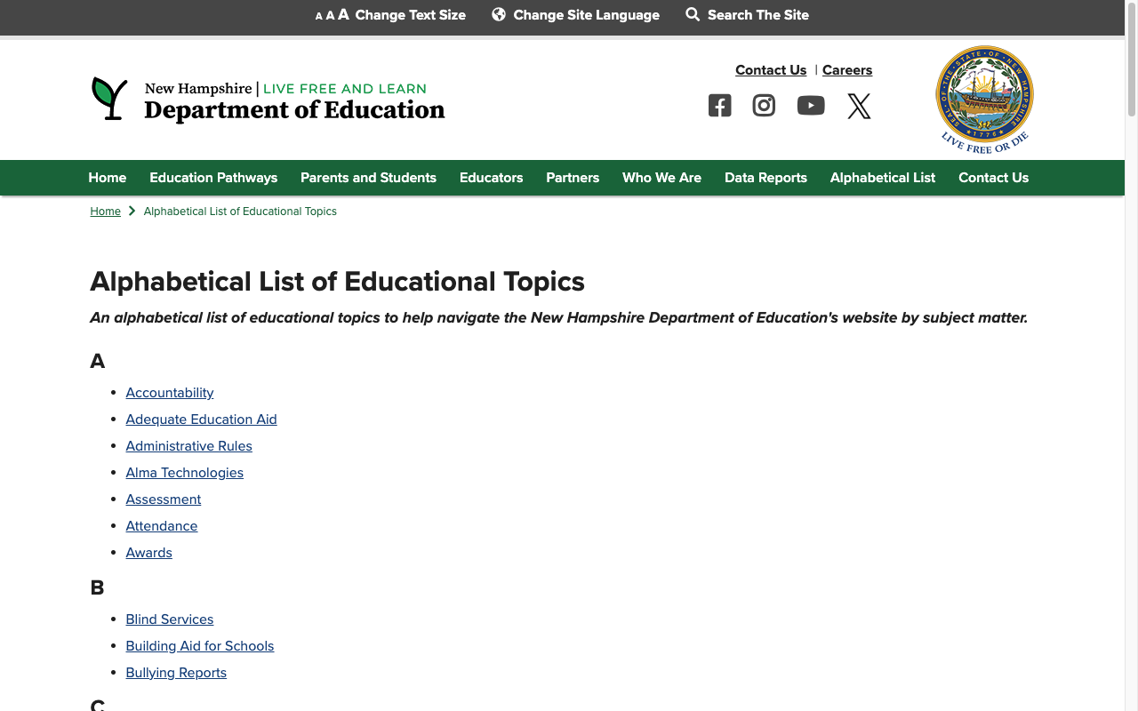
The Alphabetical List of Educational Topics is a particularly clever feature — an A-to-Z directory of over 90 educational topics with direct links, from "Accountability" to "Xello." This serves as a secondary navigation system that bypasses the site hierarchy entirely, helping users who know what they're looking for but not where it lives in the menu structure.
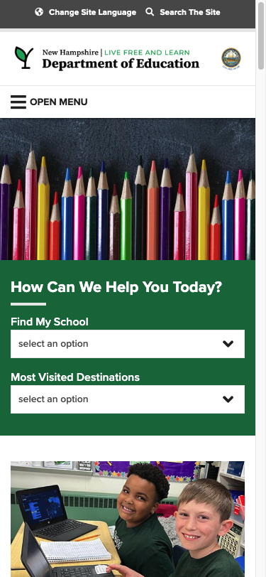
The "How Can We Help You Today?" widget on the homepage offers two dropdown shortcuts: "Find My School" (with options for local districts, charter schools, private schools, home education, CTE programs, colleges, and adult education) and "Most Visited Destinations" (linking to credentialing, school safety, special education, data reports, and more). This is a smart UX pattern that reduces clicks for the most common tasks.
3. Excellent Mobile Responsiveness
The site fully collapses to a clean mobile layout at 375px. The navigation transforms into a hamburger menu labeled "OPEN MENU," the hero image and "How Can We Help" widget reflow cleanly, and the promotional cards stack vertically. Touch targets are appropriately sized, and no horizontal scrolling was observed. The utility bar condenses to show only "Change Site Language" and "Search The Site."
4. Functional Search with Comprehensive Results
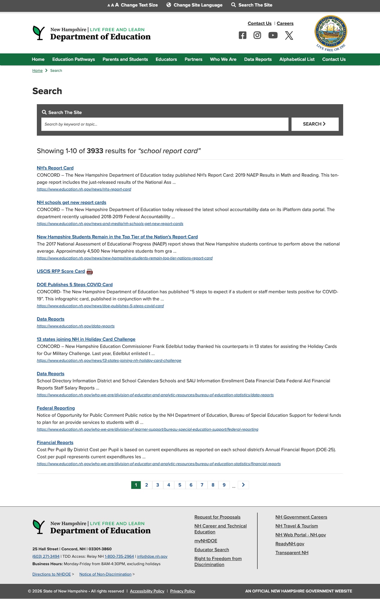
The site search is accessible via the "Search The Site" link in the utility bar, which opens an overlay with a keyword search box. Searching for "school report card" returned 3,933 results with pagination across 9+ pages. Results include relevant titles, snippets, and direct URLs, surfacing content like "NH's Report Card," "NH schools get new report cards," and links to the Data Reports section.
While the search lacks autosuggest, filtering, and spelling correction — features that would elevate it further — the raw result quality is strong. The search is powered by the Drupal-based site's built-in search index and correctly scopes to education.nh.gov content.
5. Data Reports Hub with Direct Tool Access
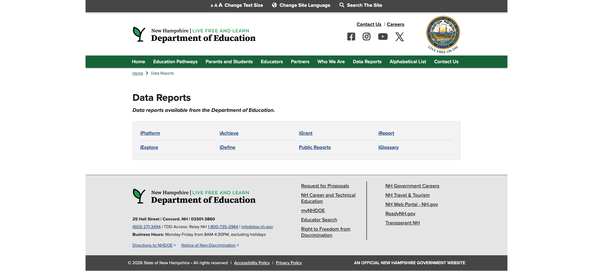
The dedicated Data Reports nav item provides a clean landing page with direct links to all eight iPlatform tools. Each tool's dropdown link in the nav bar eliminates an extra click for power users — hovering over "Data Reports" reveals iPlatform, iAchieve, iGrant, iReport, iExplore, iNHDEX, iDefine, Public Reports, iGlossary, and iFinance, all accessible in one click.
Weaknesses
1. Sparse Parent & Student Resources
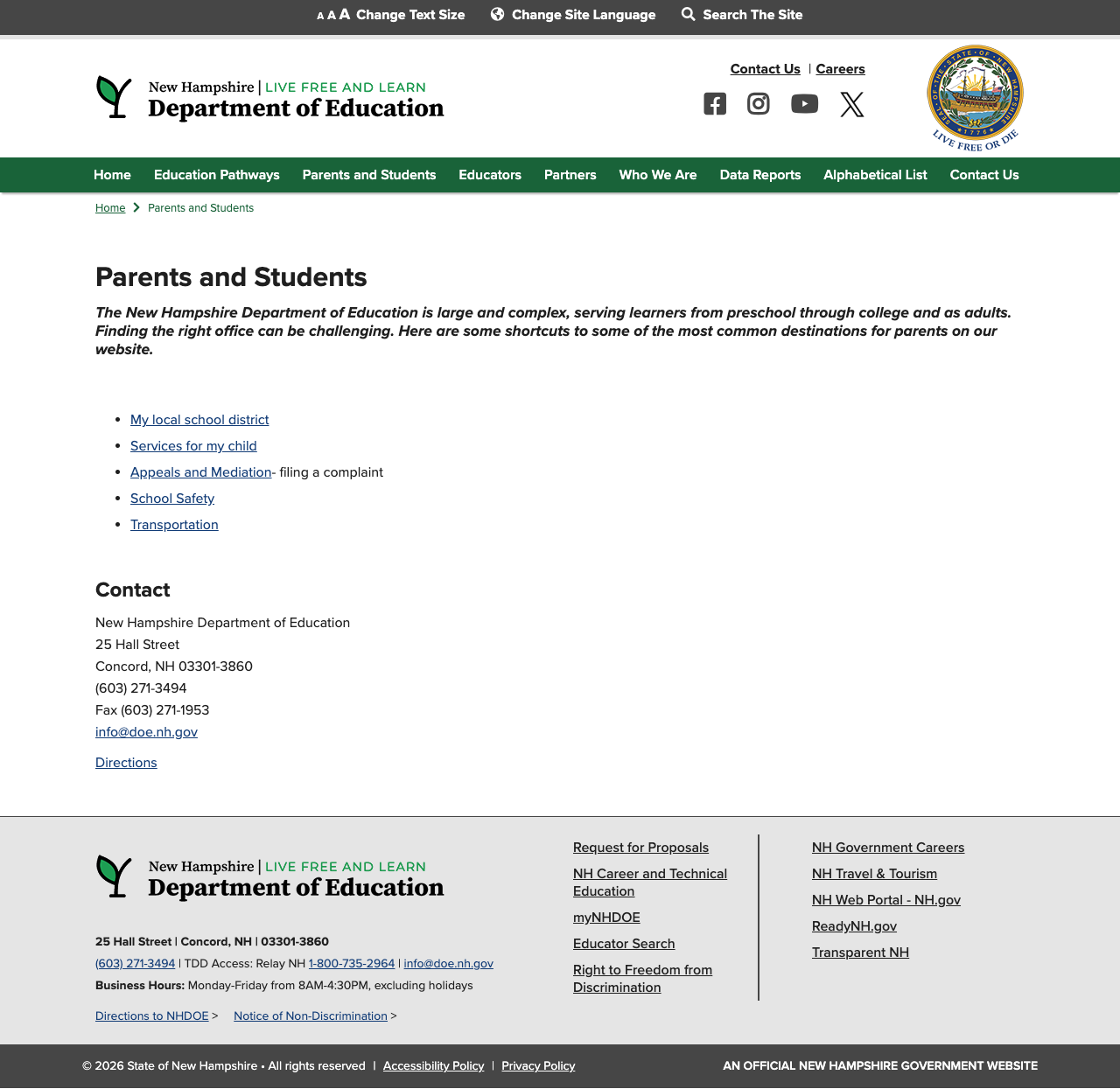
The Parents and Students landing page is disappointingly thin — just five bullet-point links (My local school district, Services for my child, Appeals and Mediation, School Safety, Transportation) followed by a generic contact block. Compare this to the Educators page, which features rich content on credentialing, teacher resources, grants, UDL, and research.
There are no plain-language guides, no "start here" onboarding for new parents, no grade-specific resources, and no integrated multilingual parent content (despite the iPlatform's impressive translation work for iReport). A parent looking for help with their child's education would find little actionable guidance here — they'd need to know the bureaucratic structure to navigate deeper.
2. Cluttered Homepage Design
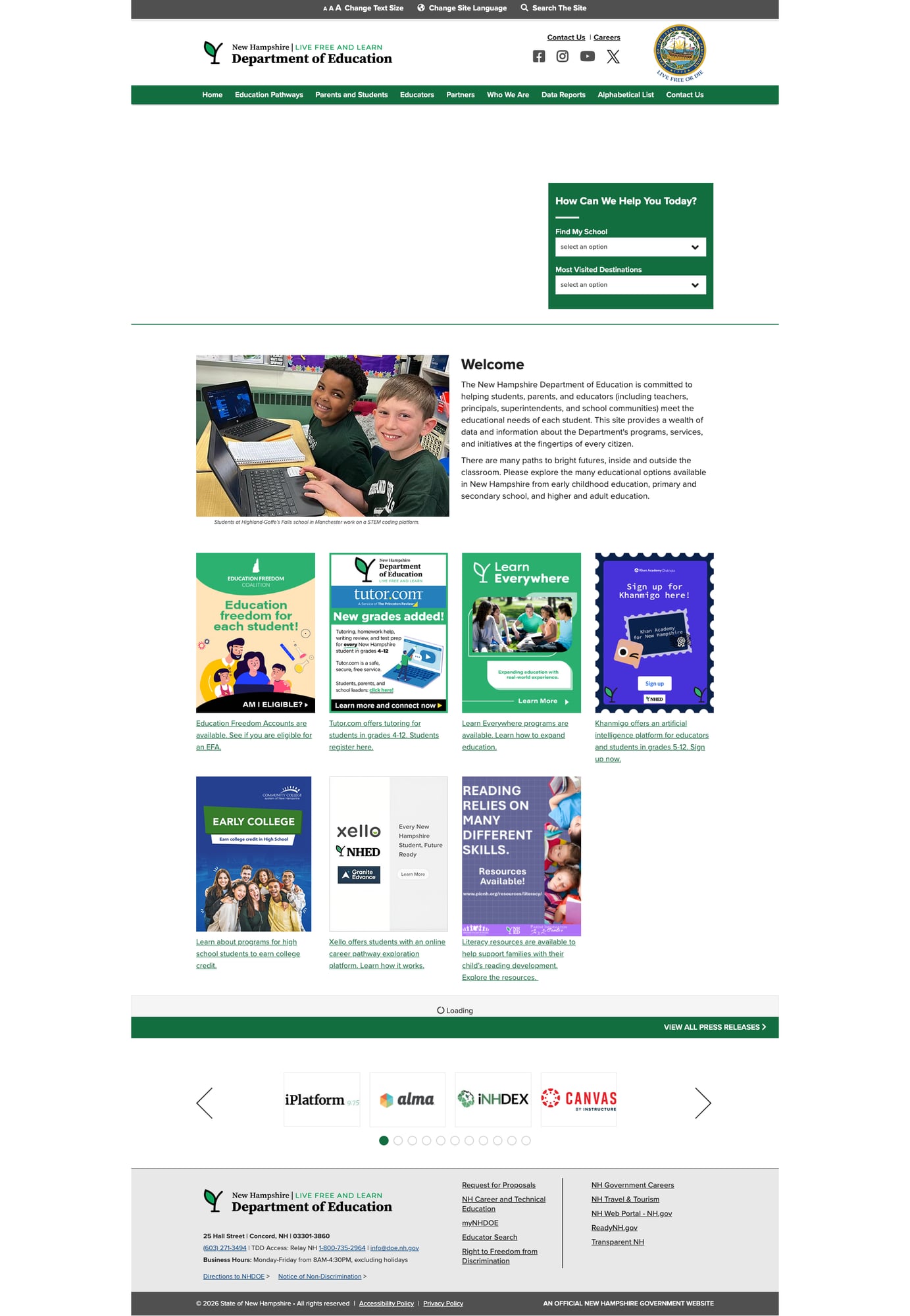
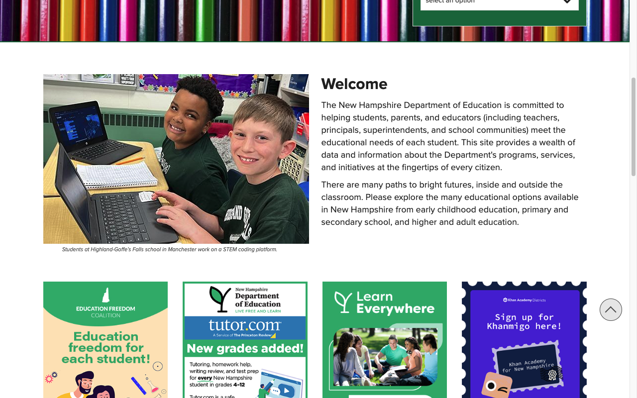
The homepage below the fold suffers from promotional overload. Seven large promotional cards compete for attention — Education Freedom Accounts, Tutor.com, Learn Everywhere, Khanmigo (Khan Academy), Early College, Xello career exploration, and literacy resources. These are all valuable programs, but presented as equally-weighted promotional tiles without hierarchy, the effect is visual noise rather than helpful wayfinding.
The news section at the bottom loads dynamically (showing "Loading" before content appears), and the affiliate logo carousel cycles through 11+ partner logos. The overall impression is that every program wants homepage real estate, and no one has said "no." A curated, rotating spotlight approach would serve users better.
3. Limited Multilingual Support on Main Site
While the iPlatform's iReport offers impressive translation support in six languages, the main website relies solely on Google Translate via the "Change Site Language" utility link. Google Translate provides machine-translated versions of pages, but the quality for education-specific terminology can be unreliable. There's no native multilingual content on the main site, no language-specific parent resources, and no indication of which languages are prioritized — a gap for a state seeing increasing linguistic diversity, particularly from refugee communities.
4. Search Lacks Modern Features
Despite returning comprehensive results, the search experience is basic. There's no autosuggest as you type, no faceted filtering (by topic, audience, date, or content type), no spelling correction, and no relevance indicators. For a site with 3,900+ indexed pages, these features would meaningfully improve discoverability. The search also doesn't surface iPlatform data tools prominently — a missed opportunity to connect users to the site's best content.
5. Visual Design Shows Its Age
The site uses a consistent green-and-white state branding scheme that's professional but not modern. The homepage hero banner — a pencil stock photo overlaid with the "How Can We Help" widget — feels like a design pattern from 2015. The promotional card grid uses mismatched aspect ratios and inconsistent design styles (some are photo-based, some are graphic-heavy). The footer repeats contact information already available in the header. Typography is functional but uninspired, relying heavily on default serif and sans-serif combinations without a strong typographic hierarchy.
Opportunities
Redesign the Parent Portal — Transform the sparse Parents and Students page into a guided experience organized by grade level or life stage (pre-K, elementary, middle, high school, post-secondary). Include plain-language guides for common questions: how to find your school, understanding assessments, special education rights, and school choice options. Port the multilingual iReport translations to parent-facing content.
Modernize the Homepage — Replace the promotional card grid with a curated spotlight section (1–2 featured programs rotating seasonally) plus a persistent "Quick Links" grid for the 6–8 most-used resources. Move partner programs to a dedicated page and let the homepage breathe.
Enhance Search with Autosuggest and Filters — Adding typeahead suggestions and basic topic/audience filters would dramatically improve the experience on a site this content-rich. Consider featuring iPlatform tools in search results for data-related queries.
Threats
Content Sprawl Without Governance — The site shows signs of every bureau and program adding content without a unified content strategy. The Alphabetical List partially compensates, but as more tools and programs are added, navigation complexity will compound. Without content governance, the site risks becoming a labyrinth despite good structural bones.
Tableau Dependency for Data Tools — The entire iPlatform ecosystem runs on Tableau dashboards at
jwt.nh.gov, with specific browser requirements (Chrome, Safari, or Edge — and Safari users must manually disable cross-site tracking prevention). If Tableau licensing, hosting, or cross-site cookie policies change, the state's flagship data transparency platform could face accessibility issues.
Standout Feature
iPlatform 9.75 is New Hampshire's crown jewel — a suite of eight interconnected data tools that provides among the most comprehensive school data transparency we've encountered in this review series. The combination of iAchieve (assessment), iReport (accountability report cards), iExplore (comparative analysis), and iGrant (financial transparency) gives parents, educators, journalists, and researchers genuine analytical power. The addition of iGlossary and iDefine for accessibility, plus multilingual iReport translations in six languages, shows a commitment to making data not just available but understandable.
Visit iPlatform to explore the full suite.
Bottom Line
New Hampshire's DOE website is a tale of two experiences. Beneath a dated, cluttered surface lies one of the strongest data transparency platforms in the country — the iPlatform ecosystem is genuinely impressive, and the Alphabetical Topic Index is a clever navigation solution. But parents will find little guidance, the visual design needs modernizing, and the search could do much more to connect users with the site's best content. Data enthusiasts and education researchers should bookmark iPlatform immediately; casual visitors may need the Alphabetical List to find what they're looking for.
Grade Breakdown
| Criterion | Weight | Score | Notes |
|---|---|---|---|
| Navigation & Information Architecture | 15% | 7/10 | 9 nav items with dropdowns, all functional. Breadcrumbs on all pages. Alphabetical List and "How Can We Help" widget add wayfinding value. Slightly crowded top nav. |
| Accessibility (WCAG 2.1 AA) | 15% | 7/10 | Skip link, 6 ARIA landmarks, 38/39 images with alt text, text size controls, TDD access. H2 appears before H1 on homepage. 4 empty links (social icons). |
| Search Functionality | 10% | 6/10 | Returns 3,933 results with pagination. No autosuggest, filters, or spelling correction. Basic but functional. |
| Mobile Responsive Design | 10% | 8/10 | Clean hamburger menu, proper reflow at 375px. Touch-friendly. Utility bar condenses well. |
| Data Transparency & Open Data | 10% | 9/10 | iPlatform ecosystem with 8 tools (iAchieve, iGrant, iReport, iExplore, iDefine, iGlossary, iFinance, Public Reports). Multilingual iReport in 6 languages. Archived data from 2017+. |
| Parent Resources | 10% | 4/10 | Only 5 links on landing page. No guides, no grade-specific resources, no integrated multilingual content. Homepage promos partially compensate. |
| Educator Resources | 10% | 7/10 | Credentialing portal with knowledge base, teacher resources, grants/funding, UDL network, education research, Canvas LMS integration. Solid depth. |
| Visual Design & Branding | 10% | 5/10 | Consistent green/white state branding. Homepage cluttered with 7 promo cards. Hero area and card grid feel dated. Mismatched card styles. |
| Performance & Load Speed | 10% | 7/10 | Pages load quickly in browser. Bot protection blocks curl (403). Hosted on NH.gov platform with proper CDN. Tableau dashboards require specific browser settings. |
| Overall | 100% | 67/100 | C |
Discussion