OverviewAll statesNebraska
67/100
Grade: C — Solid Foundation, But the Front Door Needs Work
Nebraska's Department of Education website (education.ne.gov) presents a study in contrasts. Behind a somewhat cluttered homepage lies a genuinely robust set of tools and resources — from the innovative AQuESTT accountability framework to the well-maintained Nebraska Education Profile data portal. The problem isn't what Nebraska has built; it's how easily users can find it.
For parents searching for school information, educators looking for professional development, or administrators navigating compliance requirements, the pieces are all here. The site's "I Am..." audience-based navigation is a thoughtful touch that acknowledges different users arrive with different needs. But the journey from landing page to useful content requires more clicks and more patience than it should in 2026.
The site runs on WordPress with a clean, consistent blue-and-white brand identity and loads fast — under half a second. These fundamentals are sound. The gaps are in search quality, homepage information architecture, and some dated internal pages that haven't aged gracefully.
Strengths
1. Audience-Based "I Am..." Navigation
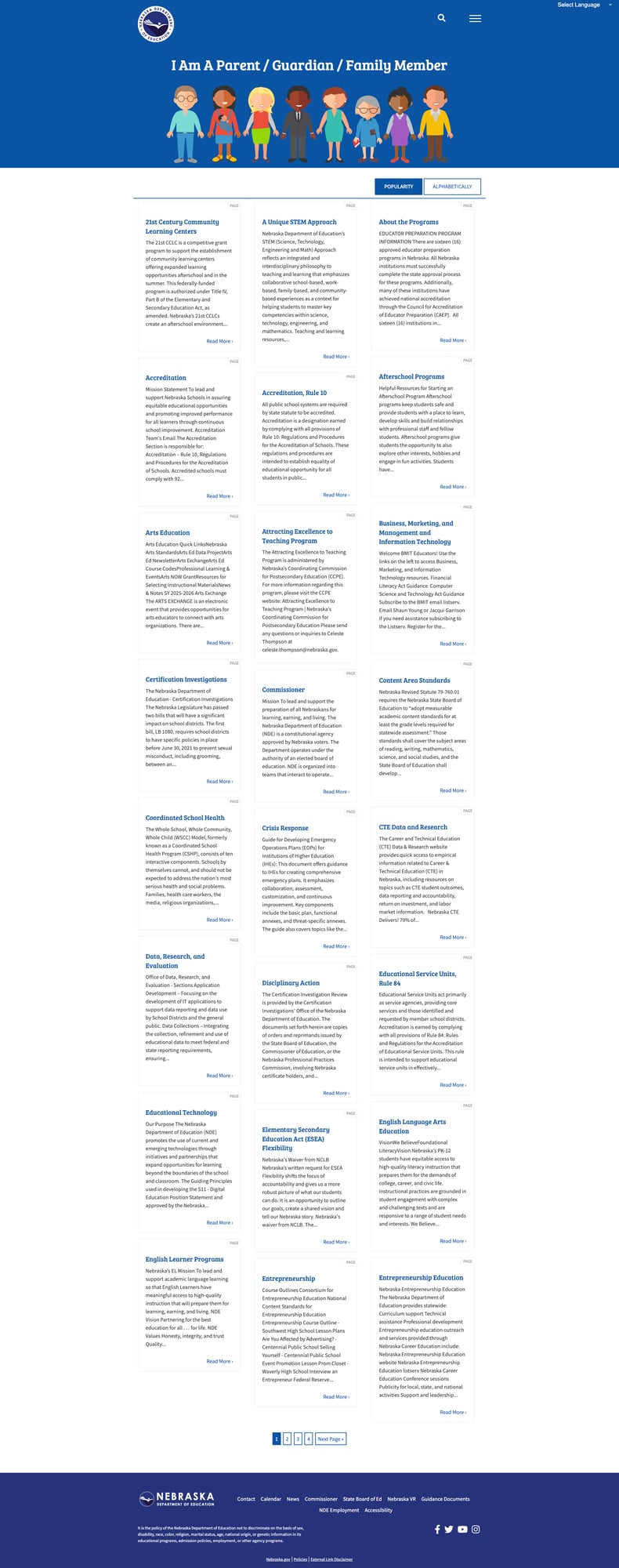
Nebraska stands out with its "I Am..." modal — a role-based navigation overlay that lets users self-identify as a parent, teacher, administrator, student, job seeker, or other stakeholder. Each persona page (e.g., I Am A Parent/Guardian/Family Member) presents a curated grid of 20+ resource cards relevant to that audience, complete with brief descriptions and "Read More" links.
This is a user-centered design pattern that many state education agencies lack entirely. Rather than forcing visitors to decode bureaucratic department names, Nebraska meets users where they are. The parent page alone covers topics from accreditation and afterschool programs to crisis response, content area standards, and data research — all in plain language.
2. Nebraska Education Profile (NEP) Data Portal
The Nebraska Education Profile is a separate, purpose-built data portal that represents one of the better state-level education data tools we've reviewed. It features current 2024-2025 data, a clean interface with state-level and district/school drill-down capabilities, its own search function, and multilingual support.
The NEP portal allows users to select a district and school from dropdown menus, view state-level aggregate data, and submit formal data requests. The announcement banner confirms the most recent data is available, and the tool is clearly maintained as a priority. For a state serving over 360,000 students, this kind of dedicated data infrastructure is essential and well-executed.

3. Comprehensive Educator Resources
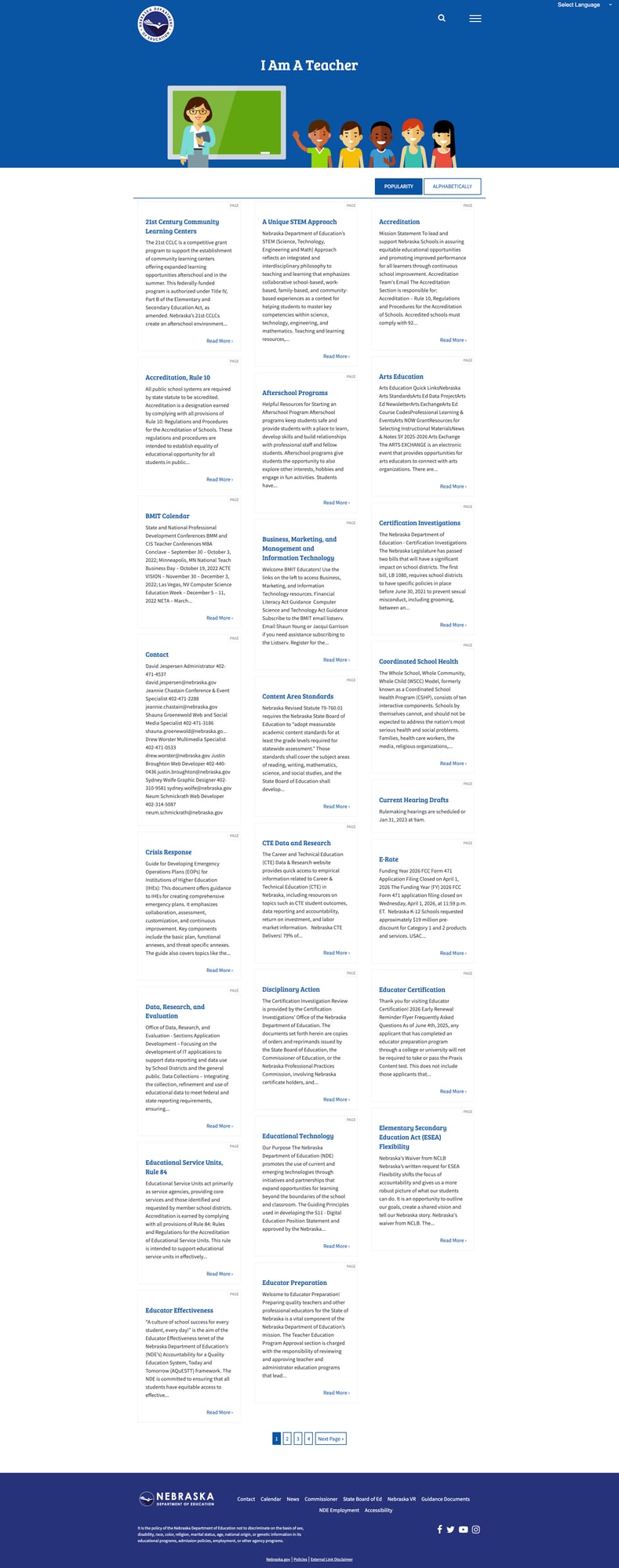
The Teacher persona page is one of the most content-rich educator resource hubs we've seen. It provides organized access to over 30 distinct resource areas including: a unique STEM approach, arts education, career and technical education (CTE) data, content area standards, coordinated school health resources, crisis response guides, certification investigation information, and educational technology tools.
Each resource card includes a brief description and a "Read More" link to deeper content. The page also surfaces timely information like the BMIT Calendar (state and national professional development conferences) and direct contact information for subject-area specialists. The breadth here is impressive — from entrepreneurship education to world languages to school counseling.
4. Strong Mobile Responsiveness
Nebraska's site handles mobile viewports cleanly. Content reflows properly on a 375px-wide screen without horizontal scrolling, the "I Am..." navigation remains accessible, and text remains readable. The hamburger menu, search icon, and language selector all adapt appropriately to smaller screens. Touch targets appear adequately sized, and the single-column layout on mobile preserves the content hierarchy without sacrificing functionality.

Weaknesses
1. Search Returns Poor Results with No Smart Features
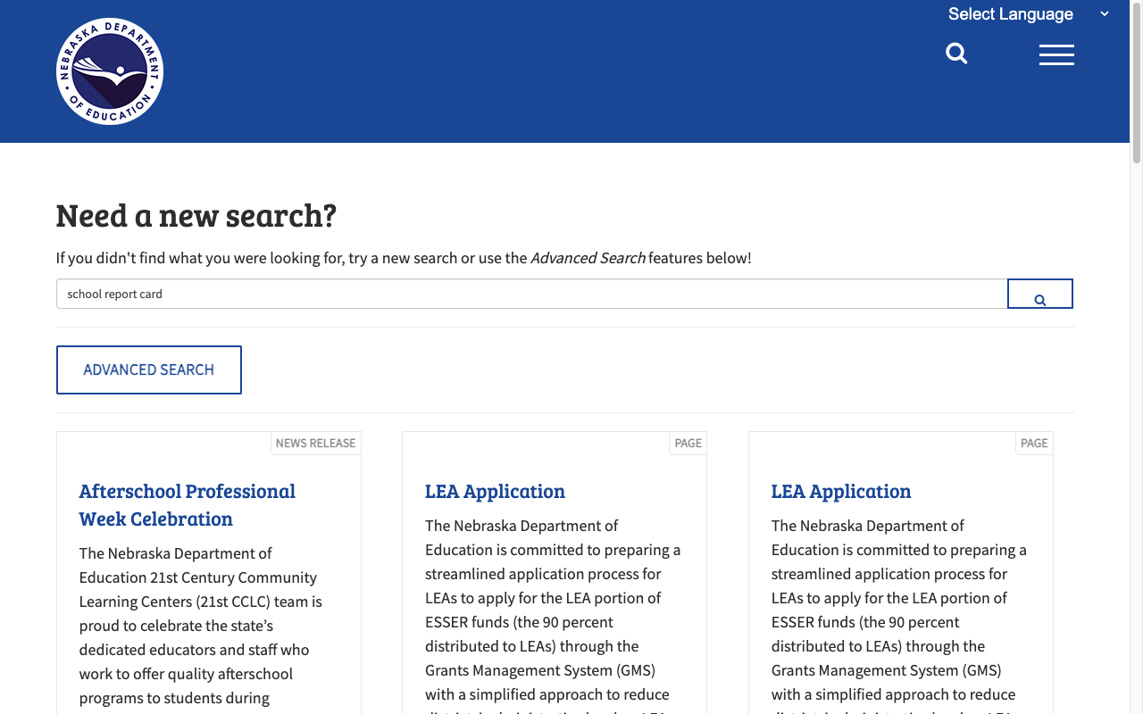
Searching for "school report card" — one of the most common queries a parent might enter — returns "Afterschool Professional Week Celebration" as the first result, followed by two duplicate "LEA Application" entries. The actual Nebraska Education Profile (the state's school report card equivalent) doesn't appear in the top results at all.
The search does offer an "Advanced Search" option and categorizes results by type (News Release, Page), but there's no autosuggest, no spelling correction, no relevance weighting, and no filters for date or content area. For a site with hundreds of pages spanning dozens of programs, the search function significantly undermines discoverability.
2. Dated Internal Pages and Inconsistent Maintenance
The Data, Research, and Evaluation landing page — one of the most important sections for anyone seeking education data — displays "Updated April 20, 2018" at the bottom. While the linked resources (like the NEP portal) are current, the landing page itself hasn't been refreshed in over eight years. This creates a trust gap: visitors seeing a 2018 timestamp may assume the data behind it is equally stale.
This pattern likely repeats across other section landing pages. The contrast between the well-maintained NEP portal and this dated gateway page suggests uneven investment in different parts of the site.

3. Homepage Prioritizes Internal Operations Over User Needs
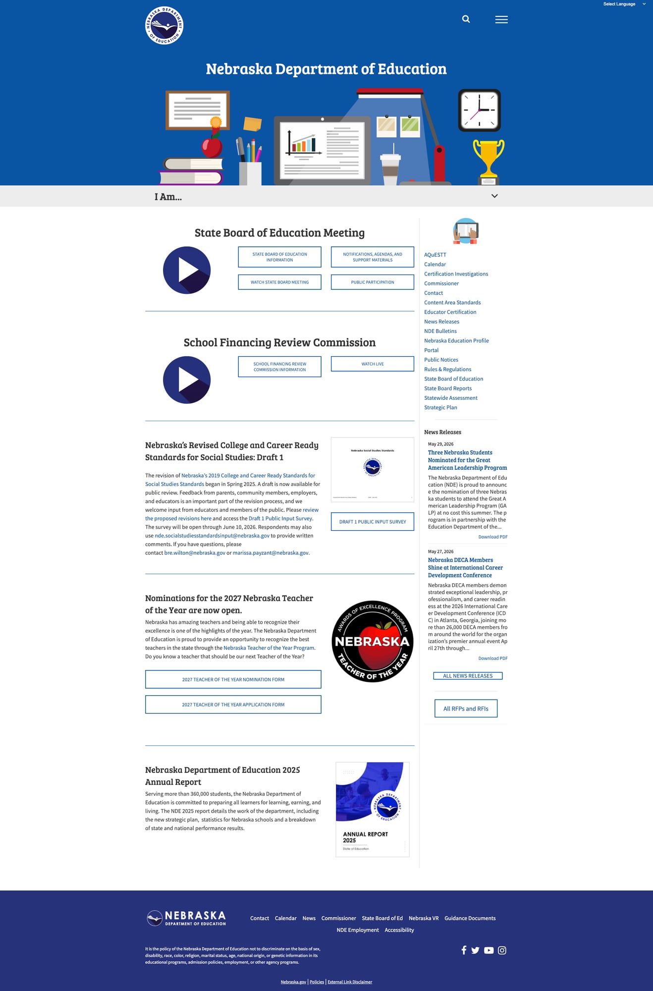
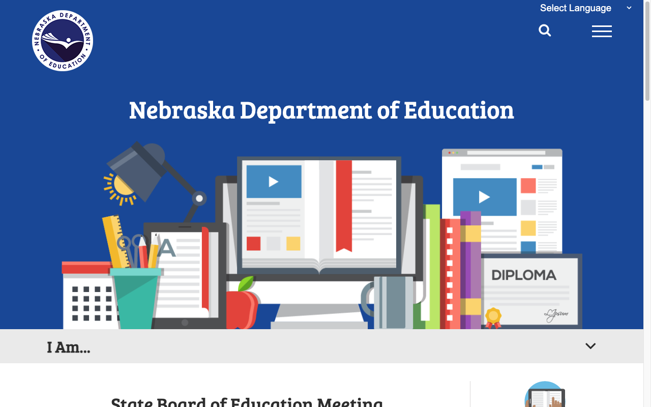
The first content a visitor sees below the hero image is "State Board of Education Meeting" with links to watch live proceedings, followed by "School Financing Review Commission" — both internal governance functions. While transparency is valuable, most visitors to a state education website are parents checking school performance, educators finding resources, or administrators managing compliance.
The homepage lacks a clear call-to-action for the site's most-visited functions. The "I Am..." bar sits below the fold and is easy to miss. There are no quick links to school lookup, report cards, or the most common tasks. The right sidebar has a useful link list (AQuESTT, Calendar, Standards, etc.), but it competes visually with the board meeting content and news releases for attention.
4. No Breadcrumbs or Sitemap
Navigation through the site's deeper pages lacks breadcrumb trails, making it easy to lose context when drilling into specific program areas. The site also returns a 404 for the XML sitemap (/sitemap_index.xml), which affects both user wayfinding and search engine indexing. For a site with this many pages and programs, breadcrumbs would significantly improve the user's sense of location within the hierarchy.
Opportunities
Redesign the homepage around user tasks. Move the "I Am..." navigation above the fold or replace the hero area with a task-oriented entry point (e.g., "Find a School," "Check Test Scores," "Get Certified"). Board meeting information could live in a dedicated section or sidebar without dominating the landing experience.
Invest in search infrastructure. Implementing a modern search solution with autosuggest, typo tolerance, and content-type filtering would dramatically improve discoverability. The site's content is rich — the search just needs to surface it properly. Consider integrating the NEP portal's data into main site search results.
Audit and refresh dated landing pages. A systematic review of section landing pages to update timestamps, refresh content, and ensure consistent formatting would improve trust and professionalism. The Data Services page is the most visible example, but likely not the only one.
Threats
Content sprawl without governance. With dozens of program areas, each maintaining their own sub-sections, there's a risk of link rot, duplicate content, and inconsistent user experiences as teams update their areas independently. The lack of a functioning sitemap suggests site-wide content governance may be limited.
Accessibility compliance gaps. While Nebraska has a strong accessibility statement and good foundational practices (alt text, ARIA attributes, skip navigation), the absence of a formal accessibility audit report or VPAT means compliance may be assumed rather than verified — a legal and reputational risk under current ADA enforcement trends.
Standout Feature
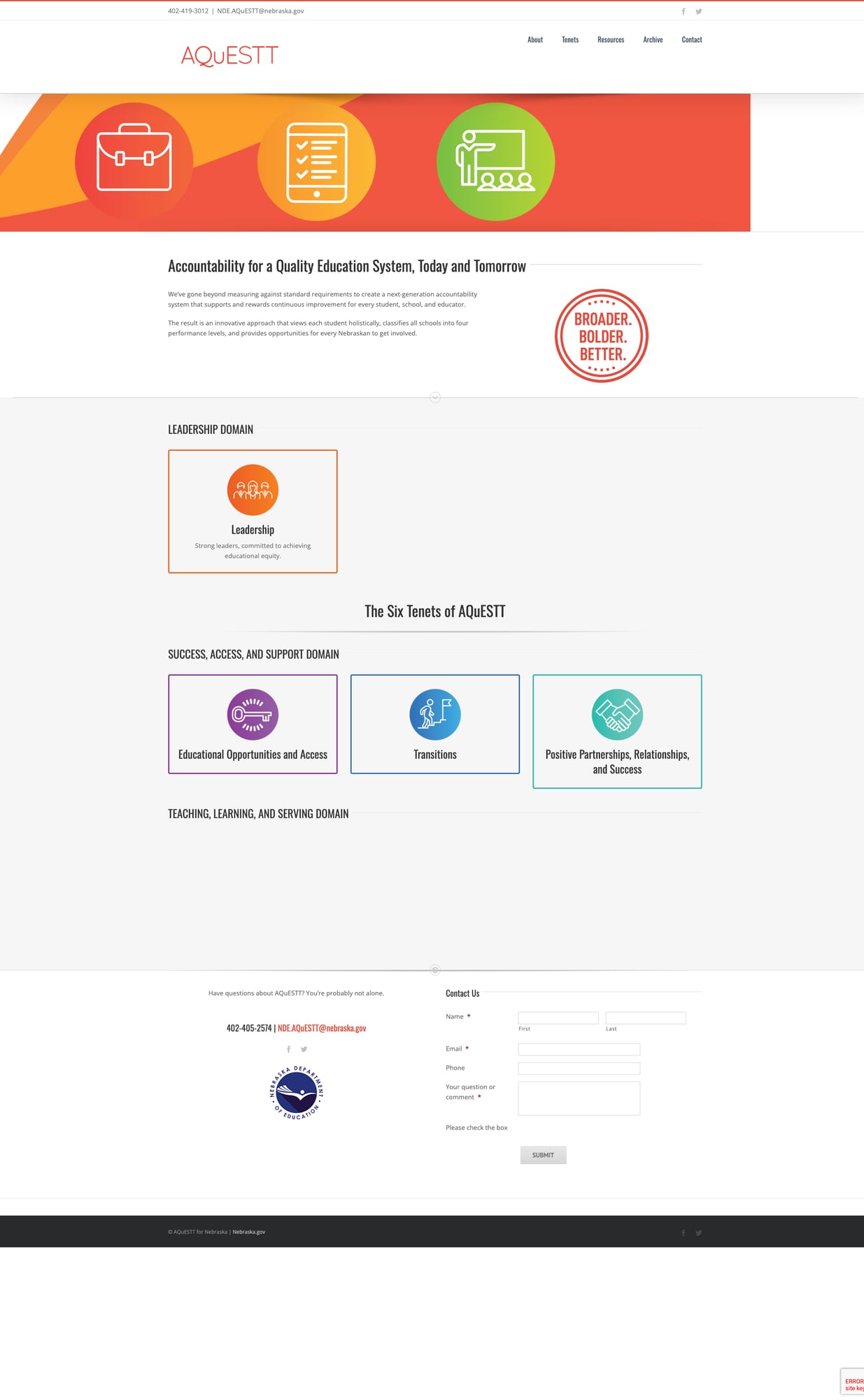
AQuESTT — Accountability for a Quality Education System, Today and Tomorrow. Nebraska's AQuESTT system is a genuinely innovative accountability framework that goes beyond standard test-score-driven report cards. It classifies schools into four performance levels using a holistic approach organized around six tenets across two domains: "Success, Access, and Support" (covering Educational Opportunities and Access, Transitions, and Positive Partnerships) and "Teaching, Learning, and Serving."
The AQuESTT site is branded separately with its own distinct visual identity and tagline ("Broader. Bolder. Better."), includes a contact form, and provides resources organized by tenet. This approach to school accountability — looking at leadership, partnerships, and transitions alongside traditional metrics — reflects a forward-thinking philosophy that other states could learn from.
Bottom Line
Nebraska's education website is a solid workhorse with genuinely valuable tools hiding behind an uninspired front door. Parents will find what they need if they know to click "I Am..." — the audience-based pages are excellent. Educators have access to one of the more comprehensive resource collections we've reviewed. And the NEP data portal is a standout. But the cluttered homepage, weak search, and dated internal pages create unnecessary friction for first-time visitors who don't know where to look. A homepage redesign and search upgrade would move Nebraska from a C to a B.
Grade Breakdown
| Criterion | Weight | Score | Notes |
|---|---|---|---|
| Navigation & Information Architecture | 15% | 7/10 | "I Am..." modal is innovative; lacks breadcrumbs and sitemap; deep hierarchy requires clicks |
| Accessibility (WCAG 2.1 AA) | 15% | 7/10 | WCAG 2.1 AA statement, skip nav, alt text on all images, ARIA attributes, Google Translate (13 languages); no formal audit published |
| Search Functionality | 10% | 5/10 | Functional with Advanced Search option, but poor relevance, duplicate results, no autosuggest or filters |
| Mobile Responsive Design | 10% | 7/10 | Clean reflow, viewport meta, touch-friendly layout; hamburger menu works well |
| Data Transparency & Open Data | 10% | 6/10 | NEP portal is current and well-built; Data Services landing page dated 2018; data request form available; no bulk download API |
| Parent Resources | 10% | 7/10 | Dedicated parent persona page with 20+ resource cards; plain language; relies on Google Translate for multilingual support |
| Educator Resources | 10% | 7/10 | 30+ resource categories, subject-area specialist contacts, CTE data, professional development calendar |
| Visual Design & Branding | 10% | 6/10 | Consistent blue branding, clean typography; homepage cluttered with governance content; hero illustration is generic |
| Performance & Load Speed | 10% | 8/10 | 0.4s page load, 87KB homepage, reliable uptime; fast and lightweight |
| Overall | 100% | 67/100 | C |
Discussion