OverviewAll statesMinnesota
74/100
Grade: C+ — A Data Powerhouse in a Dated Shell
Minnesota's Department of Education (MDE) website is a study in contrasts. Beneath a visually dated exterior built on decade-old technology lies one of the most comprehensive data ecosystems in the country. Parents looking up their child's school will find the excellent Minnesota Report Card tool; educators will find deep resources on everything from licensing to curriculum standards; and researchers will discover a treasure trove of downloadable datasets spanning decades. The problem is that all this substance is wrapped in a presentation layer that feels like it hasn't been meaningfully updated since 2016.
The site runs on Oracle WebCenter Content (UCM) with Bootstrap 3.3.6 — a framework released in 2016 that has long since been superseded. The homepage features gray pill-shaped buttons and a news carousel, but no hero imagery, no visual storytelling, and no sense of the vibrant educational community the state serves. It's functional to its core, which is both its greatest strength and its most obvious weakness.
What saves Minnesota from a middling grade is its exceptional investment in data transparency, multilingual support through a dedicated Language Center with 27 languages, and rock-solid site reliability with zero broken navigation links across the entire site.
Strengths
1. Outstanding Data Ecosystem
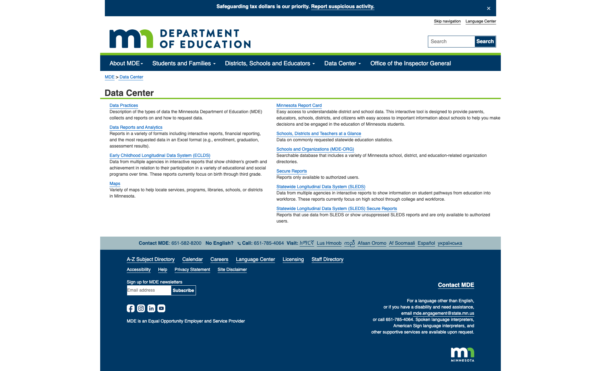
Minnesota's Data Center is among the most comprehensive we've reviewed in this series. The dedicated Data Center page serves as a gateway to 10 distinct data tools and portals:
- Data Reports and Analytics — 50+ downloadable report categories spanning accountability, assessment, enrollment, graduation, finance, staffing, and student data
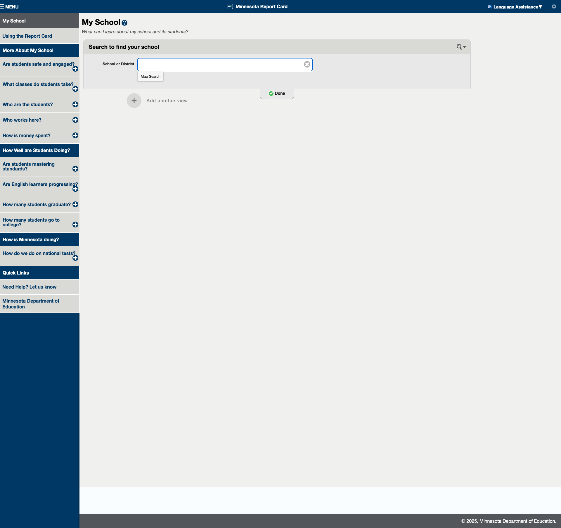
- Minnesota Report Card — Interactive school/district lookup with tabs for safety, classes, demographics, staffing, spending, standards mastery, EL progress, graduation, and college-going rates
- ECLDS — Early Childhood Longitudinal Data System tracking birth through third grade
- SLEDS — Statewide Longitudinal Data System tracking high school through workforce
- MDE-ORG — Searchable school/district/organization directory
- Maps, Schools at a Glance, Secure Reports — Additional specialized tools
The breadth is remarkable. From Child & Adult Care Food Program participation to Special Education compliance reviews, from Financial Profile Spreadsheets dating back to 1997 to current-year assessment files — if Minnesota collects it, you can probably find it here.
2. Dedicated Language Center with 27 Languages
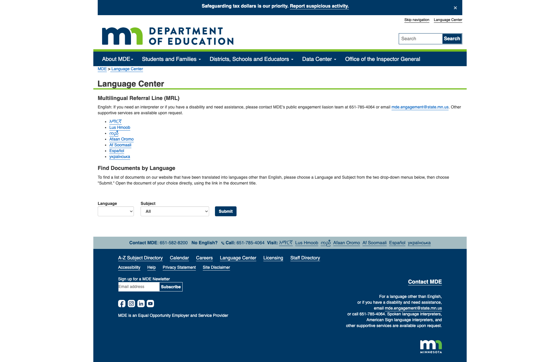
Most state education websites offer Google Translate or nothing. Minnesota maintains a dedicated Language Center that reflects the state's actual immigrant and refugee communities. Seven languages get full native-language pages: Amharic, Hmong, Karen, Oromo, Somali, Spanish, and Ukrainian. But the real gem is the "Find Documents by Language" tool — a searchable database of translated documents filterable by 27 languages and 10 subject areas (Early Learning, Special Education, Testing, Food and Nutrition, etc.).
The site also maintains a Multilingual Referral Line (651-785-4064) and offers spoken language interpreters, ASL interpreters, and other supportive services upon request. This level of multilingual investment is in the top tier nationally.
3. Mobile-Responsive Design
Despite running on Bootstrap 3.3, the site handles mobile responsiveness well. At 375px (iPhone SE), the navigation collapses to a hamburger menu, content stacks cleanly in a single column, quick-link buttons reflow properly, and the footer remains readable. The proper viewport meta tag (width=device-width, initial-scale=1) is set without user-scalable=no, preserving the user's ability to zoom.

4. Robust Search with Filtering
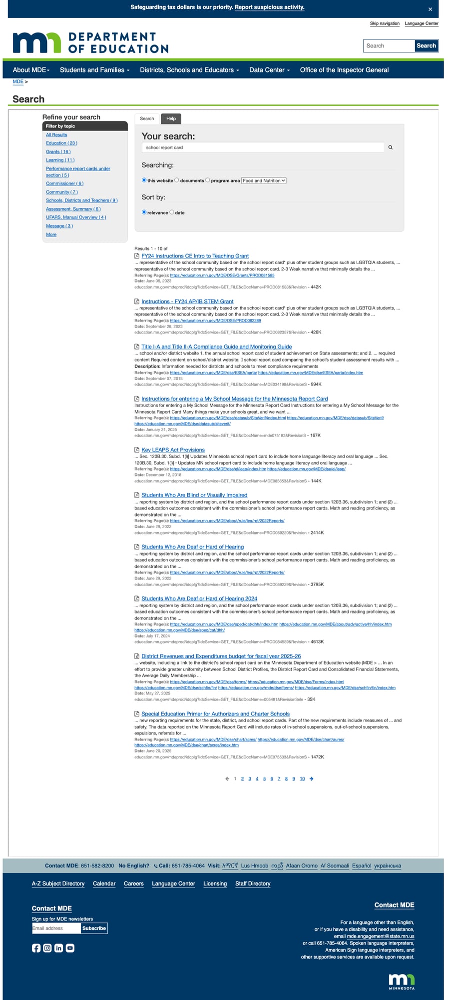
Minnesota's Vivisimo/MNIT-powered search is one of the better implementations we've seen on state education sites. A search for "school report card" returns paginated results (10+ pages) with:
- Three search scopes: "this website," "documents," or by program area
- Sort options: by relevance or date
- Topic filtering: sidebar lets you refine by categories like Education, Grants, Learning, Commissioner, etc.
- Result metadata: each result shows date, file size, referring pages, and description
No autosuggest or spelling correction, but the core search functionality is solid and reliably returns relevant results.
5. Zero Broken Navigation Links
Every one of the 5 main navigation links and all 9 homepage quick links returned HTTP 200. Interior section pages (Students & Families, Districts/Schools/Educators, Data Center) all loaded cleanly. In a landscape where state government sites routinely have broken navigation, Minnesota's 100% link health is notable.
Weaknesses
1. Visually Dated Design
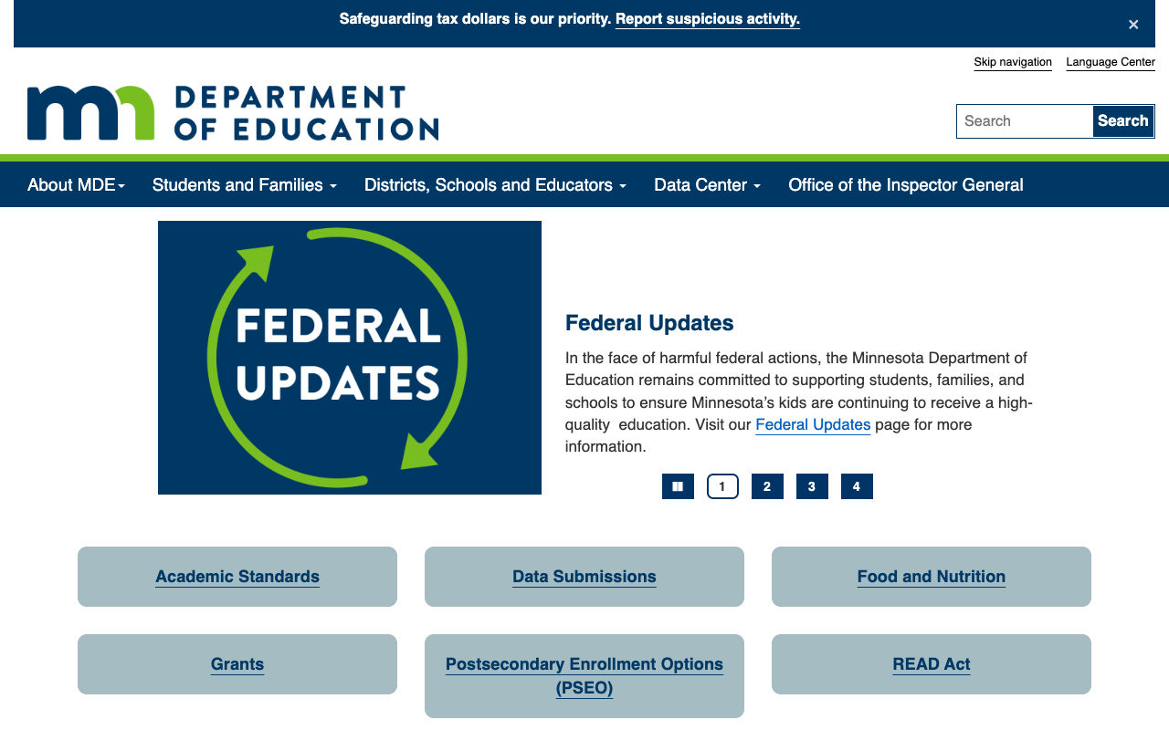
The site's visual presentation is its most obvious weakness. The homepage features a row of gray pill-shaped buttons as its primary navigation below the hero carousel — functional but visually flat. There's minimal imagery, no photography of Minnesota students or schools, no visual storytelling. The color palette is limited to navy, white, and a muted blue-gray. Typography is functional but unremarkable.
The underlying tech stack tells the story: Oracle WebCenter Content CMS with Bootstrap 3.3.6 (released February 2016) loaded from MaxCDN. The SmartMenus jQuery plugin powering the dropdown navigation is version 1.0.1. Everything works, but nothing about the visual experience communicates "modern state agency investing in digital services."
2. Data Portal Visual Disconnect
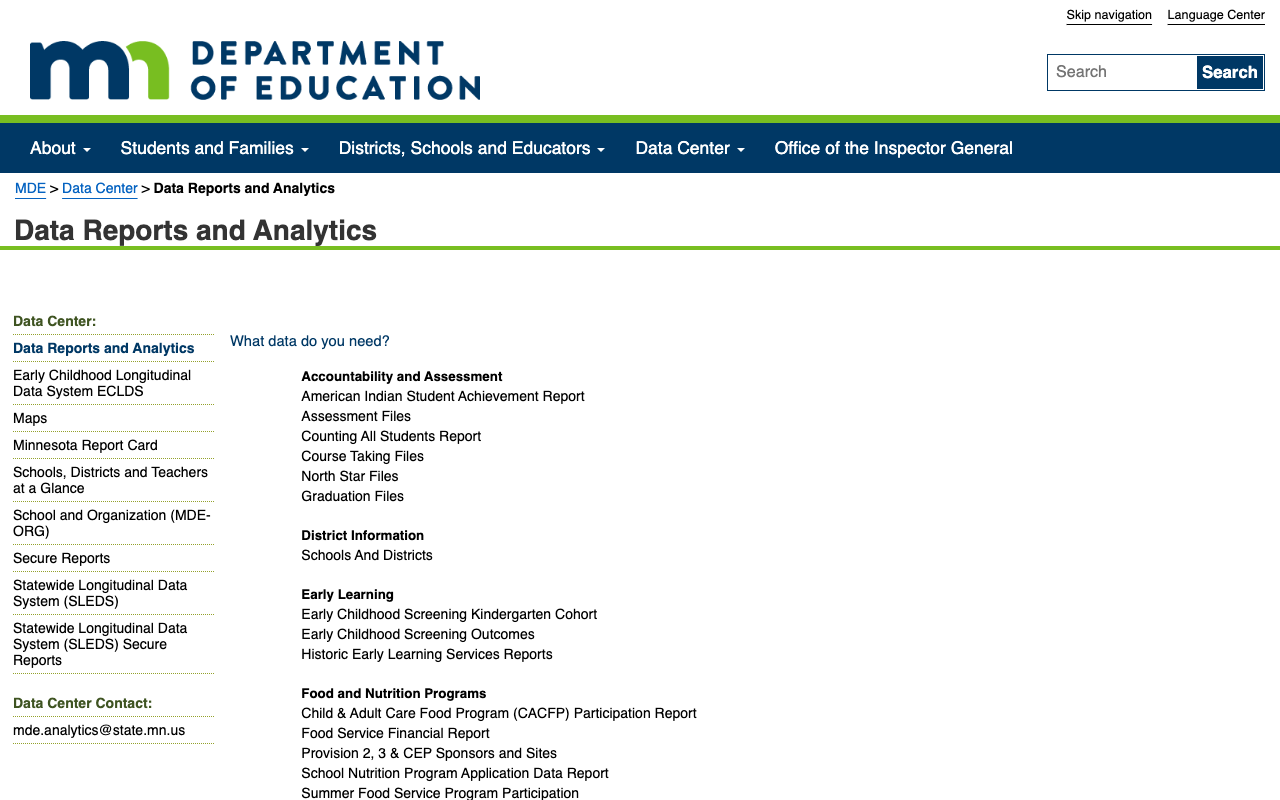
While the data resources are exceptional in breadth, the Data Reports and Analytics portal (pub.education.mn.gov) presents them in a sprawling HTML table inside an iframe. The categories — Accountability & Assessment, District Information, Early Learning, Food and Nutrition Programs, School Finance, Special Education, Student Data — are simply listed vertically with no icons, no descriptions, and no visual hierarchy to help users find what they need.
Compare this to the Minnesota Report Card tool, which has a modern interface with left-side navigation, school search, and organized question-based tabs. The contrast between these two data tools on the same site is jarring and suggests uneven modernization investment.
3. Content Staleness in Family Resources
Several family-facing pages show signs of content aging. The Back-to-School Toolkit contains a single document — "Back to School: Middle School Edition" dated August 2016. Some offsite resource links in family sections point to URLs using HTTP rather than HTTPS. While the core programmatic pages are maintained, the parent-facing "wrapper" content that makes the site feel alive and current has been neglected.
4. Homepage Prioritizes Administrators Over Families
The homepage's nine quick-link buttons are: Academic Standards, Data Submissions, Food and Nutrition, Grants, PSEO, READ Act, School Finance, Special Education, and Statewide Testing. Of these, only PSEO is clearly parent-oriented. Data Submissions, Grants, and School Finance are squarely administrator-focused. A parent visiting this homepage for the first time would need to know to click "Students and Families" in the nav bar — the homepage itself doesn't invite them in.
Opportunities
Visual modernization without a full rebuild: The Bootstrap 3 → 5 upgrade path is well-documented and would immediately improve typography, grid layout, and component styling. Adding hero photography, student success stories, and visual cards for the quick links would transform the homepage from utilitarian to welcoming.
Unify the data experience: The Minnesota Report Card tool proves MDE can build modern interactive interfaces. Applying similar treatment to the Data Reports & Analytics portal — with categorized cards, preview thumbnails, and a search/filter interface — would make the data ecosystem more discoverable.
Dedicated parent onboarding: A "New to Minnesota Schools?" guide or interactive wizard that helps parents navigate enrollment, testing, school choice options, and multilingual resources could become a national model given the existing Language Center infrastructure.
Threats
Technical debt: Oracle WebCenter Content is an enterprise CMS that's increasingly uncommon in government web. Finding developers and maintaining the platform will become harder over time, and the Bootstrap 3.3 dependency means security patches for the frontend framework ended years ago.
Federal funding uncertainty: The prominent "Federal Updates" banner on the homepage acknowledges ongoing federal policy changes. If federal data reporting requirements shift, the extensive data infrastructure that is MDE's greatest asset could require significant rework.
Standout Feature
The Minnesota Report Card is the clear standout. This standalone interactive tool lets users search for any school or district and explore data through plain-language questions: "Are students safe and engaged?" "Are students mastering standards?" "How many students graduate?" "How is money spent?" The left-side navigation organizes data into three sections — "More About My School," "How Well are Students Doing?" and "How is Minnesota doing?" — with a comparison feature ("Add another view") for side-by-side analysis. Language assistance is built into the header. It's exactly what a school report card should be.
Bottom Line
Minnesota's education website is the kind of site where the substance vastly outperforms the style. Parents will find what they need — especially through the Language Center and Report Card tool. Educators and administrators will find a deep, reliable resource ecosystem. Data researchers will be in heaven. But the dated visual design and administrator-focused homepage mean first impressions don't do justice to what's underneath. A visual refresh could easily push this site into B territory.
Grade Breakdown
| Criterion | Weight | Score | Notes |
|---|---|---|---|
| Navigation & Information Architecture | 15% | 8/10 | 5 clear top-level items, all functional, breadcrumbs throughout, A-Z directory. No mega-menus. |
| Accessibility (WCAG 2.1 AA) | 15% | 7/10 | Proper ARIA landmarks, alt text on all images, skip nav, lang attribute. Bootstrap 3 limits some modern a11y patterns. |
| Search Functionality | 10% | 7/10 | Vivisimo search with topic filtering, scoping, sorting, pagination. No autosuggest or spelling correction. |
| Mobile Responsive Design | 10% | 7/10 | Bootstrap responsive grid, hamburger menu, proper viewport. Framework age limits modern touch patterns. |
| Data Transparency & Open Data | 10% | 9/10 | Exceptional: Report Card, 50+ report categories, ECLDS, SLEDS, downloadable files spanning decades. |
| Parent Resources | 10% | 7/10 | Comprehensive Students & Families section with 30+ links. Outstanding Language Center. Some dated content. |
| Educator Resources | 10% | 8/10 | 40+ educator-focused links across licensing, development, curriculum, accountability, and community engagement. |
| Visual Design & Branding | 10% | 5/10 | Oracle UCM with Bootstrap 3.3.6. Consistent navy/green branding but dated, minimal imagery, flat visual hierarchy. |
| Performance & Load Speed | 10% | 8/10 | 108ms TTFB, 57KB page. HSTS, XSS protection, content-type-options headers. Radware bot management. |
| Overall | 100% | 74/100 | C+ |
Discussion