OverviewAll statesIdaho
64/100
Grade: C- — A Polished Shell Around Empty Rooms
The Idaho Department of Education website (sde.idaho.gov) presents an interesting paradox: it's one of the most technically polished state education agency sites in the country, built on a clean WordPress theme with strong branding, zero broken links, and excellent mobile responsiveness — yet four of its five main navigation landing pages contain literally no content. It's like walking into a beautifully renovated building where most of the offices haven't been furnished yet.
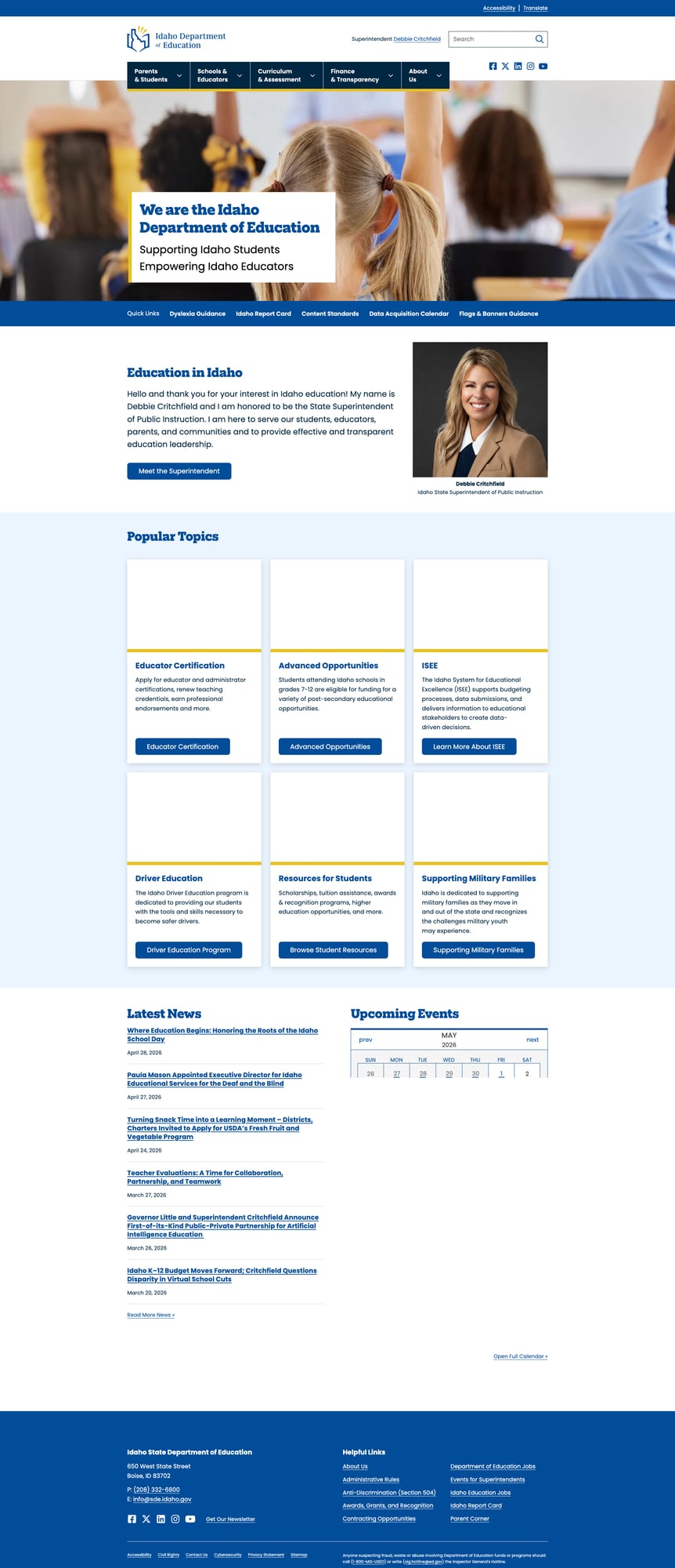
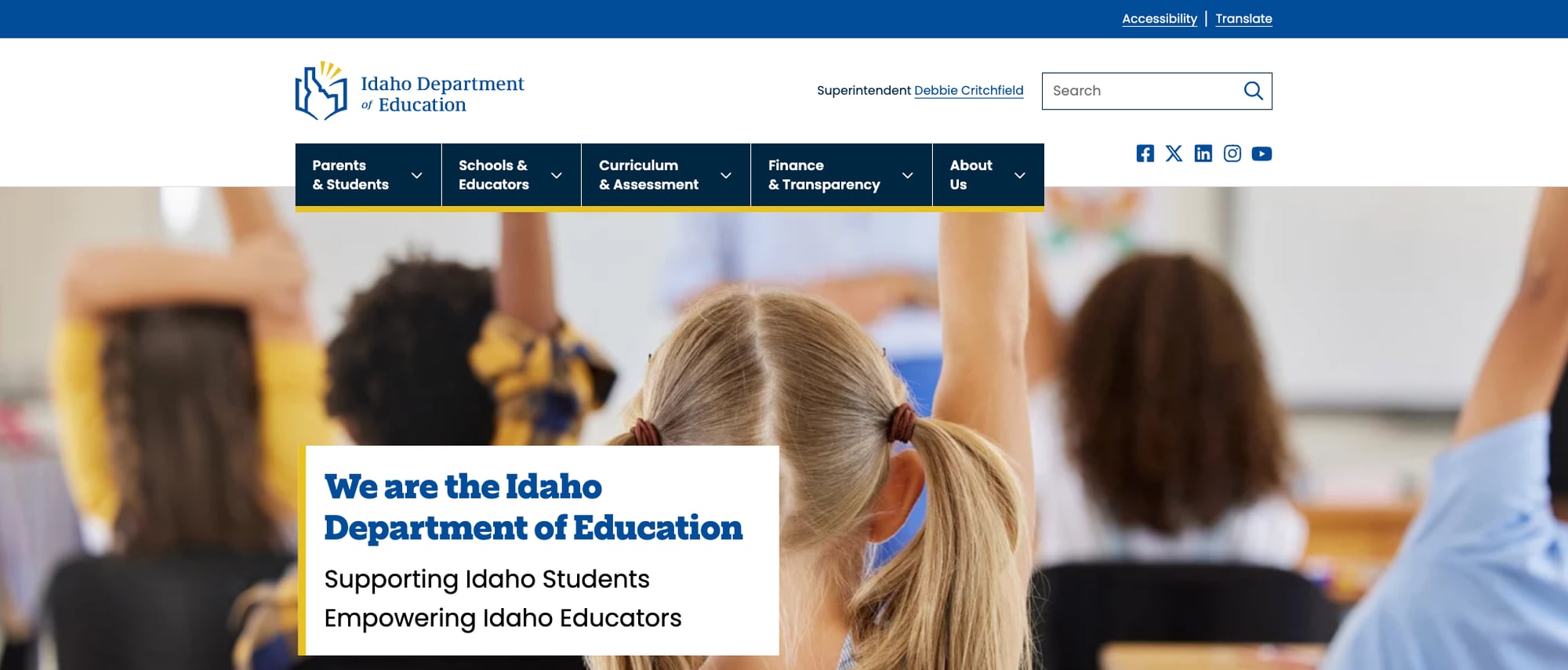
Idaho's SEA website runs on WordPress with a custom theme featuring the state's distinctive blue and gold palette. The homepage makes a strong first impression with a hero image, superintendent welcome message, Quick Links bar, Popular Topics cards, and a Latest News section. The site clearly underwent a recent redesign — the visual design is cohesive and modern. But visitors who click any of the five main navigation categories expecting an overview or curated content will find only a title and a footer.
The real substance lives one or two levels deeper, in departmental subpages like Educator Certification, Advanced Opportunities, and Public School Finance. The disconnect between the polished surface and the hollow landing pages suggests a migration or redesign that moved content into a deeper organizational structure without creating proper gateway pages to guide users there.
Strengths
1. Zero Broken Links — Flawless Link Health
In testing every navigation link, dropdown submenu item, footer link, and Quick Link on the site, every single URL returned a 200 status code. This is the first state in our review series to achieve 100% link health across the entire site. No 404s, no silent redirects to the homepage, no dead ends. For a WordPress site with dozens of internal pages and external references, this reflects disciplined content management.
2. Excellent Data Ecosystem — Idaho Report Card
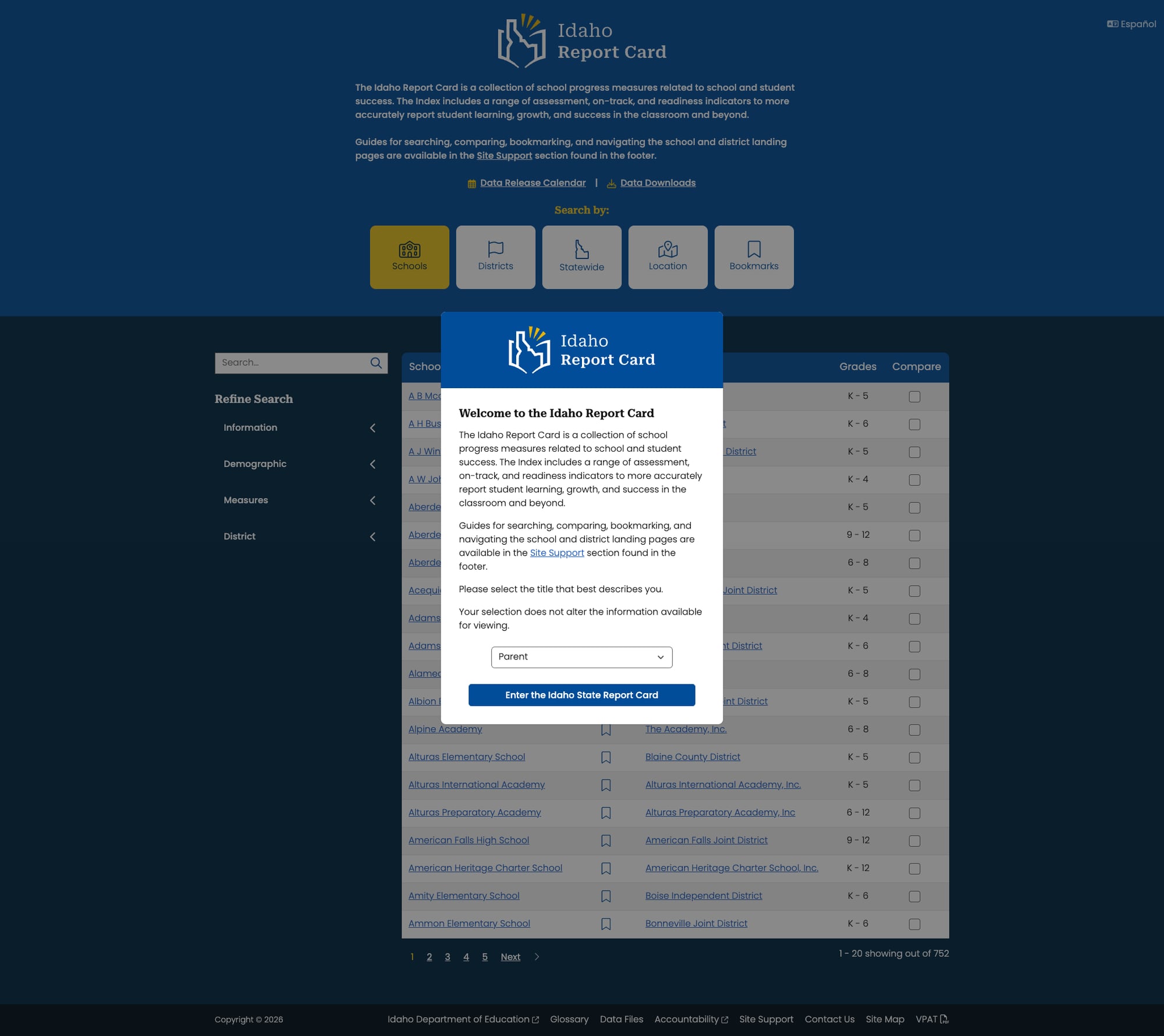
The Idaho Report Card (idahoreportcard.org) is a dedicated standalone platform for school and district performance data. It features search by school, district, statewide data, and location, with filterable measures across demographics, academics, and more. The tool includes Spanish language support, a data downloads section, a VPAT accessibility document, and a Data Release Calendar. At 752 schools indexed, it provides comprehensive coverage.
3. Strong Educator Resources in Subpages
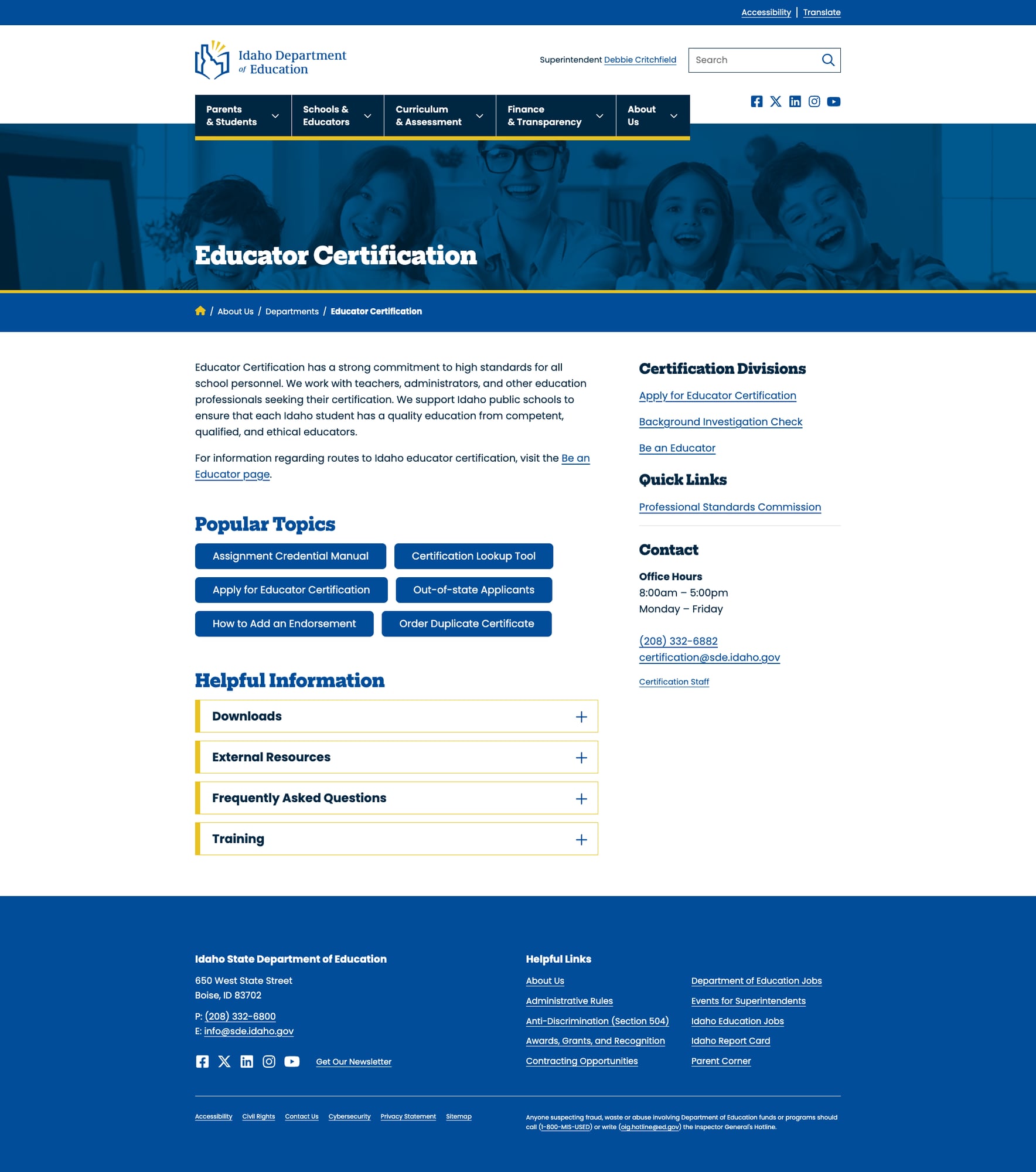
While the top-level "Schools & Educators" landing page is empty, the actual departmental subpages deliver. The Educator Certification page provides comprehensive information about certification types, renewal processes, and endorsements. The Be an Educator page targets teacher recruitment. These pages use consistent formatting with sidebar navigation, breadcrumbs, and clear content hierarchy.
4. Responsive Mobile Design
Idaho's site handles mobile viewport gracefully. The navigation collapses into a hamburger menu, content reflows properly, and the viewport meta tag is set correctly (width=device-width, initial-scale=1 with no restrictive user-scalable=no). Touch targets appear adequately sized. The Popular Topics cards stack vertically on narrow screens. This is a Bootstrap 5 implementation done right.
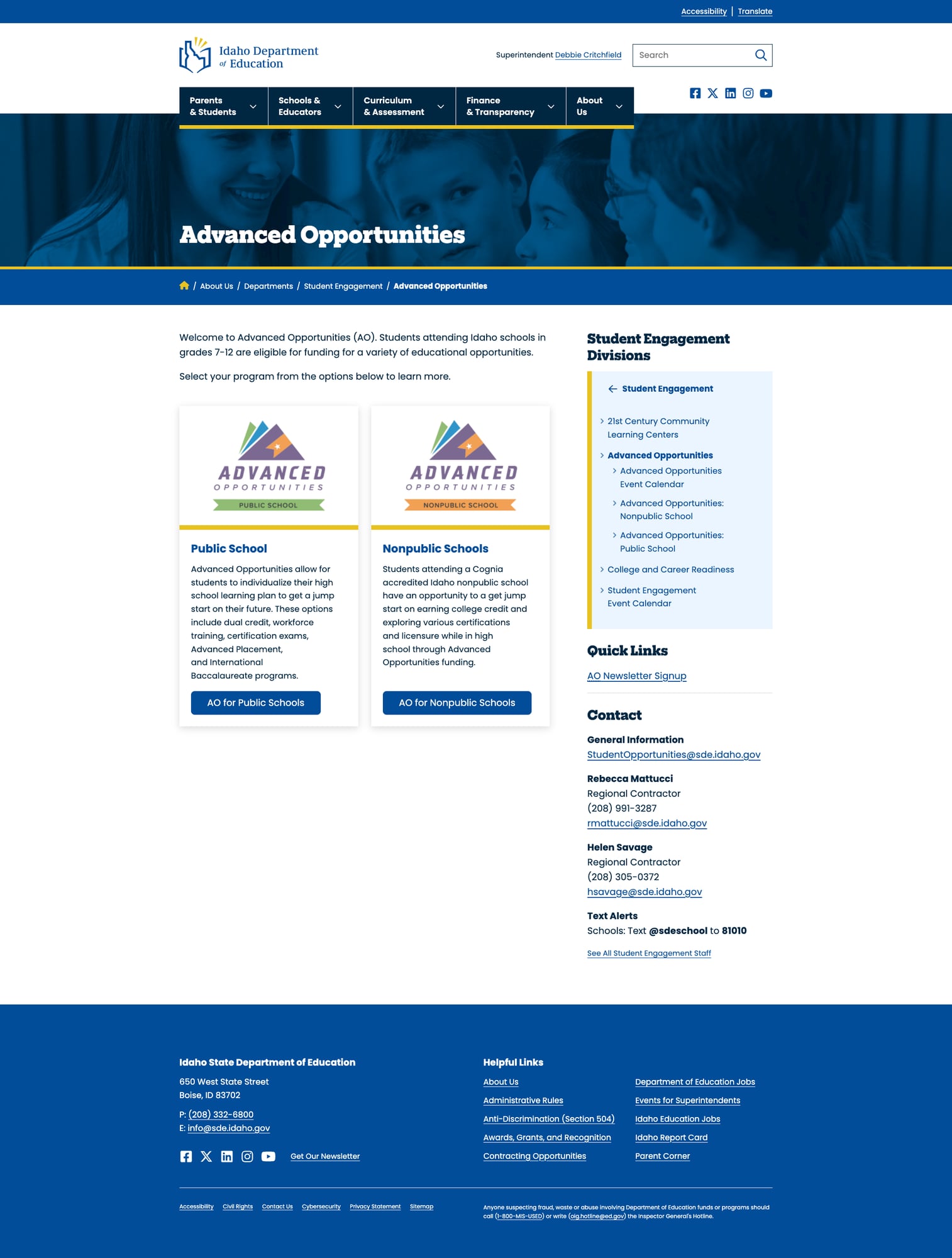
5. Advanced Opportunities Program Page
The Advanced Opportunities page is a model content page — it explains Idaho's program for grades 7-12 students to access post-secondary educational funding, with clear eligibility information, program descriptions, and resource links. This is the kind of substantive, user-focused content that should populate every section of the site.
Weaknesses
1. Empty Landing Pages — The Site's Defining Flaw
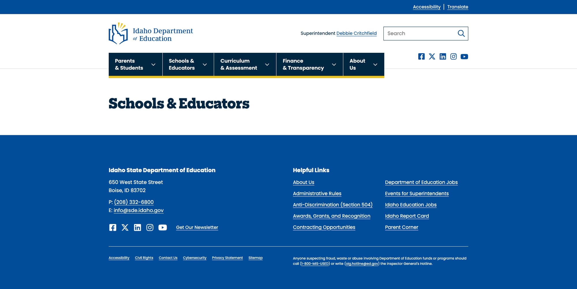
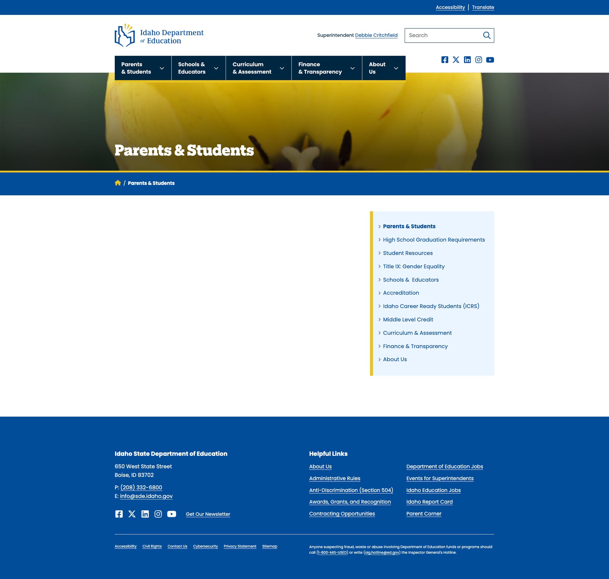
Four of five main navigation categories — Schools & Educators, Curriculum & Assessment, Finance & Transparency, and About Us — lead to pages with nothing but a title and a footer. The Parents & Students page is marginally better, showing a sidebar navigation menu but no main content. This means the primary user journey from the homepage drops into a void. Users who don't already know where they're going will hit a dead end at the first click.
2. Search Relevance Issues
The site search works — it uses WordPress's built-in search and returns results (149 for "school report card"). However, relevance ranking is poor. A search for "school report card" returns the Idaho Youth Suicide Prevention Program as the first result, with Idaho Reading Indicator as the second. The actual Idaho Report Card — arguably the site's most important tool — doesn't appear at the top. There's no autocomplete, no filtering, and no spelling correction.
3. Translation Requires a Separate Page Visit
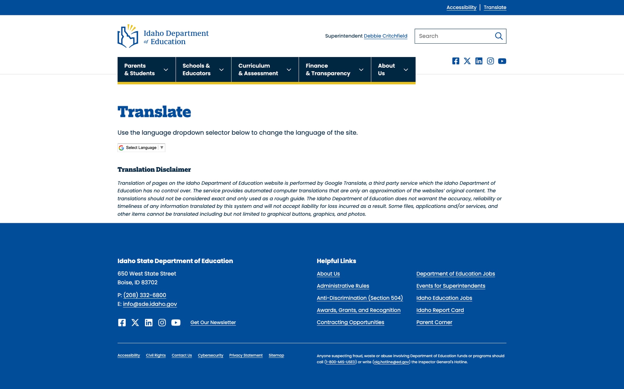
Multilingual support exists but is friction-heavy. Rather than a site-wide Google Translate widget or a language selector in the header, users must navigate to a dedicated Translate page to access translations in 9 languages. The page itself is well-designed and includes a phone interpretation service (1-800-432-4601), but requiring a page visit to change language is a barrier for non-English speakers who need immediate access.
4. News Published as PDF Downloads Only
Press releases and news items are published exclusively as PDF files rather than as web pages. The Communications page lists news items that link to downloadable PDFs. This is poor for accessibility (screen readers handle web content better than PDFs), SEO (search engines index web pages more effectively), and mobile users (PDFs are cumbersome on phones). It also means news content isn't searchable through the site search.
5. Public School Finance Data Buried Deep
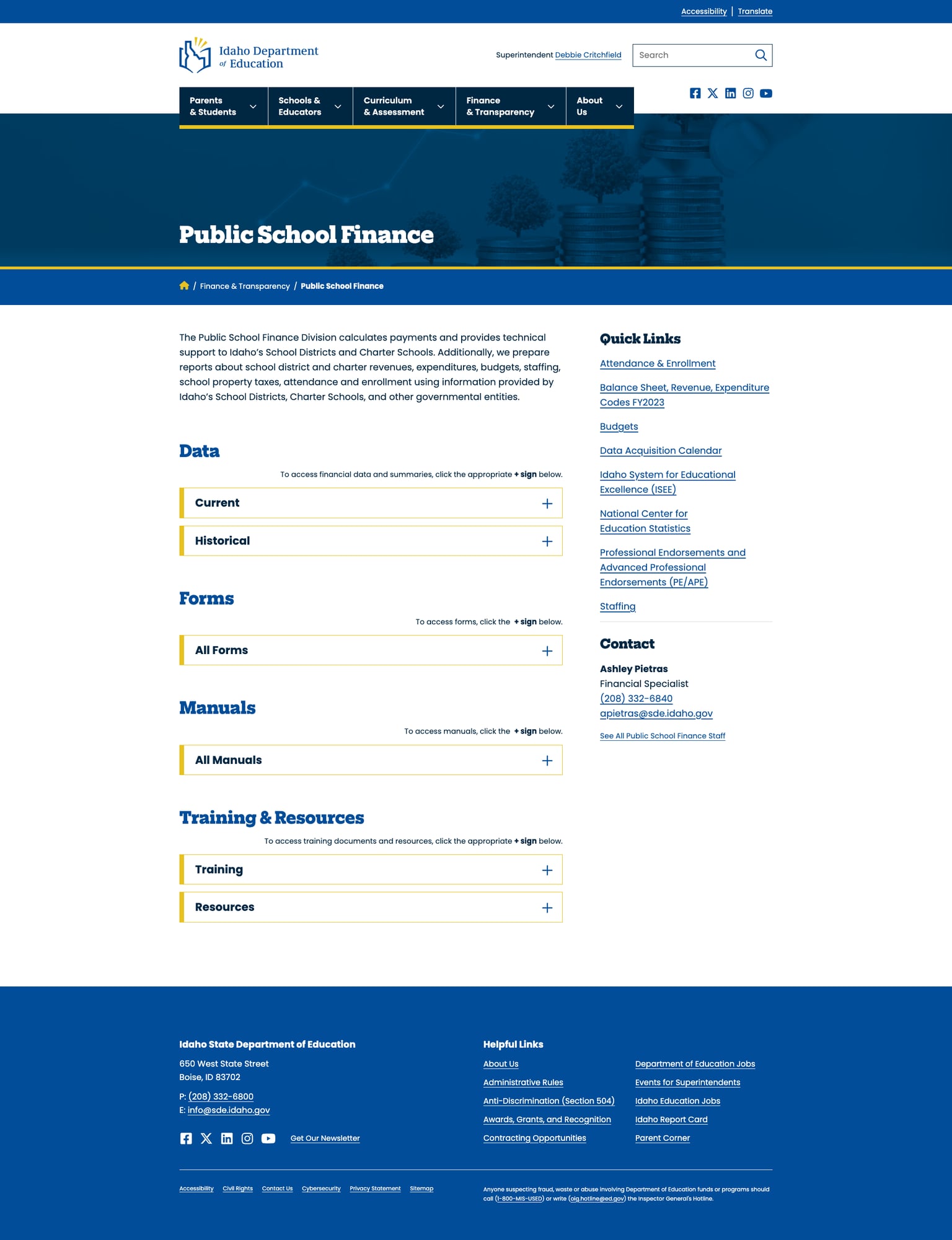
The Public School Finance page has useful financial transparency data, but reaching it requires navigating through the empty Finance & Transparency landing page. The dropdown menu helps, but the empty parent page signals to users that there's nothing here — potentially causing them to abandon the journey before discovering the actual content.
Opportunities
Populate the landing pages. This is the single highest-impact improvement Idaho could make. Each of the five main nav landing pages should serve as a curated gateway with brief descriptions of subsections, featured resources, and quick links. The current WordPress setup already supports this — it's a content authoring task, not a technical one.
Implement site-wide translation widget. Replace the separate Translate page with a Google Translate widget in the header bar, next to the existing "Translate" text link. This would make multilingual access a one-click action from any page rather than requiring navigation to a dedicated page.
Publish news as web content. Convert press releases from PDF-only distribution to WordPress posts. This improves accessibility, SEO, mobile readability, and makes news content searchable. PDFs can remain available as supplementary downloads for those who want them.
Threats
Migration gap perception. The empty landing pages suggest an incomplete WordPress migration. If the site was recently redesigned (the codebase and theme suggest it was), the gap between the polished homepage and the hollow interior may erode trust among users who interpret the emptiness as a broken or abandoned site.
Search engine indexing of empty pages. Five high-authority landing pages with no content will perform poorly in search rankings, potentially dragging down the site's overall SEO performance. Google may interpret these thin pages as low-quality content.
Standout Feature
The Idaho Report Card at idahoreportcard.org is Idaho's standout feature. It's a purpose-built, standalone data platform that lets parents, educators, and community members search school and district performance data by multiple dimensions. The tool includes Spanish language support (Español toggle), a Data Release Calendar for transparency about when new data becomes available, a Data Downloads section for bulk access, a VPAT for accessibility compliance documentation, and glossary/site support resources. With 752 schools indexed and filterable by information, demographics, measures, and district, it provides the comprehensive data transparency that the main SDE website's empty Finance & Transparency page fails to deliver.
Bottom Line
Idaho's Department of Education website is a tale of two sites: a beautifully designed, technically sound WordPress platform with zero broken links and excellent mobile responsiveness — wrapped around a content architecture where the five main gateway pages are completely empty. Visitors who know exactly where they're going (Educator Certification, Advanced Opportunities, Idaho Report Card) will find quality content. Everyone else will land on a blank page and wonder where everything went. The bones are excellent; they just need to be furnished.
Grade Breakdown
| Criterion | Weight | Score | Notes |
|---|---|---|---|
| Navigation & Information Architecture | 15% | 5/10 | Dropdown menus work well with real links, but all 5 main landing pages are empty shells. Users who click top-level nav categories hit dead ends. |
| Accessibility (WCAG 2.1 AA) | 15% | 7/10 | Skip-to-content link, proper ARIA labels, correct viewport meta, dedicated accessibility page, keyboard navigation works. Alt text present on images. |
| Search Functionality | 10% | 5/10 | WordPress search works and returns results (149 for "school report card"), but poor relevance ranking. No autocomplete, no filters, no spelling correction. |
| Mobile Responsive Design | 10% | 8/10 | Excellent Bootstrap 5 responsive implementation. Hamburger menu, proper content reflow, no horizontal scrolling, adequate touch targets. |
| Data Transparency & Open Data | 10% | 8/10 | Idaho Report Card (idahoreportcard.org) is a strong standalone data portal with school/district data, downloads, and Spanish support. ISEE system adds depth. |
| Parent Resources | 10% | 5/10 | Parent Corner (prtoolkit.org) provides parent rights toolkit externally. Main Parents & Students landing page is empty. Limited on-site parent guidance. |
| Educator Resources | 10% | 7/10 | Rich content in Educator Certification, Be an Educator, and Advanced Opportunities subpages. But Schools & Educators landing page is empty — discoverability suffers. |
| Visual Design & Branding | 10% | 7/10 | Clean, consistent blue/gold branding. Professional typography (Adobe Fonts). Cohesive visual hierarchy on content-populated pages. Hero imagery and card layouts work well. |
| Performance & Load Speed | 10% | 7/10 | 299ms TTFB, 447ms total load, 155KB page size. Solid performance. WordPress with good caching. No excessive third-party scripts. |
| Overall | 100% | 64/100 | C- |
Discussion