OverviewAll statesDelaware
65/100
Grade: C — Strong Data Backbone, Room to Grow on Mobile and Equity
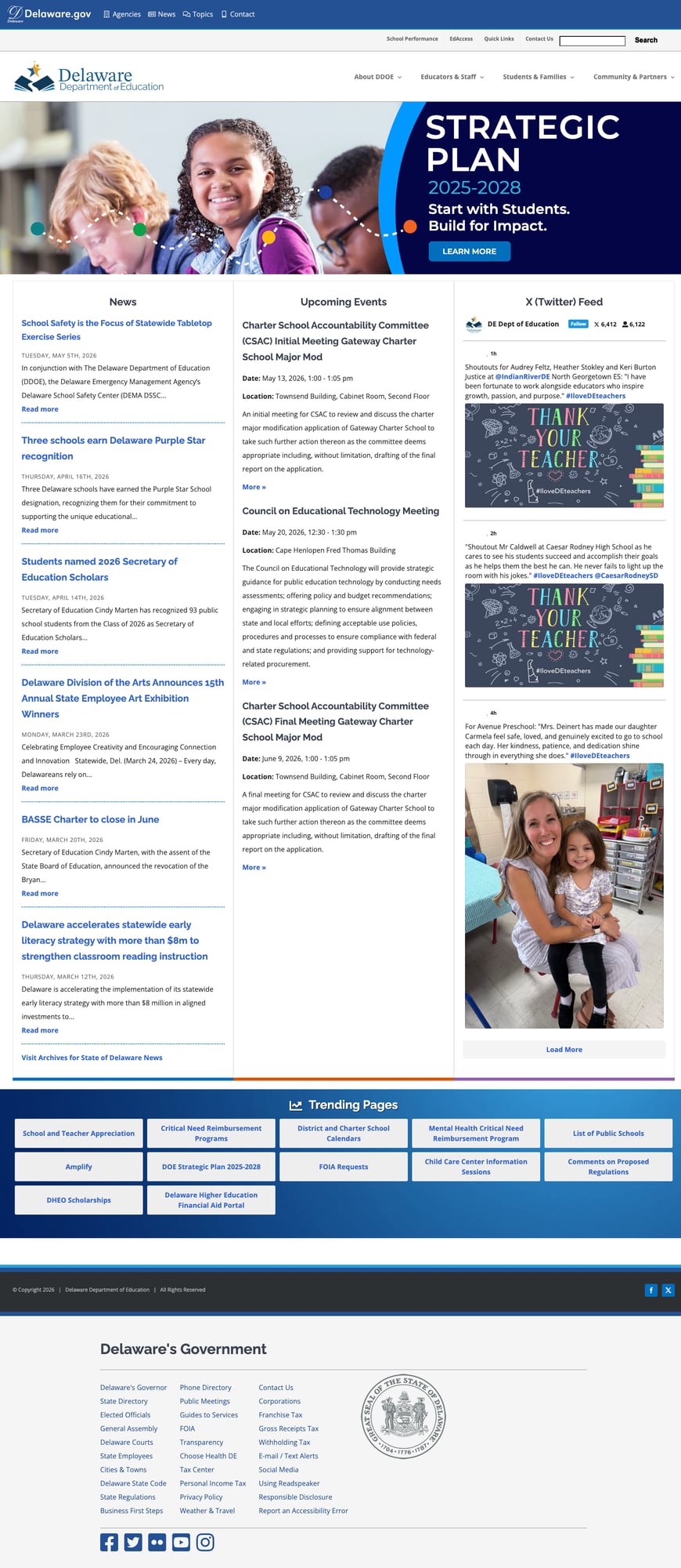
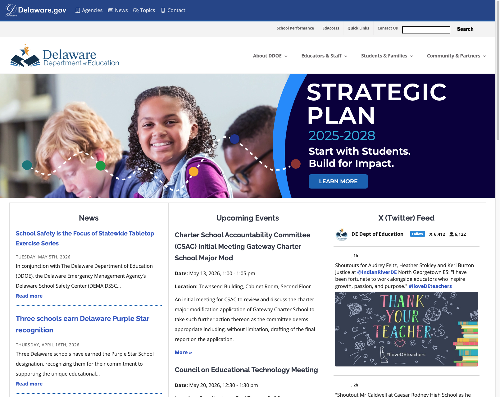
The Delaware Department of Education (DDOE) website at education.delaware.gov is a well-organized WordPress site that punches above its weight for a small state. Delaware has invested meaningfully in data transparency — its Report Card portal and Open Data platform are among the best we've reviewed — and the site's family-centered navigation structure is a genuine best practice. The homepage makes a strong first impression: a prominent 2025–2028 Strategic Plan banner, a current news feed, an events calendar, and an embedded X/Twitter feed, all within a clean blue-and-gold design.
The site recently migrated from its legacy domain at www.doe.k12.de.us to education.delaware.gov and integrates with Delaware's statewide Delaware.gov header, giving it a cohesive state-government identity. For researchers, administrators, and data-focused users, this is a high-quality resource. Where the site falls short is in serving mobile users and non-English-speaking families — gaps that matter given Delaware's growing linguistic diversity and the reality that parents increasingly access government sites on phones.
Strengths
1. Comprehensive Data and Reporting Ecosystem
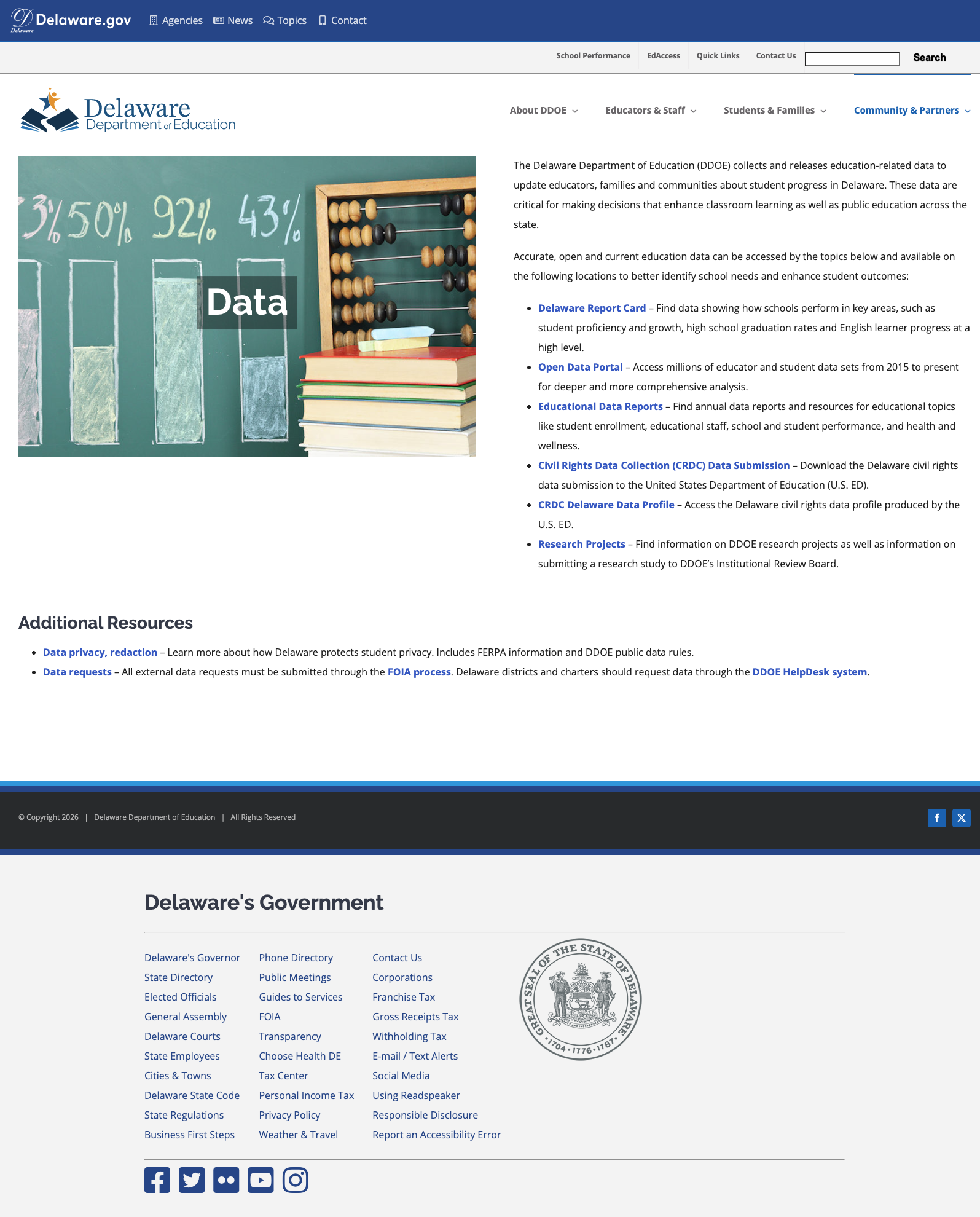
Delaware's data transparency is a genuine standout. The "Data and Reporting" page under Community & Partners serves as a well-organized hub linking to six distinct data resources: the Delaware Report Card, an Open Data Portal (data.delaware.gov), Educational Data Reports, Civil Rights Data Collection submissions, the CRDC Delaware Data Profile, and Research Projects. Each resource is clearly described with a sentence explaining what users will find. The page also includes data privacy and FOIA information, demonstrating a commitment to both transparency and responsible data governance.
2. Thoughtful Family-Centered Organization
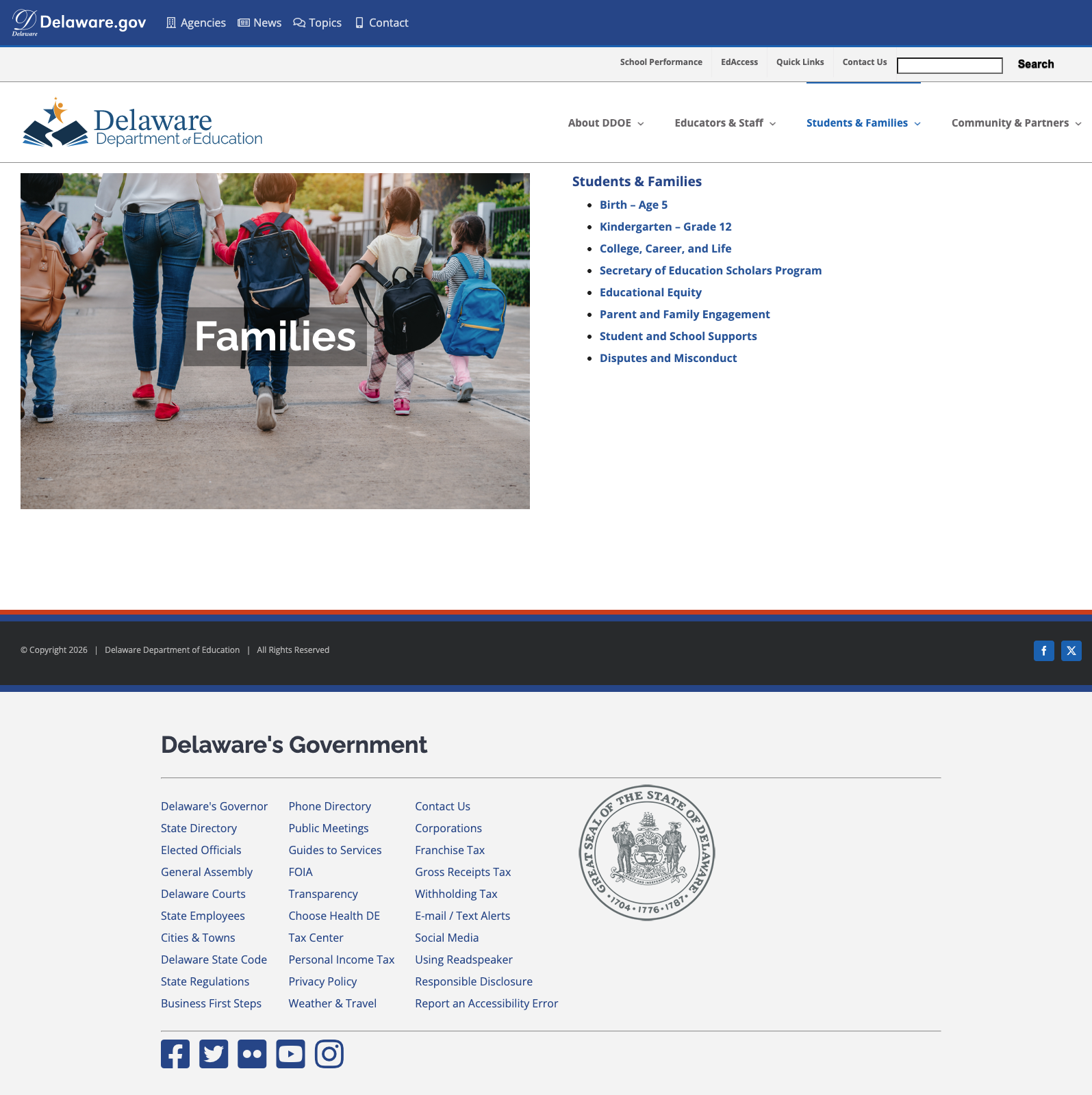
The Students & Families section (at /families/) is organized by life stage — Birth through Age 5, Kindergarten through Grade 12, and College/Career/Life — which mirrors how families actually think about education. It also includes sections on Educational Equity, Parent and Family Engagement, Whole Child Support, and Disputes and Misconduct. This life-stage navigation pattern is a best practice we rarely see implemented this cleanly. The page offers clear, jargon-free link labels that parents can immediately understand.
3. State Open Data Portal (data.delaware.gov)
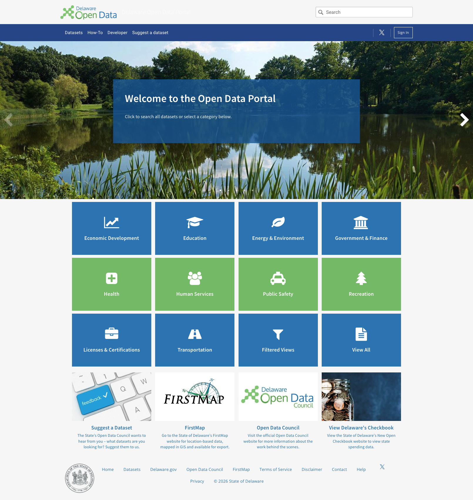
Delaware operates a dedicated Open Data Portal at data.delaware.gov that goes far beyond education. It features 12 browsable categories including Education, searchable datasets, a Developer section, a "Suggest a Dataset" feedback mechanism, an Open Data Council, and integration with FirstMap for geospatial data. The portal runs on Socrata (Tyler Technologies), a well-established open data platform, and represents a statewide commitment to data accessibility that directly supports education research and analysis.
4. Clean Navigation Structure with Rich Dropdown Menus
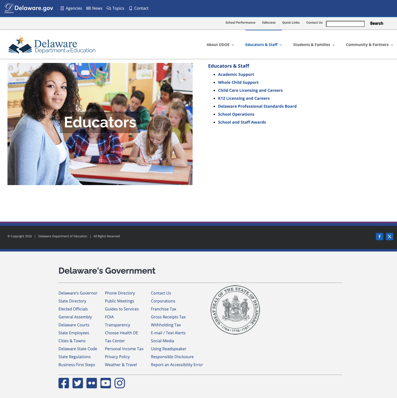
The site's four top-level sections — About DOE, Educators, Students & Families, and Community & Partners — each open into well-organized dropdown menus with specific, clearly-labeled subsections. The URL structure is logical and consistent (e.g., /educators/academic-support/, /families/birth-age-5/), making deep-linked pages easy to share and bookmark. The Delaware.gov header adds cross-agency navigation for Agencies, News, Topics, and Contact information.
5. Active and Current News Section
The homepage news section features recent stories with dates ranging from March to May 2026, covering topics from early literacy strategy ($8M investment) to school safety tabletop exercises to charter school accountability. Each story has a date, excerpt, and "Read more" link. The Upcoming Events section lists specific committee meetings with dates, times, and locations — demonstrating that the site is actively maintained and used for operational communication.
Weaknesses
1. No Multilingual Support on Main Site
Despite Delaware's growing linguistically diverse population, the main education website offers no multilingual support, translation toggle, or Spanish-language content. The Delaware Report Card subdomain does offer a translate option, but the main DDOE site — where parents go for enrollment, school choice, and family resources — is English-only. This creates an equity gap for non-English-speaking families navigating some of the most consequential decisions in their children's education.
2. Mobile Responsiveness Issues
On mobile viewport widths, the homepage exhibits layout problems. The hero Strategic Plan banner overlaps with other elements, the three-column layout (News, Events, Twitter) doesn't gracefully collapse, and the "Trending Pages" section at the bottom becomes cramped. The Avada theme is marketed as responsive, but the custom configuration here doesn't deliver a clean mobile experience. Given that parents are among the primary audience and frequently access information on phones, this is a significant gap.
3. Legacy Domain Fragmentation
The site still references the old doe.k12.de.us domain for several tools — the Report Card, HelpDesk, and Bid Solicitations all live on the legacy domain with different designs and separate authentication systems. Users clicking into these tools find themselves in a noticeably different visual environment with no consistent navigation back to the main site. As these legacy systems age, the risk of broken integrations grows and the experience for end users becomes increasingly inconsistent.
4. Search Is Functional but Basic
The site search returns relevant results for common queries, but the implementation is basic — no autosuggest, no filtering by audience (parents vs. educators vs. community), no spelling correction, and no prominent placement of popular resources. For a site with as much content as DDOE's, a more capable search experience would significantly improve findability, especially for users who can't find what they need through the menu hierarchy.
Opportunities
Add multilingual support — Implementing a Google Translate widget or, better yet, professional Spanish translations for key family-facing pages (enrollment, school choice, special education) would significantly improve equity and accessibility.
Modernize search with inline results — Consider a modern search experience with autosuggest, filters by audience (parents, educators, community), and prominent placement of popular resources.
Unify legacy and new domains — Migrating remaining tools from
doe.k12.de.ustoeducation.delaware.gov(or at least adding a consistent header/footer to legacy pages) would create a more cohesive experience and reduce the risk of broken integrations as legacy infrastructure ages.
Threats
Legacy infrastructure fragmentation — The site still references the old
doe.k12.de.usdomain for several tools (Report Card, HelpDesk, Bid Solicitations), creating a fragmented experience where users bounce between domains with different designs and authentication systems. As these legacy systems age, the risk of broken integrations grows.Mobile access equity gap — With the majority of parent traffic coming from mobile devices, a site that doesn't deliver a clean mobile experience effectively creates a two-tier information system: a good one for desktop users and a degraded one for phone users, who skew toward lower-income households.
Standout Feature
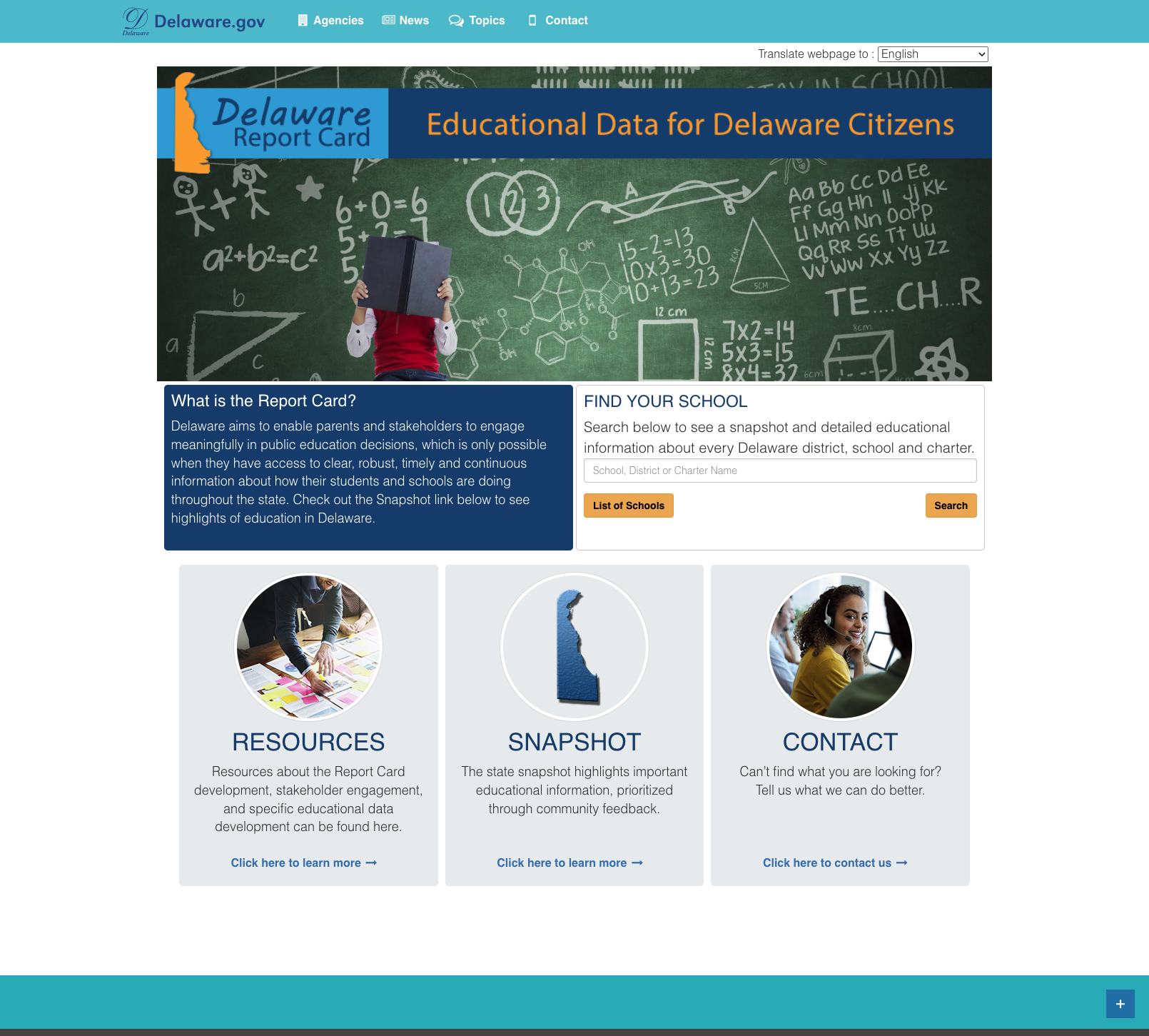
The Delaware Report Card at reportcard.doe.k12.de.us is Delaware's best digital asset. It features a clean, purpose-built interface with a school/district search, a statewide Snapshot with community-prioritized educational highlights, Resources for Report Card development and stakeholder engagement, and a translate option. The "What is the Report Card?" section explicitly connects data transparency to meaningful public engagement in education decisions — a framing that elevates this from a data tool to a civic engagement platform.
Bottom Line
Delaware's education website delivers genuine value for researchers, administrators, and data-focused users, with a data ecosystem that rivals much larger states. The navigation is logically organized, the content is current, and the family-centered structure shows real thoughtfulness about how parents actually use these sites. To move up a grade, Delaware needs to solve its mobile experience, add multilingual support, and finish consolidating its legacy domain tools under the new site — none of which are insurmountable challenges for a state that has clearly already invested in digital infrastructure.
Grade Breakdown
| Criterion | Weight | Score | Notes |
|---|---|---|---|
| Navigation & Information Architecture | 15% | 7/10 | Clean four-section structure, rich dropdowns, logical URL patterns. Delaware.gov header integration adds cross-agency navigation. |
| Accessibility (WCAG 2.1 AA) | 15% | 6/10 | Skip-to-content link, ARIA roles present, ReadSpeaker integration, Report an Accessibility Error link. No multilingual support. |
| Search Functionality | 10% | 6/10 | Search is functional and returns relevant results. No autosuggest, no audience filters, no spelling correction. Basic but not broken. |
| Mobile Responsive Design | 10% | 4/10 | Avada theme provides basic responsiveness, but hero banner overlaps, three-column layout doesn't collapse cleanly, spacing issues throughout. |
| Data Transparency & Open Data | 10% | 9/10 | Excellent: Report Card, Open Data Portal (data.delaware.gov), Educational Data Reports, CRDC data, Research Projects hub. Well-documented and current. |
| Parent Resources | 10% | 7/10 | Life-stage organization (Birth–5, K–12, College/Career), school choice, enrollment, special education. No multilingual support deducts points. |
| Educator Resources | 10% | 7/10 | Academic Support, Whole Child, Licensure, PSB, School Operations, Awards. Well-organized and reachable. |
| Visual Design & Branding | 10% | 7/10 | Clean, professional design with consistent blue/gold branding. Delaware.gov integration. Hero banner is visually appealing. Avada theme is modern. |
| Performance & Load Speed | 10% | 6/10 | Fast server response but page is 1.3MB — heavy for a government site. WordPress + Avada generates substantial CSS/JS payload. |
| Overall | 100% | 65/100 | C |
Discussion