OverviewAll statesAlaska
55/100
Grade: D+ — Culturally Rich but Held Back by Inconsistent Design
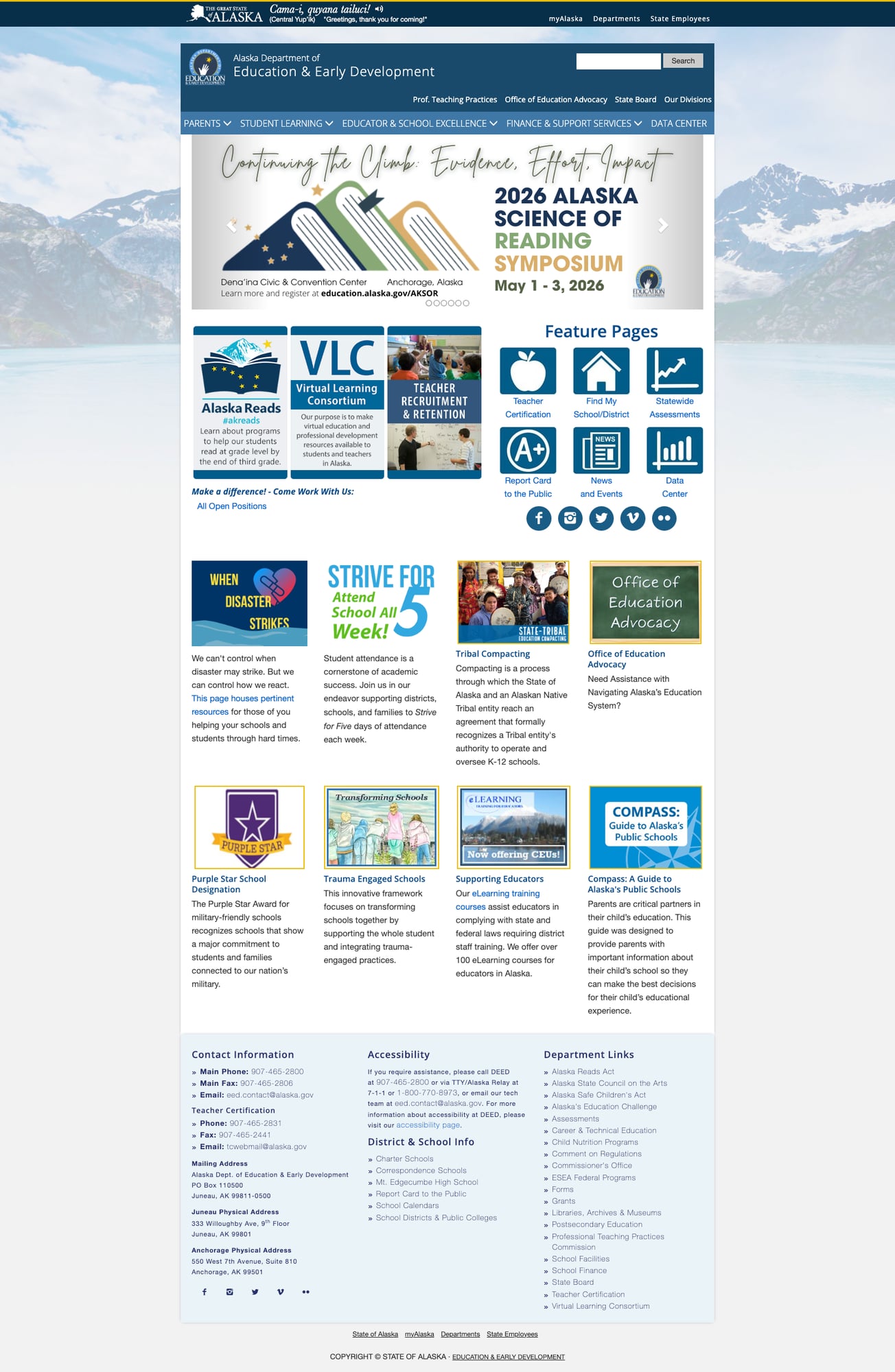
The Alaska Department of Education & Early Development (DEED) website presents a fascinating case study in contrasts. It opens with a Central Yup'ik greeting—"Cama-i, quyana tailuci!" (Greetings, thank you for coming!)—immediately signaling Alaska's unique commitment to Indigenous language preservation. The homepage is visually attractive with mountain imagery and a clear navigation bar. But scratch beneath the surface and you'll find a site held back by inconsistent design between sections and a dated underlying architecture that undermines its genuinely good content.
For parents trying to understand their child's school, educators seeking certification, or researchers looking for data, the site has real strengths—but reaching them often requires navigating across templates that look and behave differently. It's a site that clearly serves its community but would benefit from a unified design refresh.
Strengths
1. Indigenous Language & Cultural Integration
Alaska's DEED is the only state education website that greets visitors in a Native language. The Central Yup'ik welcome banner with audio pronunciation is more than a token gesture—it reflects Alaska's unique educational context where Tribal Compacting allows Native entities to operate K-12 schools. This cultural awareness permeates the site with dedicated sections for Alaska Native Language Literacy and Tribal education partnerships.
2. Comprehensive Teacher Certification Portal
The Teacher Certification section is arguably the site's best-executed area. It features a detailed breakdown of certificate types (Teacher, Administrative, Special Services, Miscellaneous), clear processing status updates, an "Online Services" section with Certificate Lookup, District Communication Hub, and new certificate applications. The TEACH-AK online system is prominently featured with realistic processing timeline expectations.
3. Alaska Reads Act Implementation Page
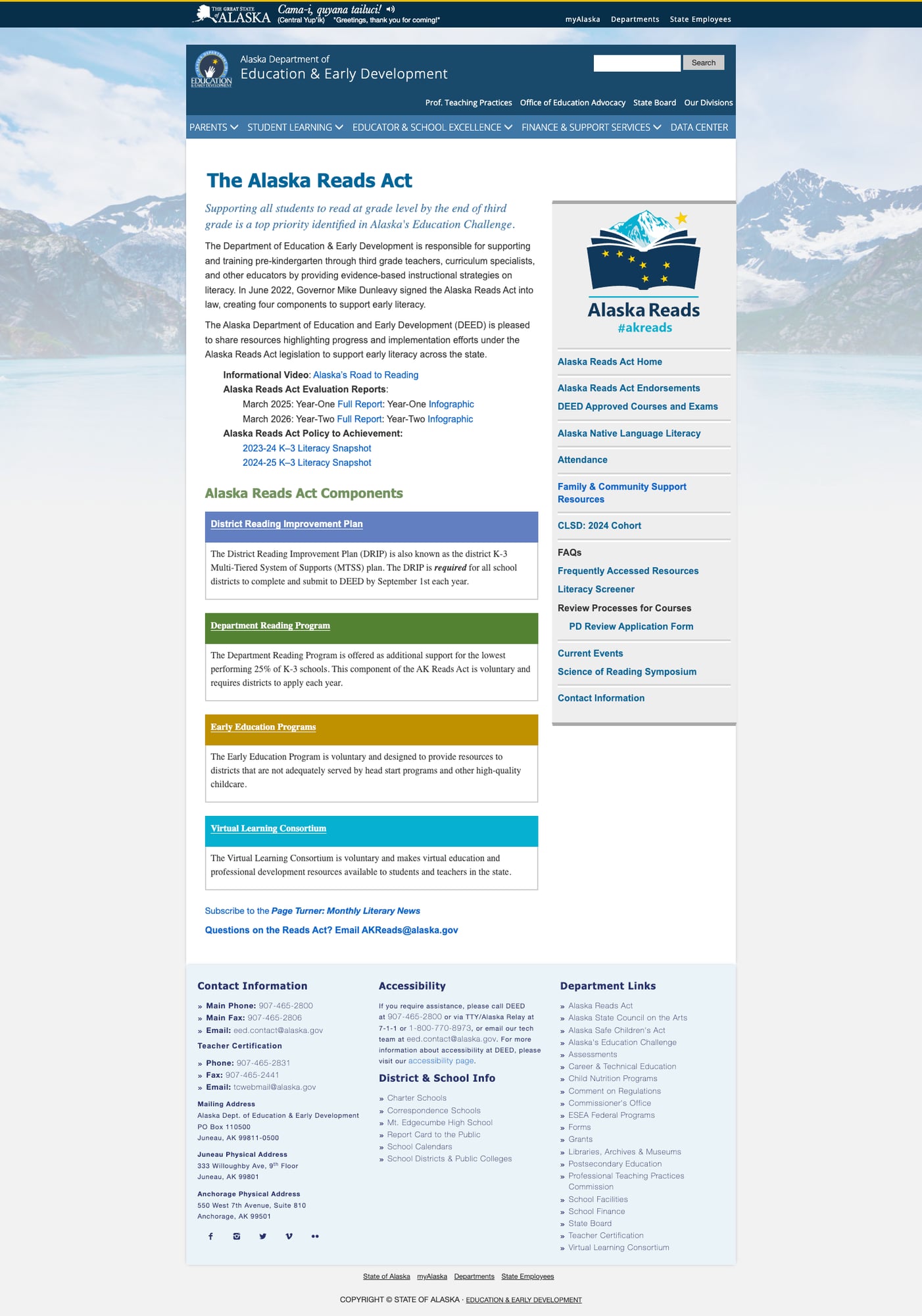
The Alaska Reads Act page demonstrates how to communicate complex policy effectively. It clearly explains the four components (District Reading Improvement Plan, Department Reading Program, Early Education Programs, Virtual Learning Consortium), provides links to evaluation reports and infographics, and maintains a sidebar with quick-access resources including FAQs, course endorsements, and the Science of Reading Symposium information.
4. Assessments Page with Visual Organization
The Assessments page uses colorful icons and clear categorization to explain Alaska's required statewide assessments (AK STAR, WIDA, DLM, NAEP, Amplify mCLASS). It includes an embedded YouTube overview video, named contact persons for each assessment type, and links to both family and educator resources. The visual hierarchy makes complex testing information approachable.
5. Compass: A Guide to Alaska's Public Schools
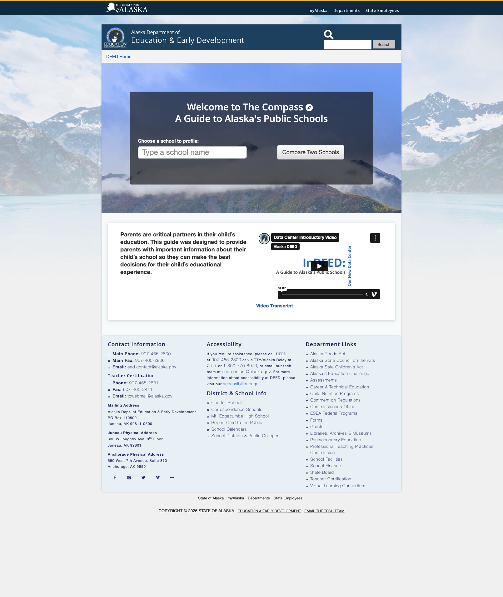
The Compass tool is a clean, parent-focused school lookup that includes an introductory video and simple search interface. While basic in functionality, it demonstrates awareness of the parent audience's needs with a "Compare Two Schools" feature.
Weaknesses
1. Inconsistent Page Design Across Sections
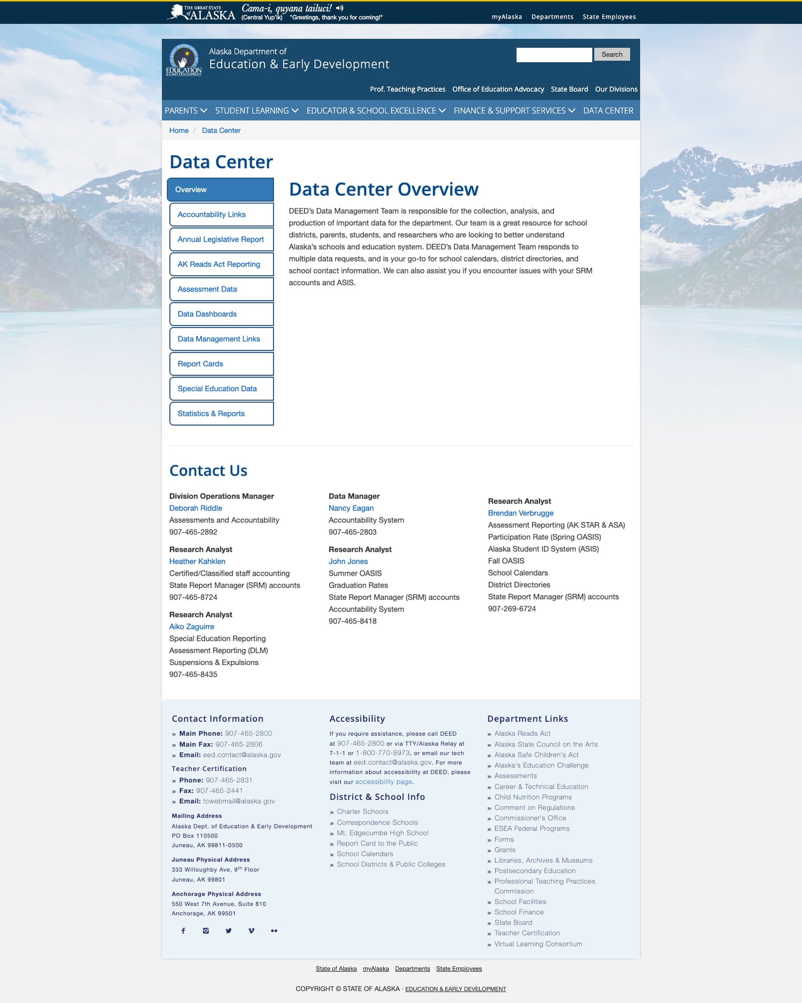
The site uses at least three distinct layout templates: the full-nav version (homepage, Data Center, eLearning), a stripped-down version missing the main navigation bar (Compass, Report Card to the Public), and content pages with sidebars (Alaska Reads). Some pages include the Yup'ik greeting banner and full secondary navigation; others drop directly to a minimal header. This inconsistency makes the site feel like several separate websites stitched together.
2. Basic Search Without Smart Features
The site search is a simple text box with a "Search" button. There is no autosuggest, no filtering by content type, no faceted search for different audiences (parents vs. educators vs. administrators). For a site with this much content spread across inconsistent URL structures, a robust search would be essential.
3. Dated Visual Design & Limited Mobile Responsiveness
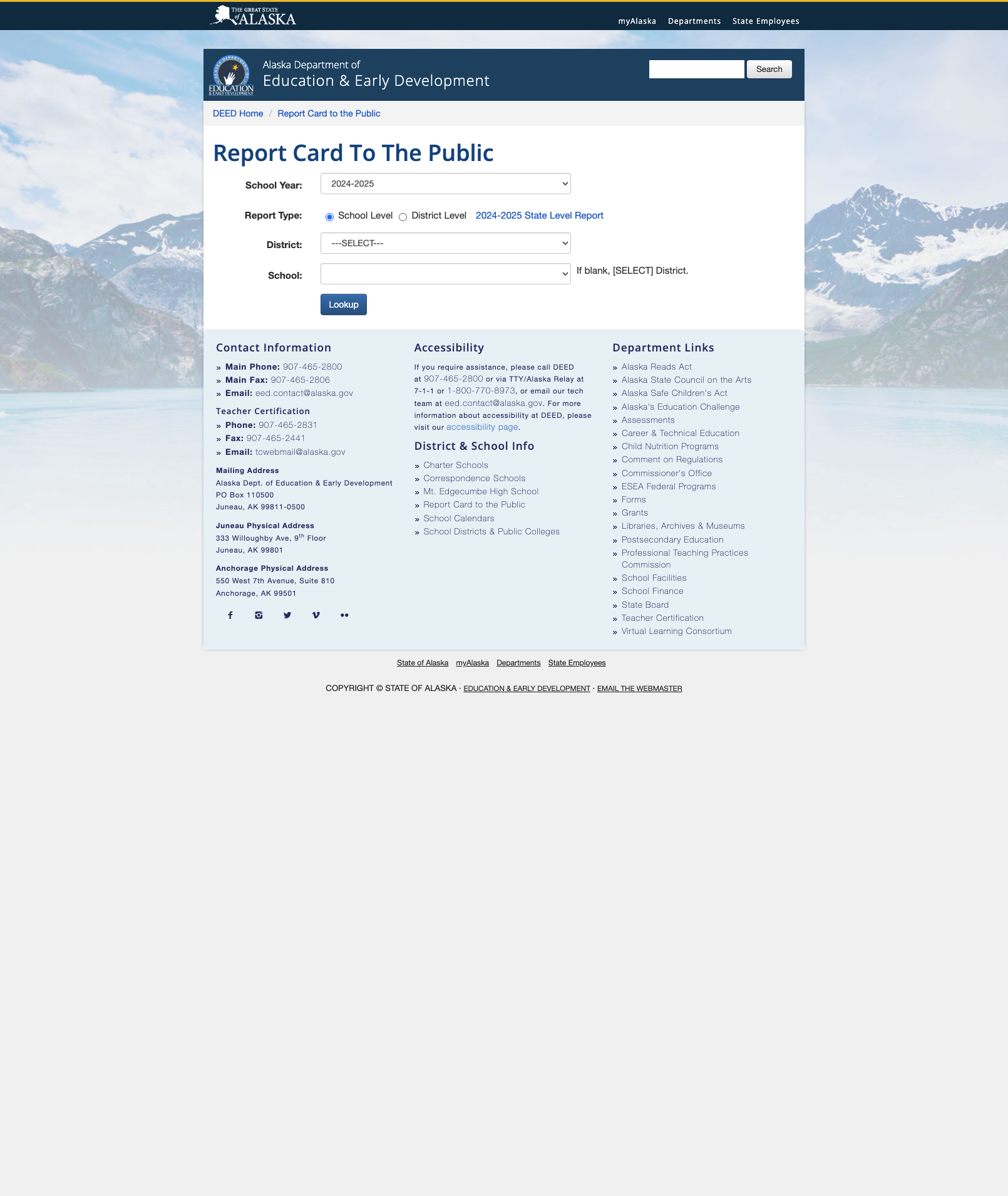
While the homepage has a professional look with its mountain backdrop and blue color scheme, many interior pages reveal an aging design system. The eLearning page is a wall of unstyled text. The Report Card tool looks like it was built in the early 2010s. The fixed-width layout and small text on several pages suggest limited mobile optimization, though the main navigation does adapt to smaller screens.
4. Report Card to the Public — Minimal Implementation
The "Report Card to the Public" is just a form with dropdowns—no context, no explanatory text, no preview of what data is available. Contrast this with states that provide interactive dashboards, at-a-glance metrics, or guided walkthroughs of school performance data. A parent arriving at this page has no idea what they'll get until they click "Lookup."
Opportunities
Unified Design System: Adopting a consistent template across all pages—ensuring the full navigation, Yup'ik greeting, and footer appear uniformly—would make the site feel cohesive rather than patchwork.
Interactive Data Dashboard: Replacing the basic Report Card lookup with a modern visualization tool (similar to what states like Colorado and Massachusetts offer) would dramatically improve data transparency and parent engagement.
Modernize Interior Page Templates: The homepage and Teacher Certification pages show what's possible. Bringing the eLearning page, Report Card, and other dated sections up to that same visual standard would meaningfully lift the overall experience.
Threats
Technical Debt Accumulation: The inconsistent templates and dated interior pages suggest underlying CMS or infrastructure issues that will only worsen over time. Without investment in maintenance, the site risks falling further behind peer-state platforms.
Accessibility Compliance Risk: The inconsistent page structures, missing navigation on some pages, and dated design patterns likely create WCAG compliance gaps. With federal accessibility requirements tightening, this could become a legal/compliance issue.
Standout Feature
Indigenous Language Welcome Banner: The Yup'ik greeting with audio pronunciation at the top of the site is unlike anything found on any other state education website. It's not performative—it connects to Alaska's substantive Tribal Compacting program, Alaska Native Language Literacy resources, and culturally responsive education initiatives. In a landscape of generic government websites, this immediately communicates Alaska's unique educational identity and priorities.
Bottom Line
Alaska DEED's website has genuinely unique strengths—its cultural integration is unmatched nationally, and specific sections like Teacher Certification and the Alaska Reads Act are well-executed. But the inconsistent templates and dated interior pages undermine the polish of its best content. Parents and educators who know exactly where to go will find solid resources; everyone else has to navigate a patchwork experience. This is a site that needs a unified design refresh to match the quality of its best content.
Grade Breakdown
| Criterion | Weight | Score | Notes |
|---|---|---|---|
| Navigation & Information Architecture | 15% | 6/10 | Logical top-level categories and clear primary nav, but inconsistent breadcrumbs and template drift between sections |
| Accessibility (WCAG 2.1 AA) | 15% | 5/10 | Skip-to-content link present, ARIA labels on carousel, but inconsistent page structures and missing nav on some pages |
| Search Functionality | 10% | 3/10 | Basic search box only, no autosuggest, no filters, no spelling correction |
| Mobile Responsive Design | 10% | 5/10 | Main nav adapts but fixed-width content areas on many pages, dated layouts |
| Data Transparency & Open Data | 10% | 6/10 | Data Center exists with categories; Report Card is bare-bones with no preview of what data is available |
| Parent Resources | 10% | 6/10 | Compass tool is useful, Alaska Reads has family resources, but scattered across site |
| Educator Resources | 10% | 7/10 | eLearning with 100+ courses, Teacher Certification is excellent, professional development links |
| Visual Design & Branding | 10% | 5/10 | Attractive homepage but wildly inconsistent interior pages, multiple template styles |
| Performance & Load Speed | 10% | 6/10 | Pages load reasonably fast, mountain imagery is optimized, minimal third-party scripts |
| Overall | 100% | 55/100 | D+ |
Discussion