OverviewAll statesAlabama
60/100
Grade: C- — Strong Educator Tools Behind a Hollow Shell
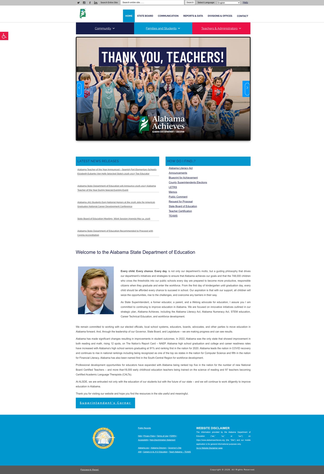
Alabama's State Department of Education website at alabamaachieves.org is a tale of two experiences. Beneath a surface that feels incomplete — empty landing pages, anemic search, and a homepage dominated by a superintendent's letter — sits genuinely useful infrastructure for educators: a comprehensive Teacher Certification portal, a functional Federal Report Card tool with current data, and richly populated mega menus linking to dozens of specialized programs. The disconnect between the site's capable backend and its thin front door is what keeps Alabama in C- territory.
For parents trying to understand how their child's school is performing, the path is needlessly obscure. For a teacher looking up certification requirements or finding professional development resources, the site actually delivers. That asymmetry defines the Alabama Achieves experience.
Strengths
1. Comprehensive Teacher Certification Portal
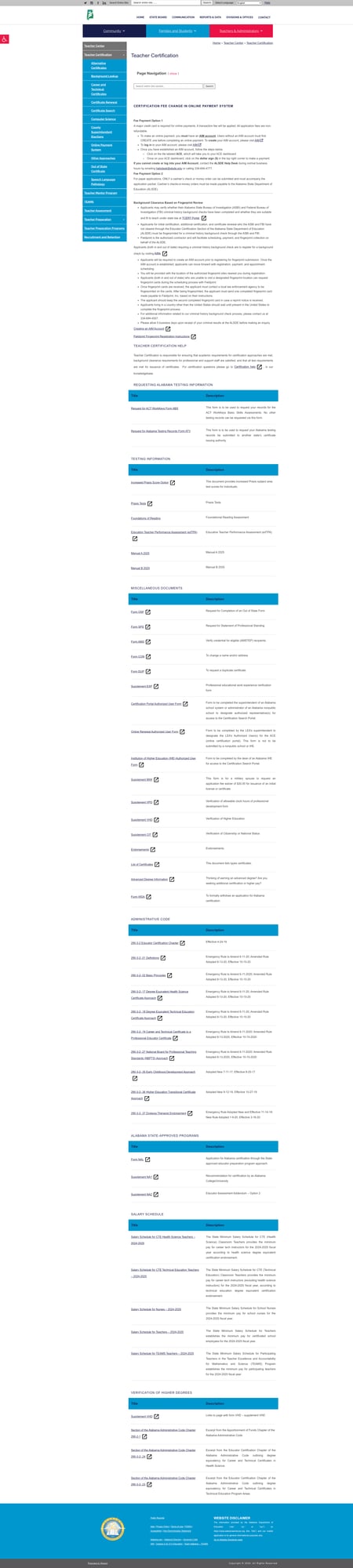
The Teacher Certification page is one of the most thorough educator resource pages in any state we've reviewed. It covers the full certification lifecycle: initial applications, renewals, out-of-state transfers, emergency certifications, and TEAMS (Teacher Education and Mentoring System) integration. The page includes direct links to the online application system, fee schedules, required testing information (Alabama Educator Certification Testing Program), and contact information organized by certification type. It's dense but genuinely useful — a working tool, not a brochure.
2. Improved Mobile Responsiveness
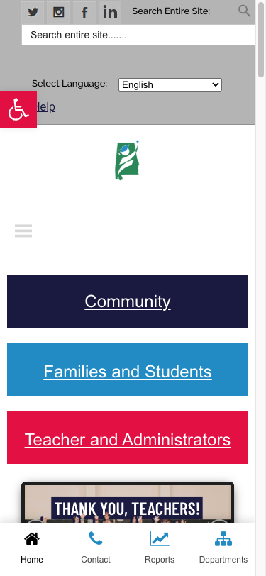
The previous audit flagged mobile responsiveness as a significant weakness. The site has since improved substantially. At 375px width, the layout adapts cleanly: the main navigation collapses to a hamburger menu, the three audience-segment buttons (Community, Families and Students, Teachers & Administrators) stack vertically with large touch targets, and — notably — a dedicated mobile bottom navigation bar appears with quick links to Home, Contact, Reports, and Departments. This is a thoughtful mobile-specific addition that many state sites lack entirely.
3. Rich Mega Menu Navigation
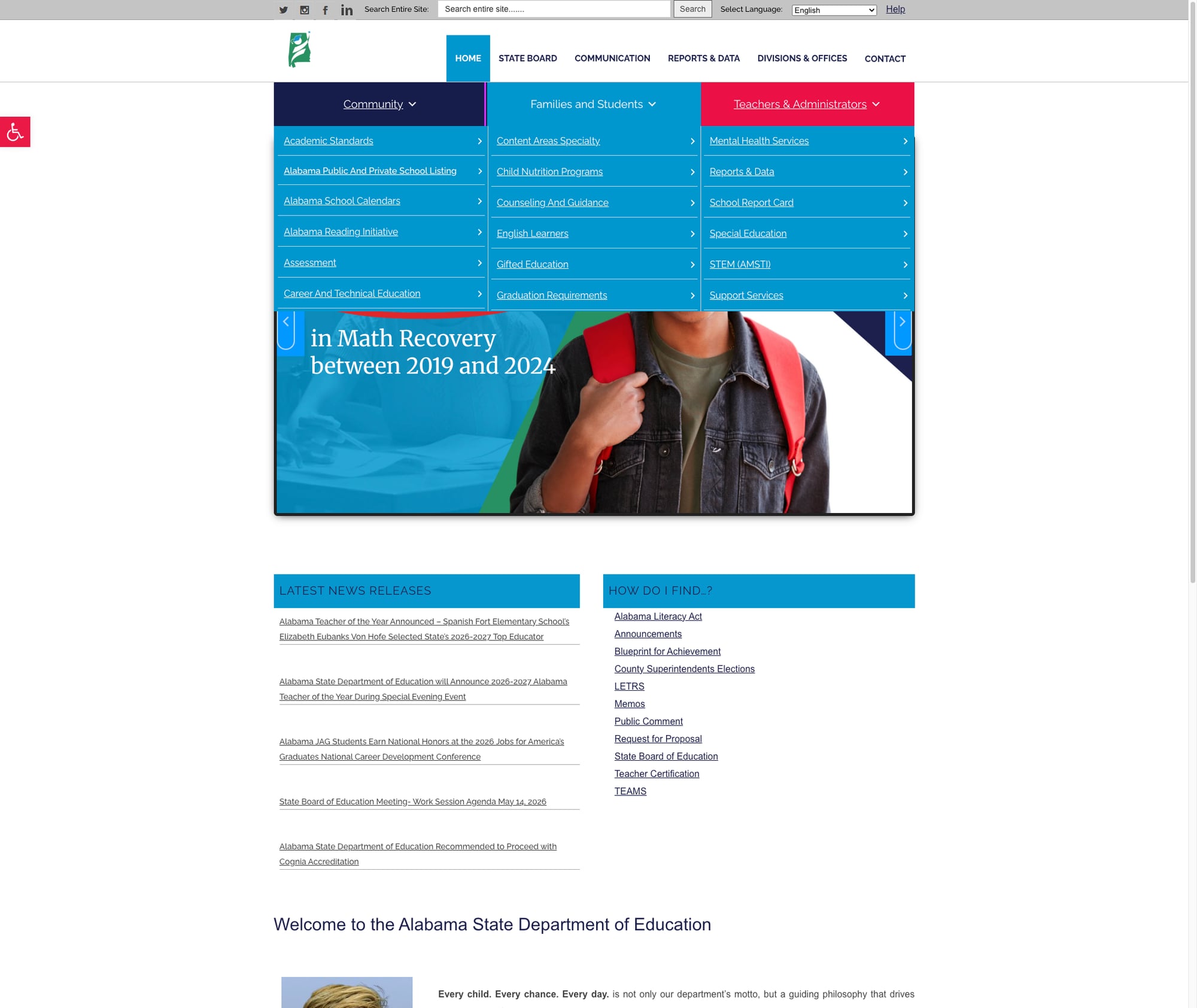
While the top-level navigation bar shows only six items (Home, State Board, Communication, Reports & Data, Divisions & Offices, Contact), the real navigation lives in three audience-targeted mega menus beneath it. The "Families and Students" dropdown contains approximately 15 links covering Academic Standards, Assessment, School Report Card, Special Education, STEM, and more. The "Teachers & Administrators" menu is even richer with 25+ links spanning Accountability, Career and Technical Education, Federal Programs, Professional Development, and specialized offices. The "Community" menu adds items like Charter Schools, Virtual Schools, Homeschool, and Weather Closure List.
4. Multilingual Support and Accessibility Toolbar
The site offers Google Translate integration with 16 language options available from every page via a dropdown selector in the header. A Pojo Accessibility Toolbar provides eight visual adjustment options: Increase/Decrease Text, Grayscale, High Contrast, Negative Contrast, Light Background, Links Underline, and Readable Font. Skip links for both content and navigation are present. While the viewport meta tag initially sets user-scalable=no, the EDAC (Accessibility Checker) frontend JavaScript programmatically corrects this — an unusual but functional approach.
Weaknesses
1. Reports & Data Landing Page Is a Shell
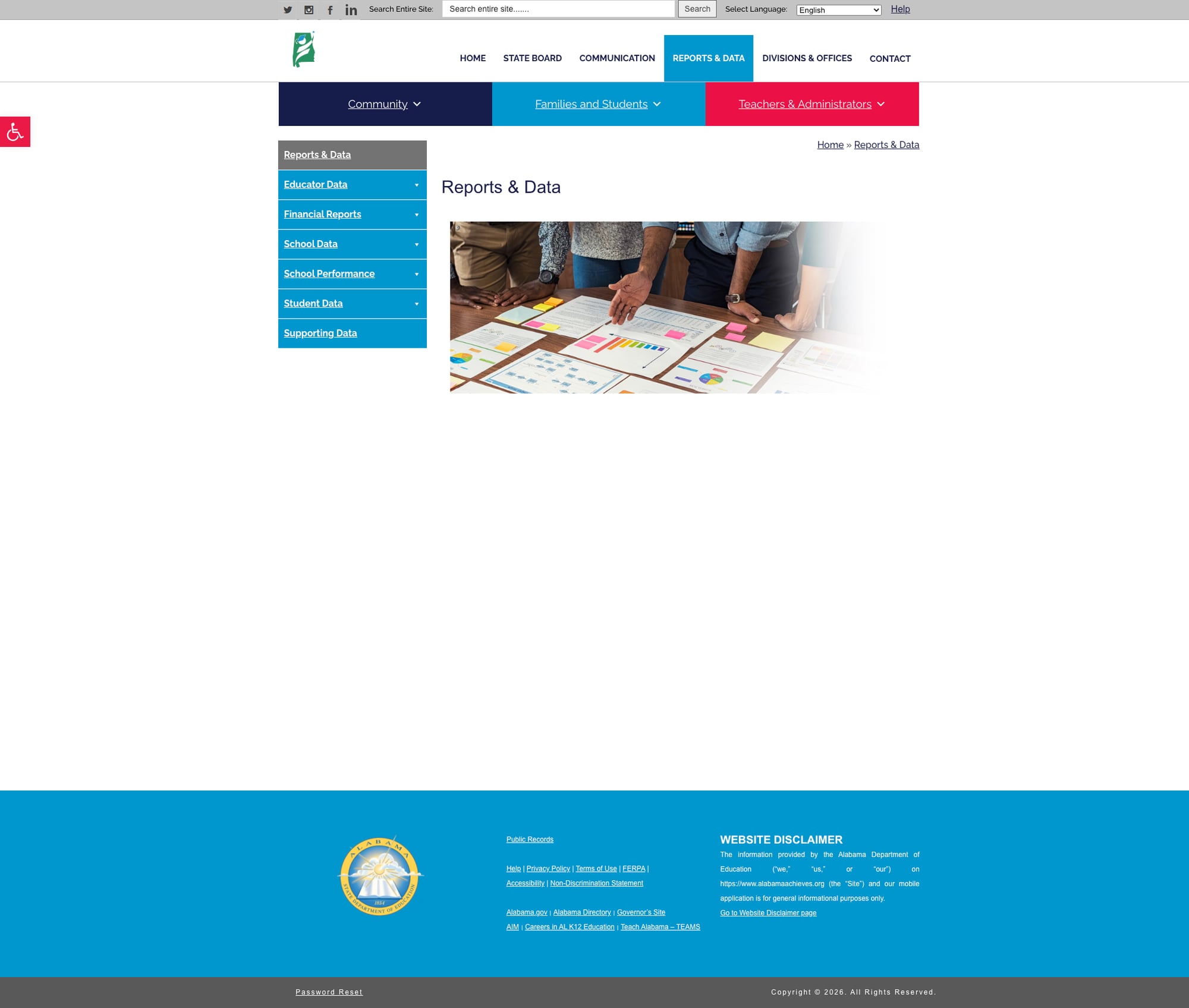
The Reports & Data page — one of the six primary navigation items — renders as little more than a title, a stock photo, and a sidebar menu. There is no introductory text explaining what data is available, no featured datasets, no links to the Report Card tool, and no context for the six subcategory links in the sidebar (Educator Data, Financial Reports, School Data, School Performance, Student Data, Supporting Data). A first-time visitor arriving at this page would have no idea that Alabama maintains a fully functional school report card system at reportcard.alsde.edu.
2. Empty Audience Landing Pages
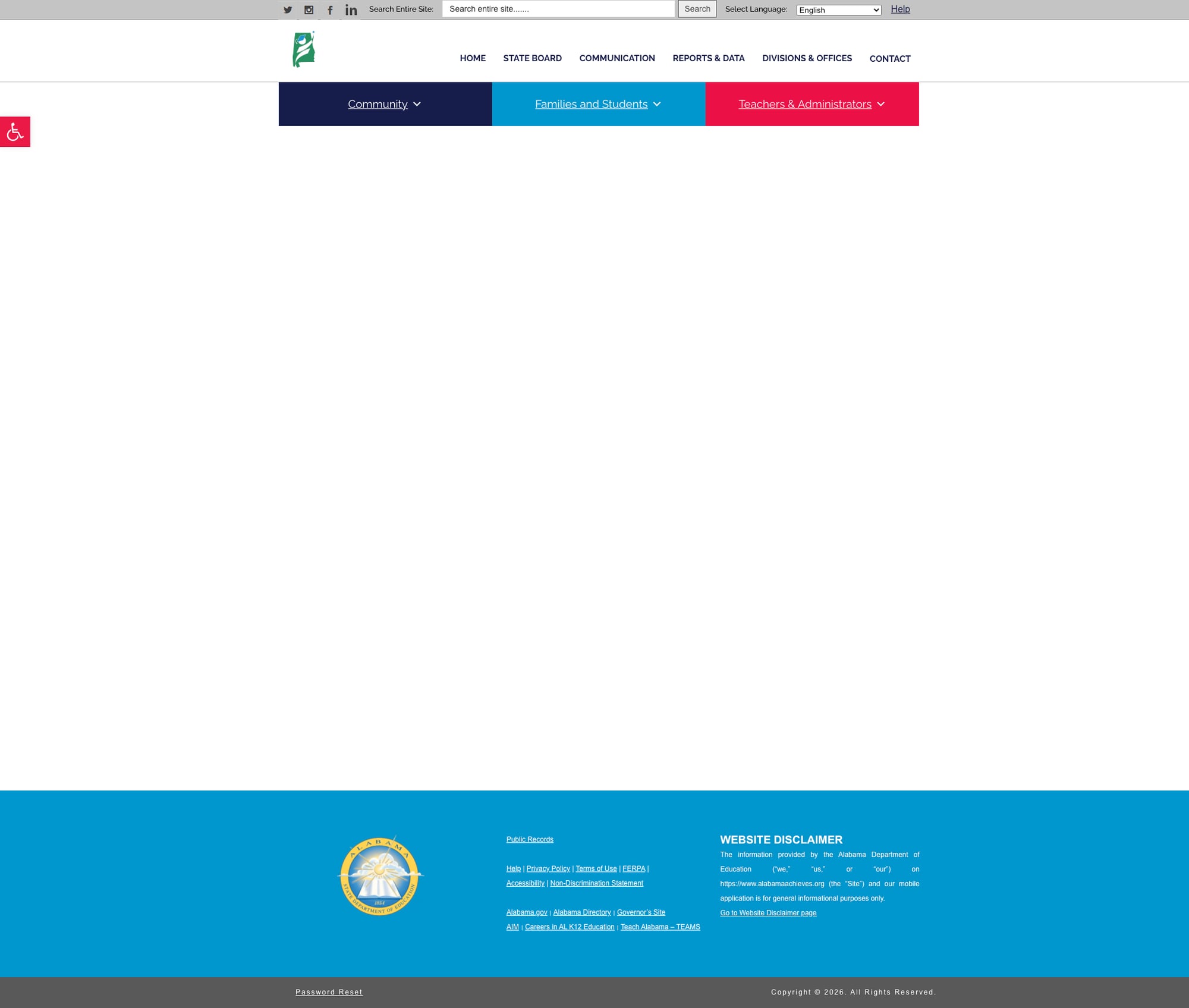
The "Families and Students" landing page at /families-and-students/ is completely empty — just a header, navigation bars, and footer with absolutely no content in between. This is the page that the prominent teal "Families and Students" mega menu button targets. A parent clicking this expecting to find resources for their child encounters a blank page. The actual content lives only in the dropdown mega menu itself, but the landing page offers nothing. This is a critical gap: the site's primary audience-segmentation feature leads to dead ends.
3. Weak Search Functionality
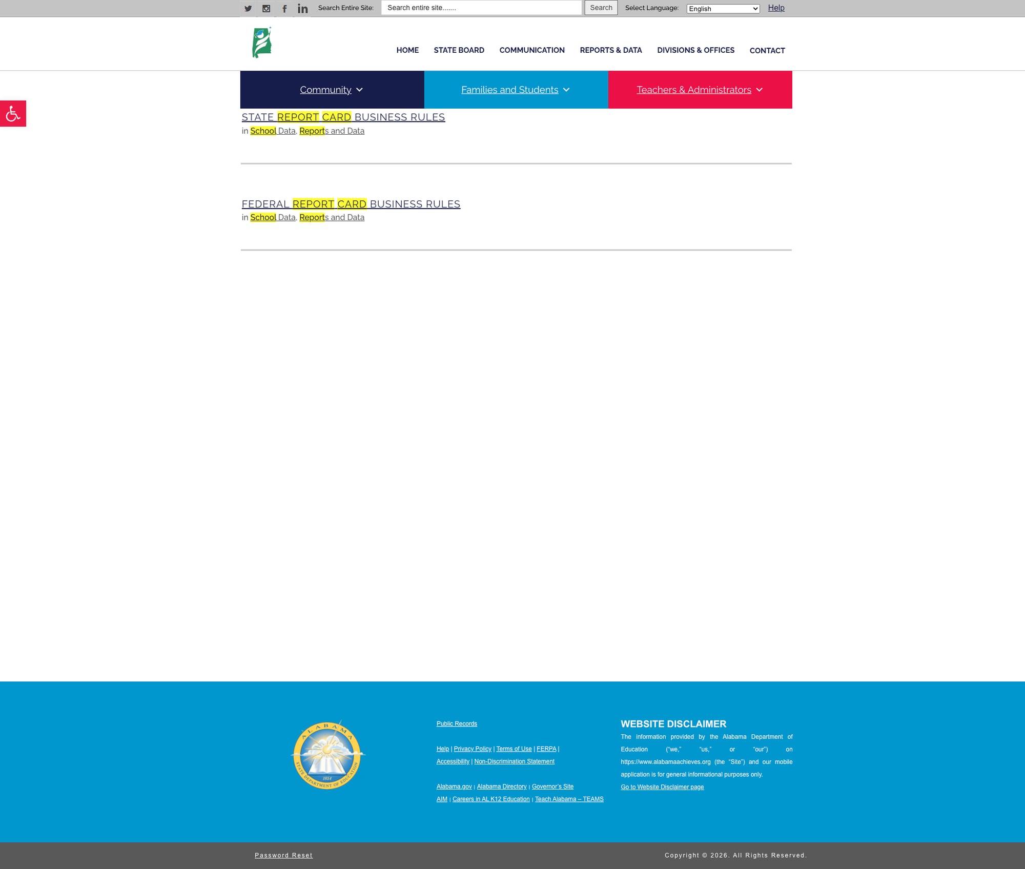
A search for "school report card" — one of the most common reasons a parent would visit a state education website — returns exactly two results: "State Report Card Business Rules" and "Federal Report Card Business Rules." Neither links to the actual Report Card tool. The search offers no autosuggest, no filters, no faceted results, no spelling correction, and no result count indicator. This is basic WordPress default search with no enhancements, on a site with hundreds of pages of content.
4. Homepage Dominated by Superintendent's Letter
The homepage's primary content area is occupied by a multi-paragraph letter from the State Superintendent — text that reads like an annual report introduction rather than a functional entry point to the site. While the "Latest News Releases" section and "How Do I Find…?" quick links provide some utility, the page lacks the dashboard-style layout that would help visitors quickly orient: no data highlights, no featured school performance metrics, no upcoming event calendar, no clear paths for different audience types beyond the mega menu buttons.
Opportunities
Populate the landing pages. The empty Families/Students, Teacher/Administrators, and Community landing pages should mirror the content of their respective mega menus with curated introductions, featured resources, and visual navigation cards. This is likely a content gap, not a technical one — the WordPress infrastructure supports it.
Upgrade search to a modern solution. Implementing Algolia, SearchWP, or even Relevanssi (a WordPress plugin) would dramatically improve discoverability. The site has hundreds of well-organized subpages that search simply cannot find today.
Promote the Report Card tool. The Federal Report Card at reportcard.alsde.edu with 2024-2025 data should be prominently featured on the homepage and the Reports & Data page. It's one of Alabama's strongest data assets and it's essentially hidden.
Threats
Content fragmentation. Key tools and data live on separate subdomains (reportcard.alsde.edu, eddir.alsde.edu, aim.alsde.edu) with no visual or navigational connection to the main site. As these systems age independently, the user experience will continue to fragment.
Accessibility compliance risk. While the Pojo toolbar and EDAC corrections show effort, the programmatic fix for
user-scalable=nois fragile — it depends on JavaScript execution and could fail for users with JS disabled or on slow connections. A proper fix in the HTML meta tag would be more robust.
Standout Feature
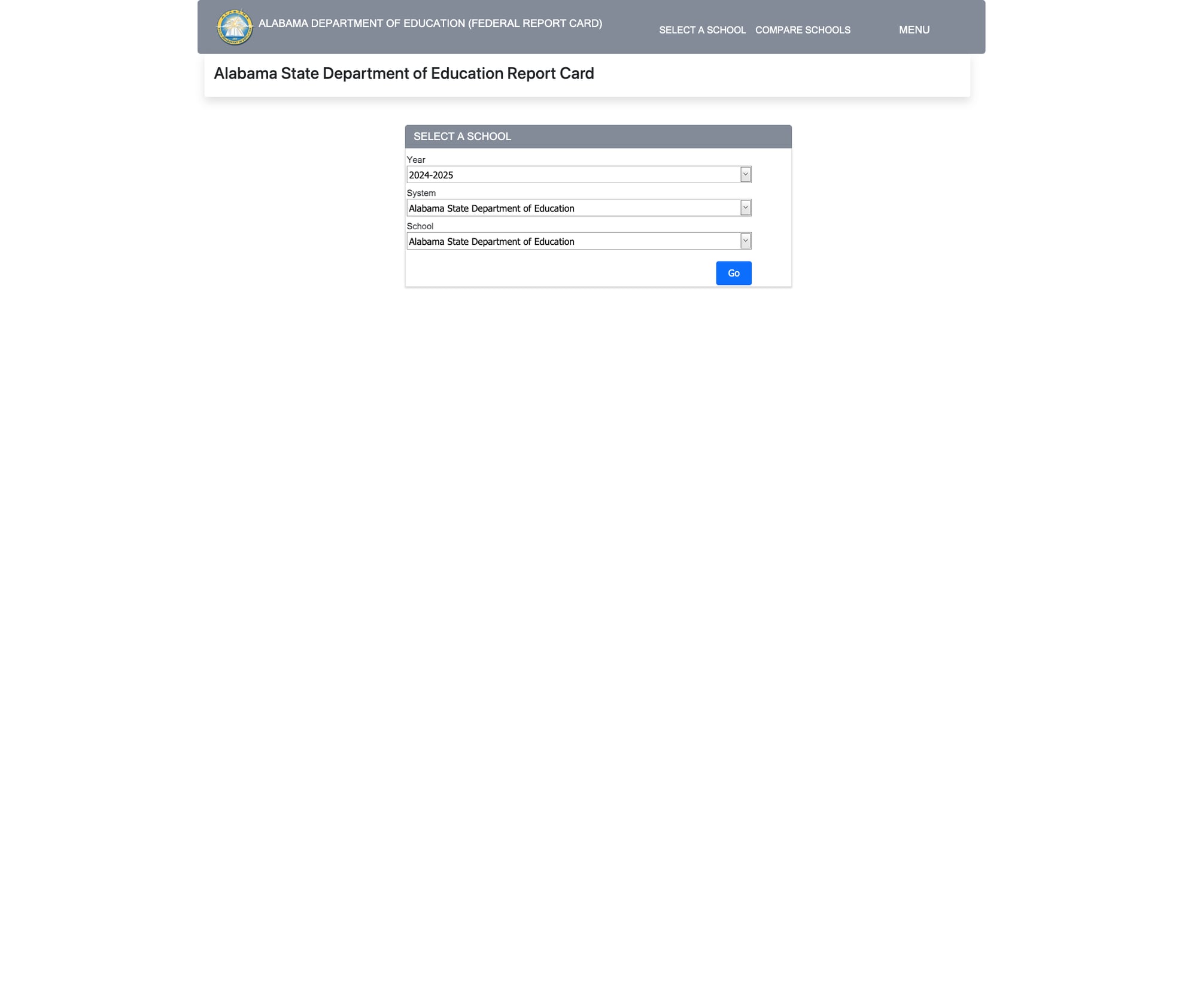
The Alabama School Report Card at reportcard.alsde.edu provides a clean, functional interface for comparing school and district performance data. It offers year selection (currently showing 2024-2025), system/district filtering, and individual school lookup with a "Compare Schools" feature. The tool includes state-level data and supports drill-down to individual schools. While the visual design is utilitarian (plain ASP.NET forms), the data coverage is current and the interface is straightforward. It's the site's most valuable public-facing tool — and it deserves a prominent spot on the homepage rather than being buried in a mega menu dropdown.
Bottom Line
Alabama Achieves delivers solid infrastructure for educators — teacher certification, professional development, and CTE resources are well-organized and genuinely useful. But for parents, students, and community members, the site presents a frustrating paradox: rich content hidden behind empty landing pages, a powerful report card tool buried in a subdomain, and a search engine that can't find its own most important features. The bones are here; they just need flesh.
Grade Breakdown
| Criterion | Weight | Score | Notes |
|---|---|---|---|
| Navigation & Information Architecture | 15% | 7/10 | Three-tier nav with rich mega menus, but landing pages are empty shells; breadcrumbs present; "How Do I Find" section helpful |
| Accessibility (WCAG 2.1 AA) | 15% | 7/10 | Pojo toolbar with 8 options, skip links, EDAC corrections; user-scalable=no fixed via JS; ARIA attributes present |
| Search Functionality | 10% | 3/10 | Basic WordPress search returns 2 results for core queries; no autosuggest, filters, or spelling correction |
| Mobile Responsive Design | 10% | 7/10 | Clean responsive layout at 375px; hamburger menu; stacked audience buttons; dedicated mobile bottom nav bar |
| Data Transparency & Open Data | 10% | 6/10 | Report Card tool at reportcard.alsde.edu with 2024-2025 data; Reports & Data page is empty; subcategories exist but are thin |
| Parent Resources | 10% | 3/10 | Families & Students mega menu has ~15 items but landing page is completely empty; no parent portal or plain-language guides |
| Educator Resources | 10% | 7/10 | Comprehensive Teacher Certification, TEAMS integration, CTE, STEM/AMSTI; Teachers & Administrators menu has 25+ items |
| Visual Design & Branding | 10% | 6/10 | Consistent blue/teal/magenta palette; Raleway typography; homepage dominated by superintendent's letter; Bridge/Qode theme |
| Performance & Load Speed | 10% | 7/10 | 133ms TTFB, 394ms total; 2.2MB page weight is heavy but load feels fast; lazy loading enabled |
| Overall | 100% | 60/100 | C- |
Discussion